Table of Contents
- Theme Installation
- Upload the routes.yaml File (⚑ Required)
- Homepage
- Homepage Content
- Homepage Default Style
- Homepage Image Right Style
- Homepage Image Circle Style
- Homepage Image Center Style
- Homepage Image Wide Style
- Homepage Image Full Style
- Homepage Number of Featured and Recent Posts
- Homepage Change Featured and Recent Posts Titles
- Homepage Styles and File Names
- Homepage Replace the Content Subscribe Form With a Button
- Homepage Remove the All Posts → Link
- Homepage Remove the Bottom Subscribe Box
- Changing Colors
- Changing Colors with CSS Variables
- Members / Subscriptions
- Disable Membership Components
- Remove ‘Log in’ and ‘Membership’ links from Header
- Remove ‘Public’, ‘Members’ and ‘Paid’ Labels from Post Card
- Remove Subscribe Form from the Homepage Content
- Remove Subscribe Form from the Homepage Bottom
- Remove Subscribe Form from the Post Page
- Remove Ghost Portal / The Bottom Right Button
- Change Subscribe Box Text
- Add Name to the Subscribe Form
- Navigation
- Search
- Pages
- Languages
- Comments
- Typography Drop Caps
- Table of Contents
- Posts Per Page
- Related Posts
- RSS Feed URL
- Publication icon
- Syntax Highlighting
- Theme Deploy with GitHub Actions
- Footnotes
- Code Injection
- Blockquote Styles
- Customize Logo Size
- Footer Copyright
- Remove Dates
- Remove Author Elements
- Remove Post Feature Image
- Remove Homepage Feature Image
- Make Post Card Feature Image Bigger
- Post Card Feature Image Ratio
- Open Post Links in a New Tab
- Zip Theme Files
Theme Installation
- Log in to your Ghost website admin (example.com/ghost).
- Click the settings icon ( ) at the bottom of the left-hand side.
- Go to Site > Theme and click Change theme.
- Click Upload theme and select the ubud.zip theme file.
- Once uploaded, click Activate.
Upload the routes.yaml File (⚑ Required)
The routes.yaml file is required for:
- Homepage content
- Blog page
- Archive page
To upload the file:
- Unzip the ubud.zip theme file.
- In Ghost admin, click the settings icon ( ) at the bottom left.
- Go to Advanced > Labs.
- Click Open under Beta features.
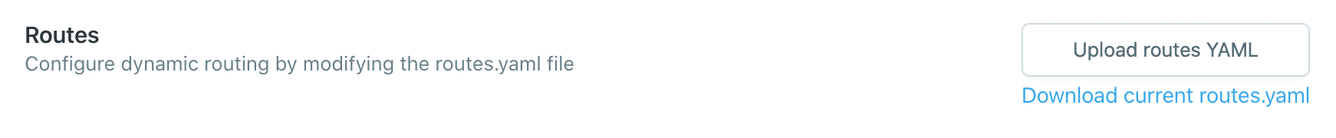
- In the Routes section, click Upload routes YAML.
- Select the
routes.yamlfile in the theme folder and upload it.
Or watch the video:
Note: Upload routes.yaml after uploading the theme zip
Ghost includes a default routes.yaml. Upload your theme’s routes.yaml to override it.
Do this after you upload the theme zip.
Homepage 404: Page Not Found
After uploading the routes.yaml file, the homepage will return 404 Page Not Found.
That’s fine. Move on to the next step and set up the Homepage.
Homepage
Make sure to Upload the routes.yaml file.
The homepage will show a list of content sections.
- Your content and image from a custom Ghost Page
- Featured posts, if they exist
- Recent three posts
- All Posts → link to the blog page
- Subscription box
Homepage Content
Make sure to Upload the routes.yaml file.
➀ In Ghost admin, create a new Page.
➁ In Page settings, set the Page URL as home.
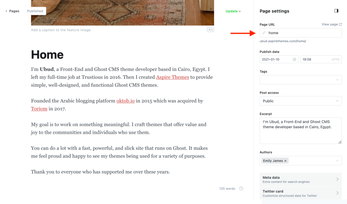
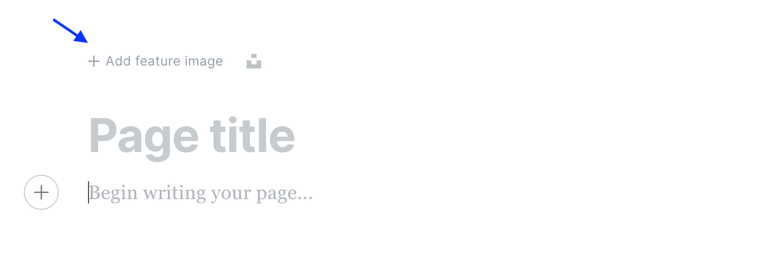
➂ Add your content, Excerpt, upload your feature image.
Above the title in the Ghost editor, click the + Add feature image to upload your image.
The page title will not be visible on the website; only the content and the image will be. However, you can name it *Home or any preferred name to make it visible from the dashboard.*
➃ Click Publish.
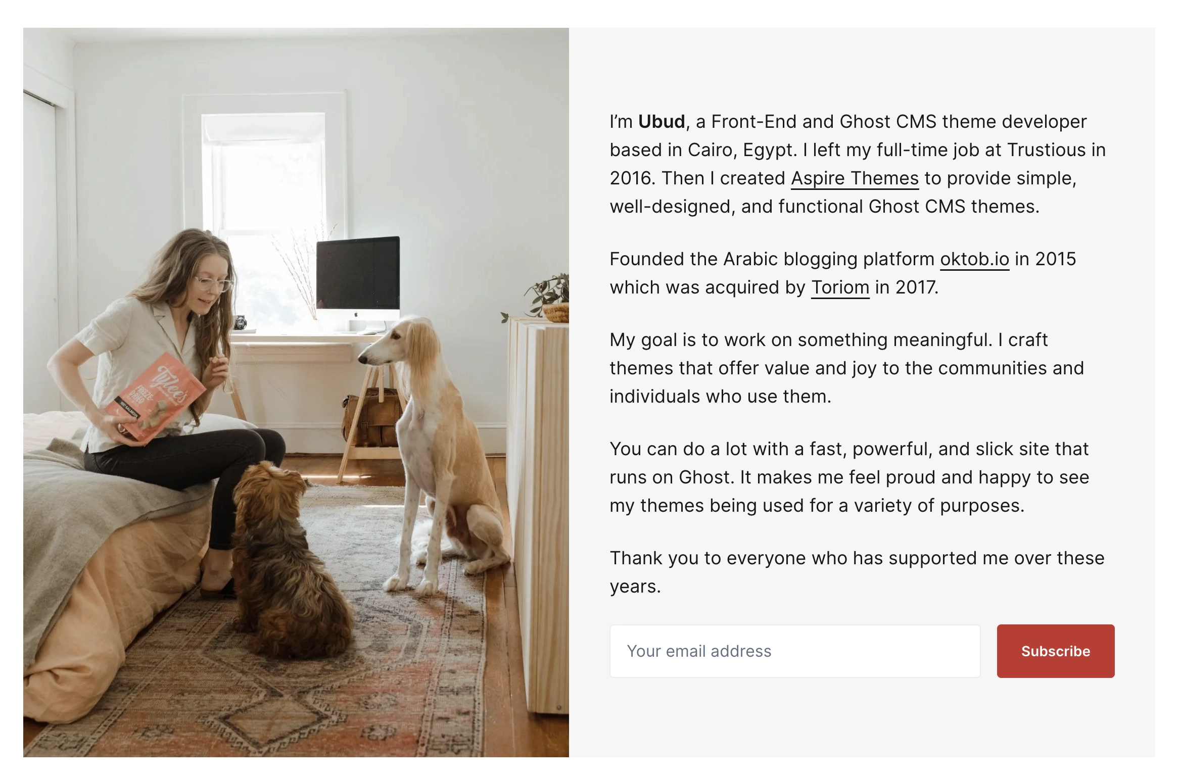
Now, go to your website homepage, and your content is visible using the theme homepage default layout style.
If you don’t want to upload an image, you can leave it empty, and the theme will only show the page content on the homepage, like the following example.
Homepage Metadata Note
Due to a Ghost limitation not exposing the custom homepage data, the homepage Metadata information will be coming from the admin General and Branding settings.
- From the site admin Settings > General, you can set up the Title & description.
- From the site admin Settings > Design > Brand, you can set up the Publication cover. You can upload the same image as the homepage feature image if you have already uploaded one.
Metadata is helpful for Search Engine Optimization and sharing your website on social media sites to have a nice-looking preview.
The Twitter card and Facebook card meta settings under Settings > General are helpful if you want to customize the look for these specific sites.
It might take some time for the social media site to fetch the new image and to see the changes; give it some time. You can also use a tool like Twitter Card validator for testing.
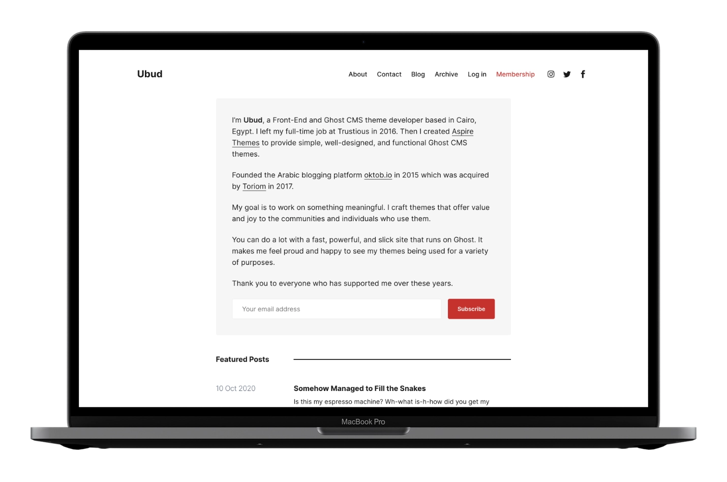
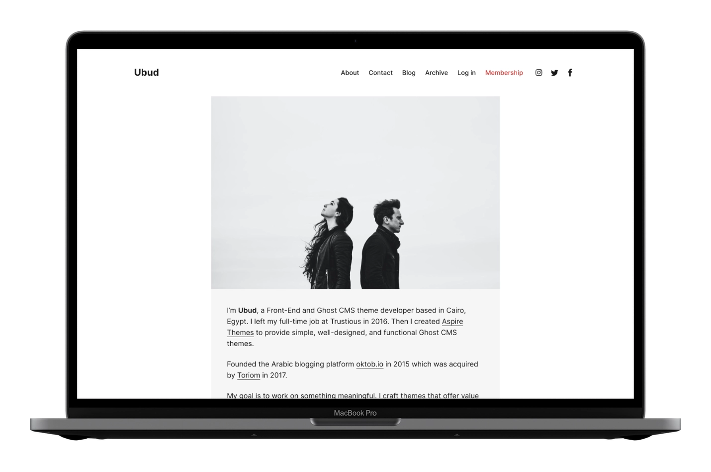
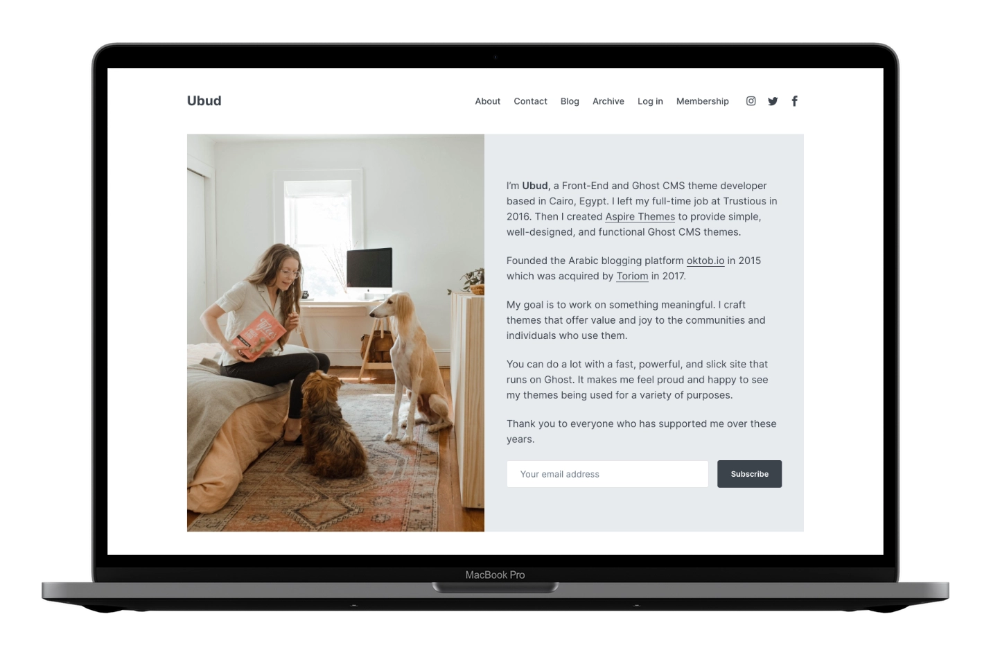
Homepage Default Style
The theme file for the home default style is partials/home/style-image-left.hbs if you want to make any changes.
Homepage Default Style Image Size
The image size is 540px wide.
When uploading the Featured image, try to upload an image with a double size to look sharp in retina displays. The 540px wide size is the one that is visible on the screen. But behind the scenes, the theme will crop the image to be 1080px wide if the uploaded image is broader than that. Again, I use this method so the image looks good on retina screens.
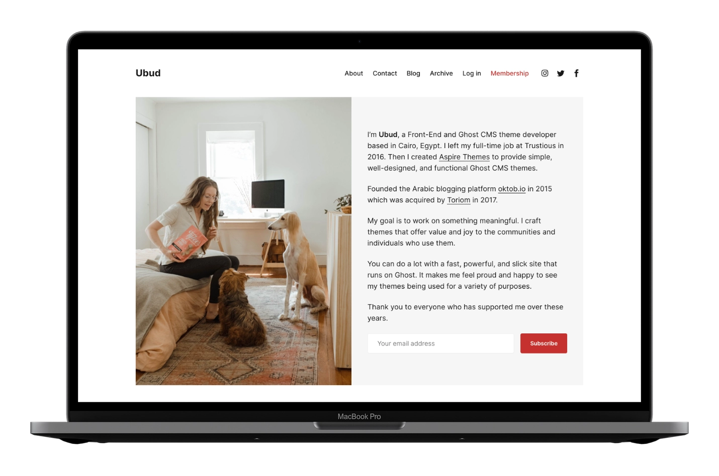
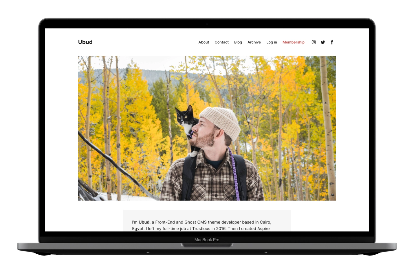
Homepage Image Right Style
The theme file for the home image right style is partials/home/style-image-right.hbs if you want to make any changes.
To activate the Image Right style:
- Go to your Ghost admin Settings > Design & branding > Homepage
- Choose Image Right from the Homepage layout style option
- Click Save
Homepage Image Right Style Image Size
The image size is 540px wide.
When uploading the Featured image, try to upload an image with a double size to look sharp on retina displays.
The 540px wide size is the one that is visible on the screen. But behind the scenes, the theme will crop the image to be 1080px wide if the uploaded image is broader than that.
Again, I use this method so the image looks good on retina screens.
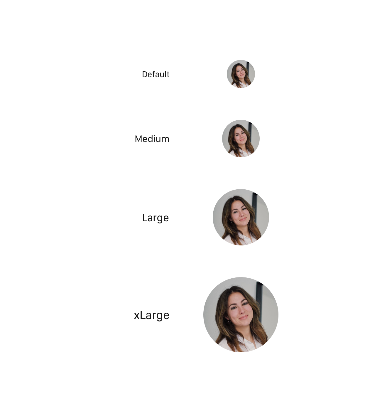
Homepage Image Circle Style
The theme file for the home image circle style is partials/home/style-image-circle.hbs if you want to make any changes.
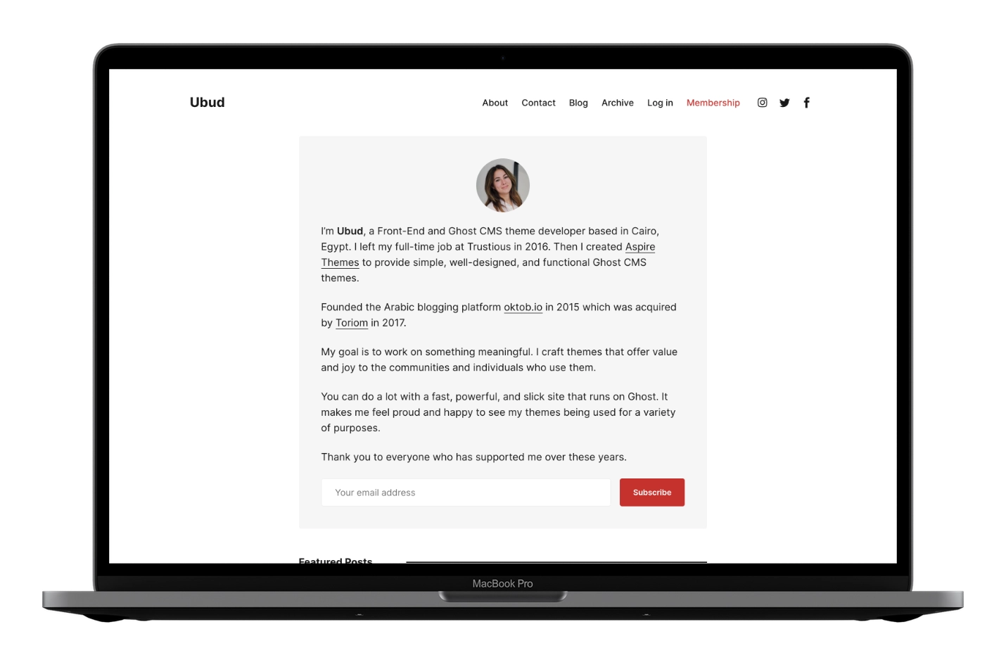
To activate the Image Circle style:
- Go to your Ghost admin Settings > Design & branding > Homepage
- Choose Image Circle Small/Medium/Large/xLarge from the Homepage layout style option
- Click Save
Homepage Image Circle Style Image Sizes
The image circle style comes with four different image sizes.
- Small →
96px×96px - Medium →
128px×128px - Large →
192px×192px - xLarge →
256px×256px
When uploading the Featured image, try to upload an image with a double size to look sharp on retina displays.
The previous sizes are the ones that are visible on the screens. But behind the scenes, the theme will use the actual image size.
Again, I use this method so the image looks good on retina screens.
- Small →
192px×192px - Medium →
256px×256px - Large →
384px×384px - xLarge →
512px×512px
The theme and Ghost will do the image crop and generate those sizes when you upload an image. I want to give you an overview of the dimensions.
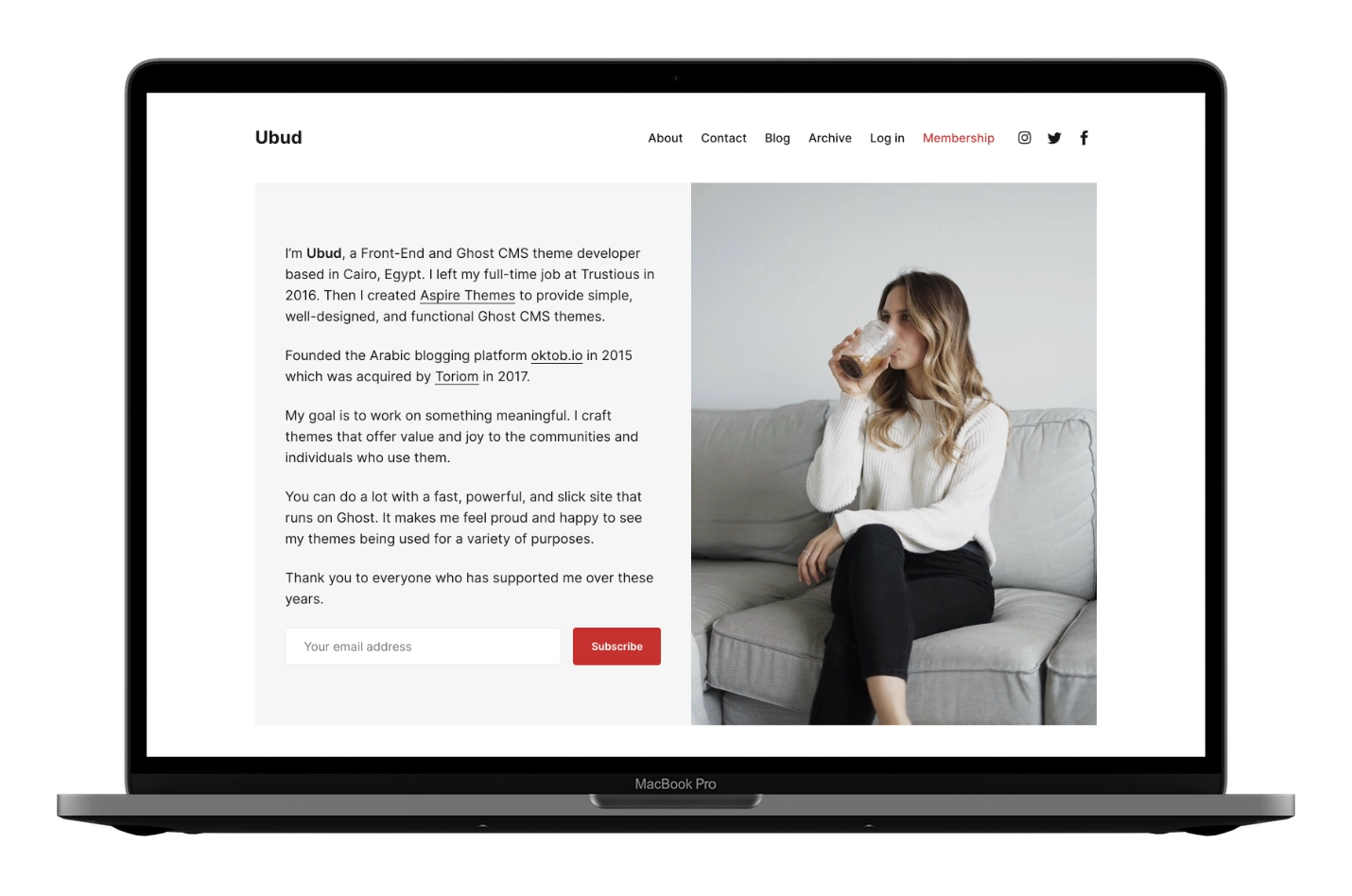
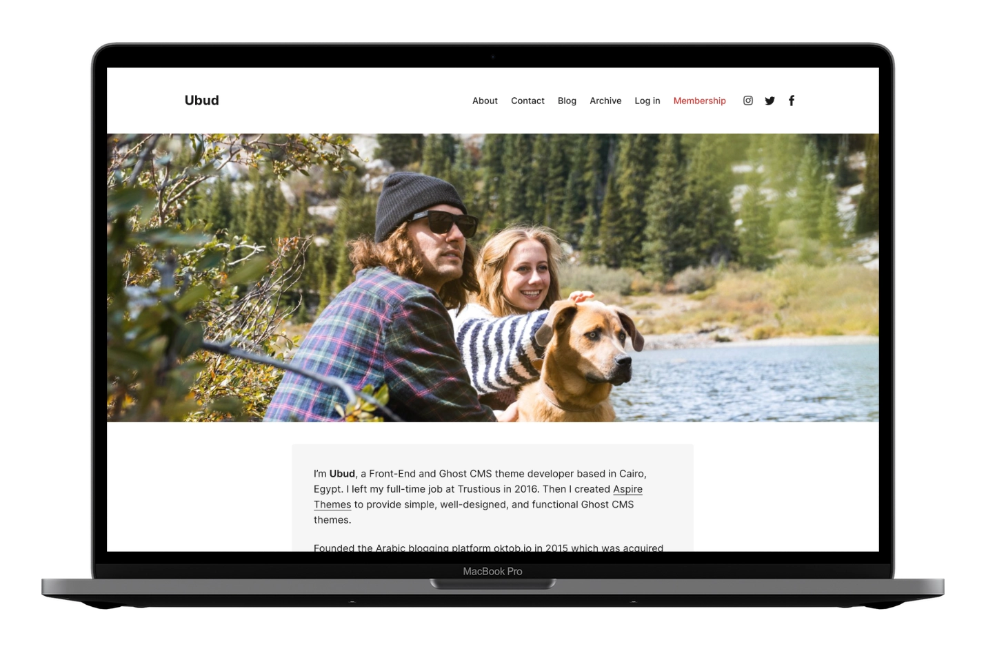
Homepage Image Center Style
The theme file for the home image center style is partials/home/style-image-center.hbs if you want to make any changes.
To activate the Image Center style:
- Go to your Ghost admin Settings > Design & branding > Homepage
- Choose Image Center from the Homepage layout style option
- Click Save
Homepage Image Center Style Image Size
The image size is 731px wide.
When uploading the Featured image, try to upload an image with a double size to look sharp on retina displays.
The 731px wide size is the one that is visible on the screen. But behind the scenes, the theme will crop the image to be 1462px wide if the uploaded image is broader than that.
Again, I use this method so the image looks good on retina screens.
Homepage Image Wide Style
The theme file for the home image wide style is partials/home/style-image-wide.hbs if you want to make any changes.
To activate the Image Wide style:
- Go to your Ghost admin Settings > Design & branding > Homepage
- Choose Image Wide from the Homepage layout style option
- Click Save
Homepage Image Wide Style Image Size
The image size is 1120px × 630px.
When uploading the Featured image, try to upload an image with a double size to look sharp on retina displays.
The 1120px × 630px size is the one that is visible on the screen. But behind the scenes, the theme will crop the image to be 2240px wide if the uploaded image is larger than that.
Again, I use this method so the image looks good on retina screens.
Homepage Image Full Style
The theme file for the home image full style is partials/home/style-image-full.hbs if you want to make any changes.
To activate the Image Full style:
- Go to your Ghost admin Settings > Design & branding > Homepage
- Choose Image Full from the Homepage layout style option
- Click Save
Homepage Image Full Style Image Size
The wider the image, the better. An image height of 676px will be perfect.
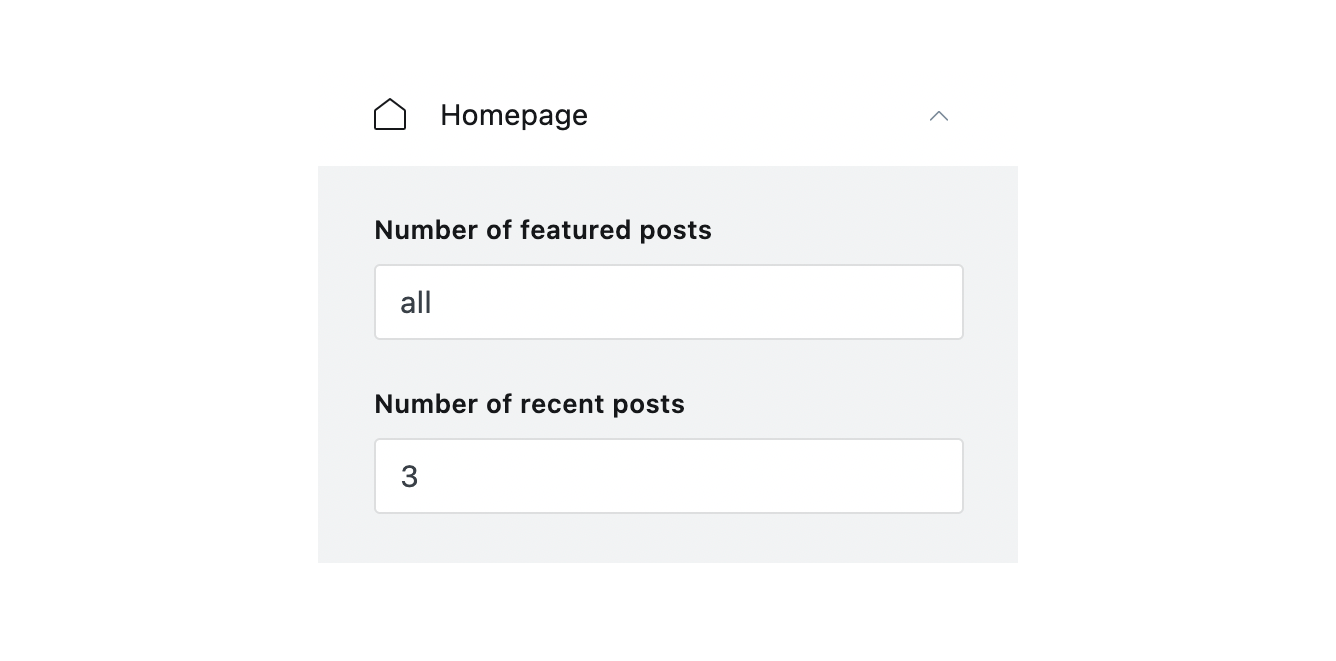
Homepage Number of Featured and Recent Posts
To control how many Featured or Recent posts to show, go to your Ghost admin Settings > Design & branding > Homepage
You will find two input settings:
- Number of featured posts default value is
all, showing all featured posts. - Number of recent posts default value is
3, which will only show the recent three posts.
Input values you can use:
- Number,
1,2or3or any number you want to include allto show all postsnoneto show nothing
Homepage Change Featured and Recent Posts Titles
To change the Featured Posts title, open the partials/home/featured-posts.hbs theme file using a code editor and change it in line 8.
To change the Recent Posts title, open the partials/home/recent-posts.hbs theme file and change it in line 8.
Homepage Styles and File Names
Below are the homepage styles and theme file names for a quick overview.
- Homepage Default Style →
partials/home/style-image-left.hbs - Homepage Image Right Style →
partials/home/style-image-right.hbs - Homepage Image Circle Style →
partials/home/style-image-circle.hbs - Homepage Image Center Style →
partials/home/style-image-center.hbs - Homepage Image Wide Style →
partials/home/style-image-wide.hbs - Homepage Image Full Style →
partials/home/style-image-full.hbs
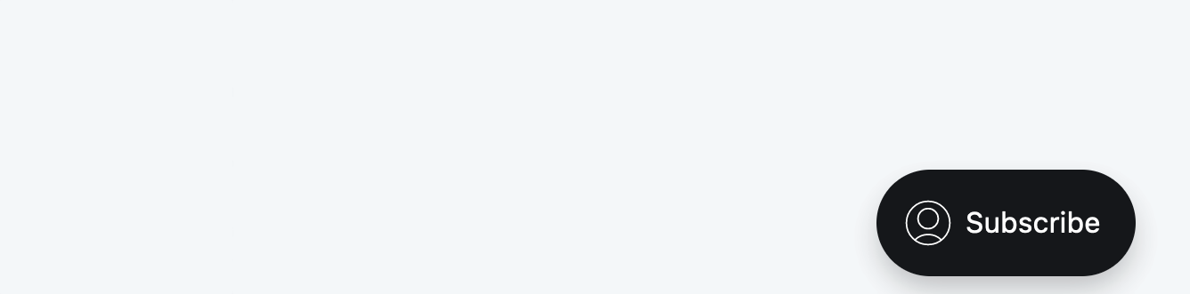
Homepage Replace the Content Subscribe Form With a Button
You may want to replace the homepage content subscribe form with a button that links to another page or website.
Open the theme file for the homepage style you are using. Replace the following line of code for the subscribe form, which will be similar to:
{{> home/subscribe-form }}
With the following line of code.
<a href='#/portal/signup' class='c-btn c-btn--full' style='color:#fff; text-decoration:none;'>Subscribe</a>
Notice that I used the #/portal/signup as a value to the Portal. You can change this value to another website or internal website page.
Once you finish, zip the theme files, and upload the final zip file to your Ghost website.
Homepage Remove the All Posts → Link
If you set the Recent Posts setting value to all or none, the All Posts → button will be invisible.
Another option to hide is to add the following CSS code in the Ghost admin Code Injection Site Header.
<style>
  .home-template .c-pagination { display: none; }
</style>
Homepage Remove the Bottom Subscribe Box
Add the following CSS code in the Ghost admin Code Injection Site Header.
<style>
  .home-template .c-subscribe { display: none; }
</style>
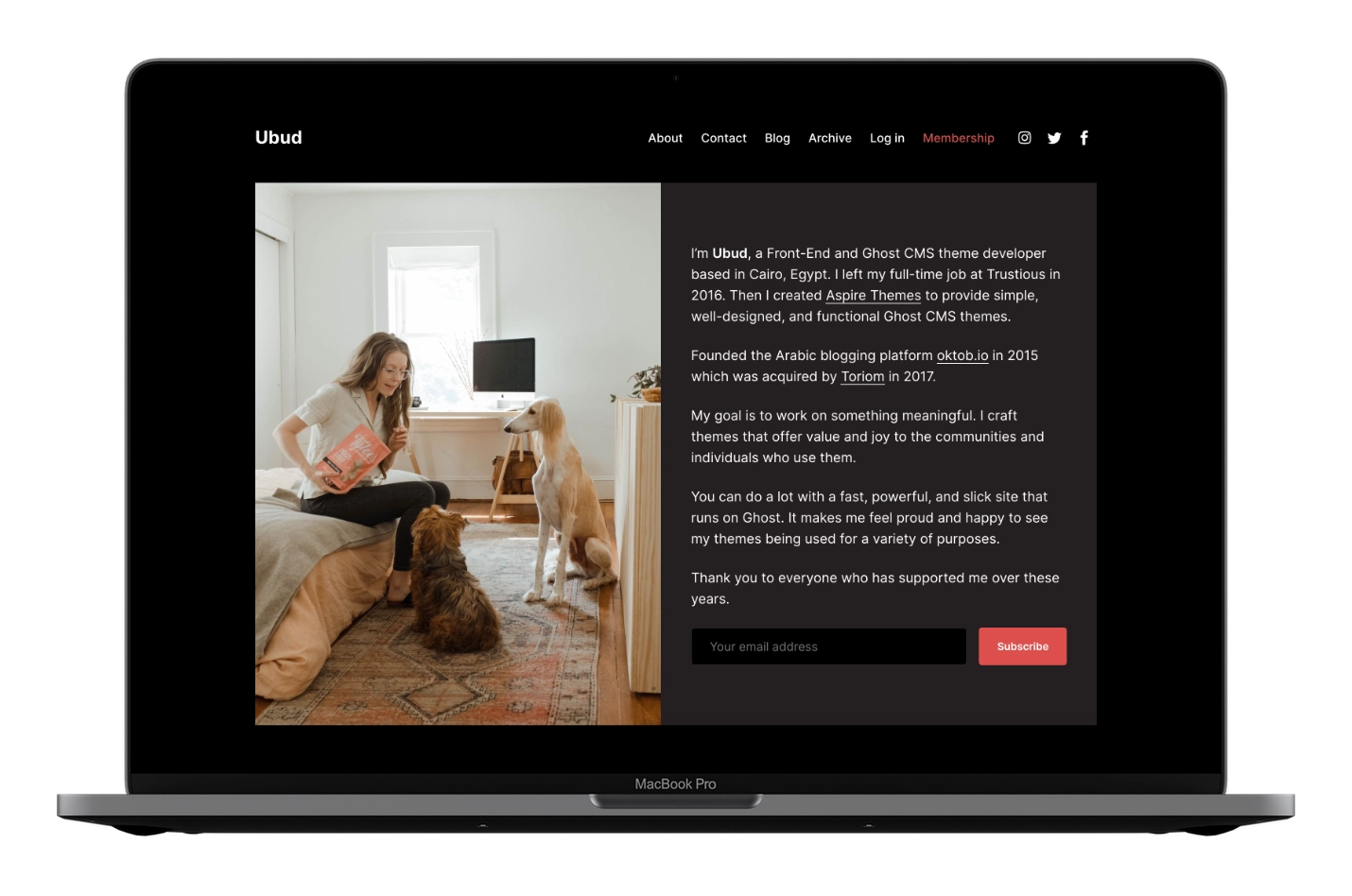
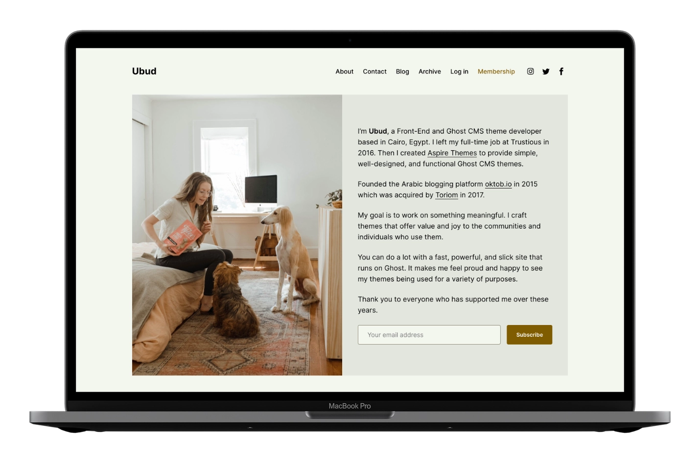
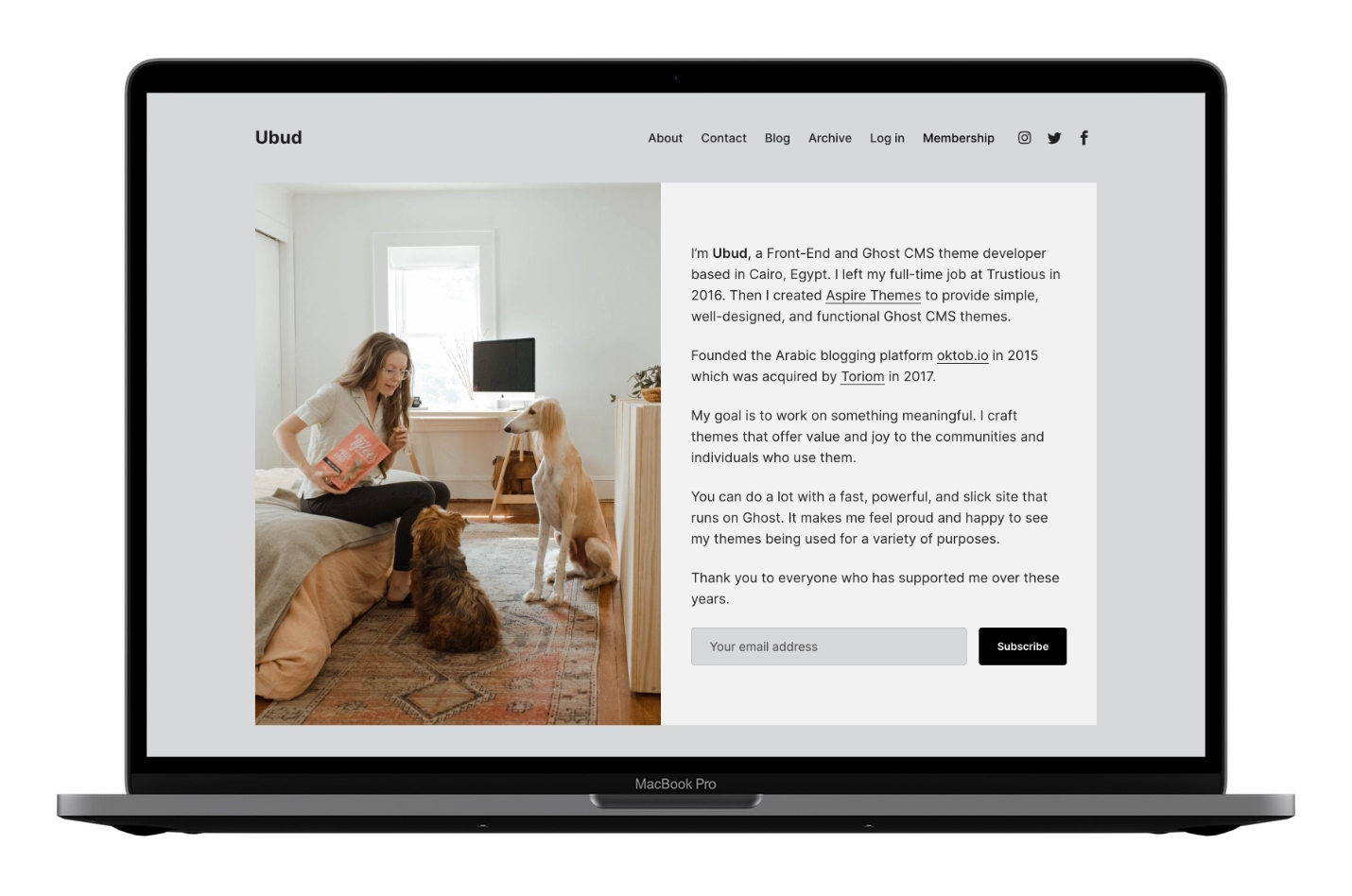
Changing Colors
Learn how to change the site accent color and adjust the theme color scheme using CSS variables, with examples.
Set Accent Color
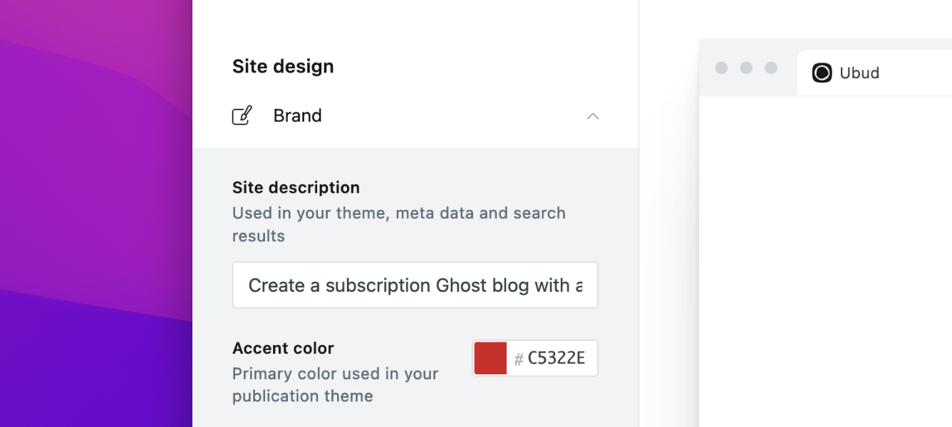
Ubud uses the accent color throughout the theme (e.g., buttons, header Membership link text, and link hover states).
Change the accent color in Ghost admin: Settings > Design > Brand > Accent color.
Changing Colors with CSS Variables
Use the Ghost admin Code Injection Site Header to change other theme colors using CSS variables.
:root {
  --color-text-primary:   #181818;
  --color-text-secondary: #646F82;

  --color-white:   #FFFFFF;

  --background-primary:   #FFFFFF;
  --background-secondary: #F6F6F6;

--background-hero: var(--background-secondary);
}
Watch the following video for an overview of the color scheme feature and how to use it.
Theme Colors Explained
If you’re not technical, don’t worry—change one value to see results immediately.
You can try the ready-made nine color schemes below.
:root {
  // Primary text is the main text color for site content.
  --color-text-primary: #181818;

  // Secondary text is used for elements like post dates, footer nav, input placeholders, content captions for images and gallery, and author info icons/metadata.
  --color-text-secondary: #687385;

  // White is used for buttons with brand colors as background.
  --color-white: #FFFFFF;

  // Border color separates post cards on the homepage and styles form input borders.
  --color-border: #ECECEC;

  // Primary background is the site background. Also used for the subscribe box icon color.
  --background-primary: #FFFFFF;

  // Secondary background is used for homepage content, subscribe box, plans, author info block, and comments.
  --background-secondary: #F6F6F6;

  // The hero background inherits from `--background-secondary`. Use this to set a unique hero color if needed.
  --background-hero: var(--background-secondary);
}
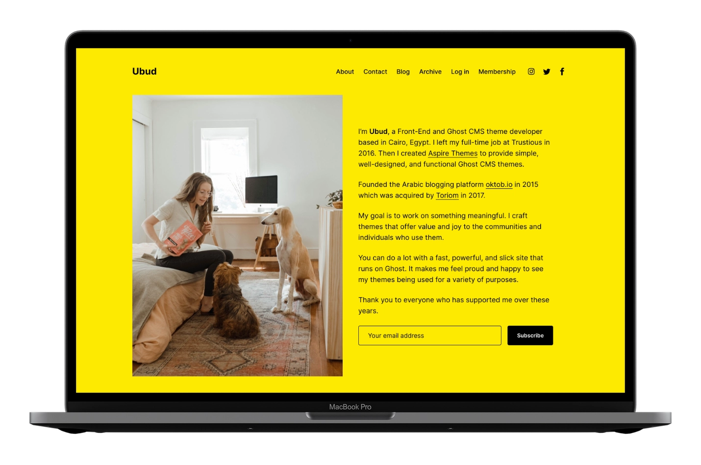
Color Scheme Examples
Below are nine accessible color scheme examples.
- Every color scheme has an accent color — set it first.
- Copy and paste the scheme code in the Ghost admin Code Injection Site Header.
All the color schemes are accessible colors for better reading and accessibility experience.
➊ Dark
Accent color → DC514D
<style>
  :root {
    --color-text-primary:   #FFFFFF;
    --color-text-secondary: #9BAAC1;

    --color-white:   #FFF;
    --color-border:  #292622;

    --background-primary: #000;
    --background-secondary: #241F21;

--background-hero: var(--background-secondary);
  }
</style>
➋ Monza
Accent color → D6001C
<style>
  :root {
    --color-text-primary:   #D6001C;
    --color-text-secondary: #D6001C;

    --color-border:  #D6001C;

    --background-primary: #FFFFFF;
    --background-secondary: #FFF3CC;

    --background-hero: var(--background-primary);
  }
</style>

➌ Soft Peach
Accent color → 905656
<style>
  :root {
    --color-text-primary:   #241616;
    --color-text-secondary: #412727;

    --color-border:  #e9dbdb;

    --background-primary: #F6F0F0;
    --background-secondary: #f2e9e9;

    --background-hero: var(--background-primary);
  }
</style>

➍ Cinnamon
Accent color → 805b00
<style>
  :root {
    --color-text-primary:   #000;
    --color-text-secondary: #374c6d;

    --color-border:  #807D67;

    --background-primary: #F4F6EF;
    --background-secondary: #e4e6e0;

    --background-hero: var(--background-secondary);
  }
</style>
➎ Bright Gray
Accent color → 373f48
<style>
  :root {
    --color-text-primary:   #3C434C;
    --color-text-secondary: #647180;

    --color-border:  #DFE3E9;

    --background-primary: #FFFFFF;
    --background-secondary: #E7EBF0;

    --background-hero: var(--background-secondary);
  }
</style>
➏ Iron
Accent color → 000000
<style>
  :root {
    --color-text-primary:   #212121;
    --color-text-secondary: #404040;

    --color-border:  #bdbec2;

    --background-primary: #d6d7d9;
    --background-secondary: #f2f2f3;

    --background-hero: var(--background-secondary);
  }
</style>
➐ Linen
Accent color → b95d0e
<style>
  :root {
    --color-text-primary:   #000;
    --color-text-secondary: #374c6d;

    --color-border:  #ece3dc;

    --background-primary: #FFFFFF;
    --background-secondary: #FCF3ED;

    --background-hero: var(--background-secondary);
  }
</style>
➑ Turbo
Accent color → 000000
<style>
  :root {
    --color-text-primary:   #000000;
    --color-text-secondary: #000000;

    --color-border:  #000000;

    --background-primary: #FEE900;
    --background-secondary: #fff14a;

    --background-hero: var(--background-primary);
  }
</style>
➒ Pampas
Accent color → c31118
<style>
  :root {
    --color-text-primary:   #292a2c;
    --color-text-secondary: #65605E;

    --color-border:  #b2b2b2;

    --background-primary: #F6F4F2;
    --background-secondary: #eeedeb;

    --background-hero: var(--background-primary);
  }
</style>

If you have any schemes you would like to share, please let me know :)
Make Content Links Have the Same Brand Color
Content links inherit the text color and switch to the brand color on hover.
To make links use the brand color by default, add this in the Ghost admin Code Injection Site Header:
<style>
  .c-content a:not([class]) {
    color: var(--ghost-accent-color);
  }
</style>
Color Tools
The following are some online websites and tools to help with color inspiration. Please make sure you choose an accessible color scheme; this is important for readers.
- https://www.fffuel.co/cccolor/
- https://coolors.co/
- https://mdigi.tools/color-shades/
- http://web-accessibility.carnegiemuseums.org/design/color/
- http://colorsafe.co/
- https://clrs.cc/a11y/
Change Color of Specific Elements
To add a color not covered by existing variables, create a new CSS variable and assign it a value.
For example, extend the previous snippet to add a new logo color and apply it to .c-logo__link:
<style>
  :root {
    --color-logo: blue;
  }

  .c-logo__link {
    color: var(--color-logo);
  }
</style>
The logo link will then be blue.
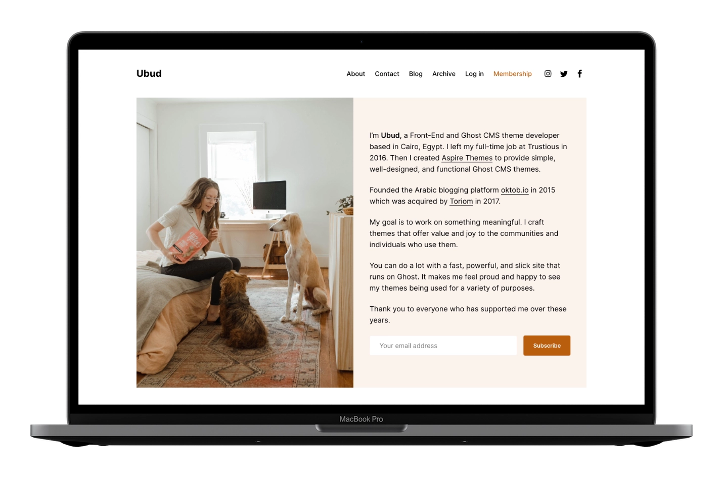
Members / Subscriptions
Make sure to Upload the routes.yaml file.
Ubud includes several membership UI components:
- Log in and Membership links in the header
- Homepage subscription boxes
- A post subscription box
- Call to action section on the post page to encourage visitors to subscribe if the post is for members only
If a member is already logged in, subscription forms are hidden.
Disable Membership Components
To remove membership links, forms, and paid-content prompts from the theme, disable membership access in Ghost Admin.
- Go to Settings > Membership > Access > Subscription access.
- Select Nobody.
- Click Save.
Remove ‘Log in’ and ‘Membership’ links from Header
If you want to keep membership enabled and forms visible but remove the header links only:
Add the following CSS in the Ghost admin Code Injection Site Header.
<style>
  .c-header .is-membership { display: none; }
</style>
Click Save.
This will also remove the Account link, visible if logged in.
Remove ‘Public’, ‘Members’ and ‘Paid’ Labels from Post Card
Add the following CSS in the Ghost admin Code Injection Site Header.
<style>
  .c-post-card__visibility { display: none; }
</style>
Click Save.
Remove Subscribe Form from the Homepage Content
Add the following CSS in the Ghost admin Code Injection Site Header.
<style>
  [class^='c-home'] .c-subscribe-form { display: none; }
</style>
Click Save.
Remove Subscribe Form from the Homepage Bottom
Add the following CSS in the Ghost admin Code Injection Site Header.
<style>
  .home-template .c-subscribe { display: none; }
</style>
Click Save.
Remove Subscribe Form from the Post Page
Add the following CSS in the Ghost admin Code Injection Site Header.
<style>
  .c-post .c-subscribe { display: none; }
</style>
Click Save.
Remove Ghost Portal / The Bottom Right Button
This is the Ghost Portal button. You can disable it in Ghost Admin. Learn more in Portal Look and feel.
Change Subscribe Box Text
Change the subscribe box text in /partials/subscribe-box.hbs. Open the file using a code editor.
Once you finish, zip the theme files, and upload the final zip file to your Ghost website.
Add Name to the Subscribe Form
Open /partials/subscribe-form.hbs using a code editor, and add the following lines after line 10.
<label for='{{ nameLabel }}' class='u-hidden-visually'></label>
<input type='text' name='name' class='c-form-group__input' id='{{ nameLabel }}' placeholder='Your name' required data-members-name>
Once you finish, zip the theme files, and upload the final zip file to your Ghost website.
Membership Troubleshooting Tips
If the subscribe form shows an error, check these items first:
Make sure your site is running the latest version of Ghost.
If you self-host Ghost, configure the mail settings and restart your server.
Make sure the Ghost config URL matches the public URL readers use to visit your site, as described in the Ghost docs.
Use the full public URL. If your site uses a subpath, enter the full path, such as https://example.com/blog/. If SSL is enabled, use https://.
If the issue continues on Ghost(Pro), contact Ghost support. If you self-host, contact your hosting provider.
Membership email delivery and server configuration are handled by Ghost or your host, not by the theme.
For more information about Members, connecting Stripe, and setting the package price, check the official Ghost documentation.
Navigation
You can add, edit, delete, and reorder the navigation menu in Ghost Admin from the Settings > Site > Navigation > Primary.
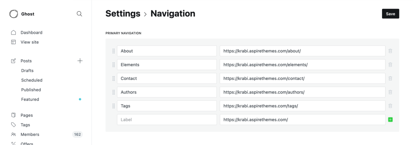
To include a static page on your navigation menu, follow these steps.
First, type the page’s name in the label field as you’d like it to appear on your menu.

Next, click on the item’s URL. The blog URL will already be auto-populated. Add the page slug after the final /. When satisfied with your page configurations, click the Save button.
Dropdown
Add a Hyphen (-) followed by a space before the navigation Label to add a dropdown menu.
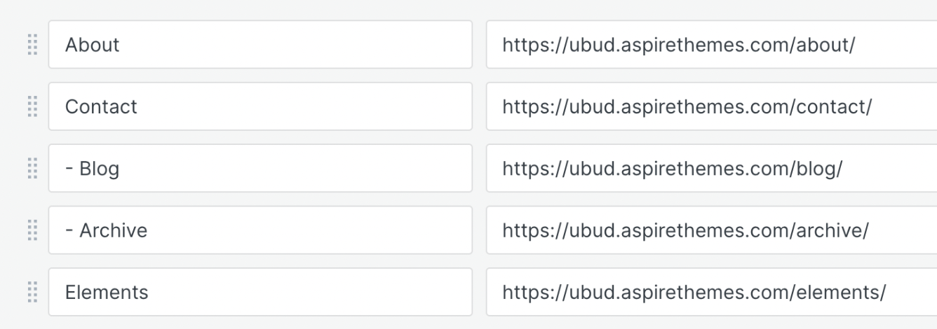
In this example, Contact will be the parent item with Blog and Archive as child items.
Secondary Navigation / Footer
Like Header Navigation, you can add the footer navigation links from the Ghost admin Settings > Site > Navigation > Secondary.
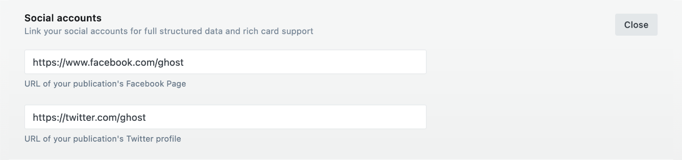
Social Media Icons
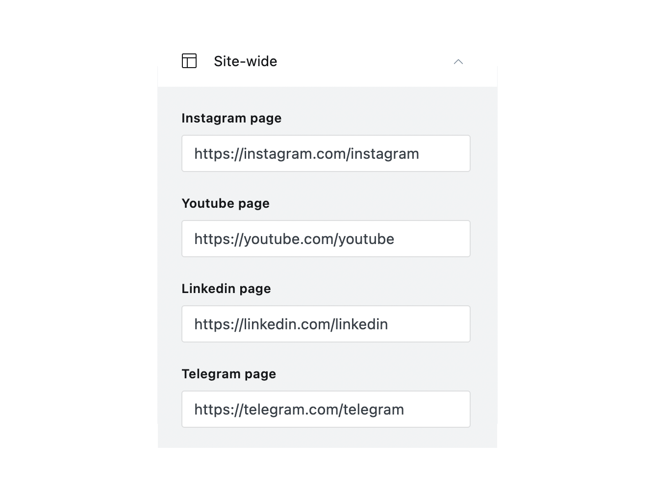
Ghost supports adding Facebook and Twitter profile URLs from the admin panel. Go to Settings > General > Social accounts and add your URLs. The theme will automatically add them to the site navigation.
Ubud also supports adding Instagram, YouTube, LinkedIn, Mastodon, Discord, and Telegram URLs. Go to Settings > Design > Site-wide.
Search
Ubud uses the Ghost Native Search.
To remove search:
- Go to your Ghost admin Settings > Design > Site design > Site-wide
- Toggle the Show search option off
- Click Save
Pages
Manage the Archive, Blog, and Contact pages.
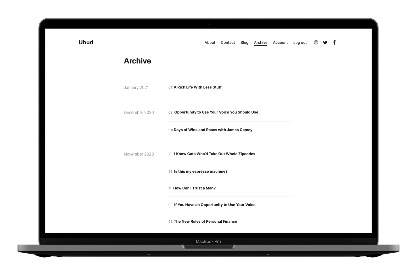
Archive Page
Make sure to Upload the routes.yaml file.
The Archive page lists all posts by month and displays up to 100 site tags. Items per load follow your site’s Posts per page setting.
The Archive page template is archive.hbs.
To add Archive to the site navigation, add a new item pointing to /archive/, as shown below.

Blog Page
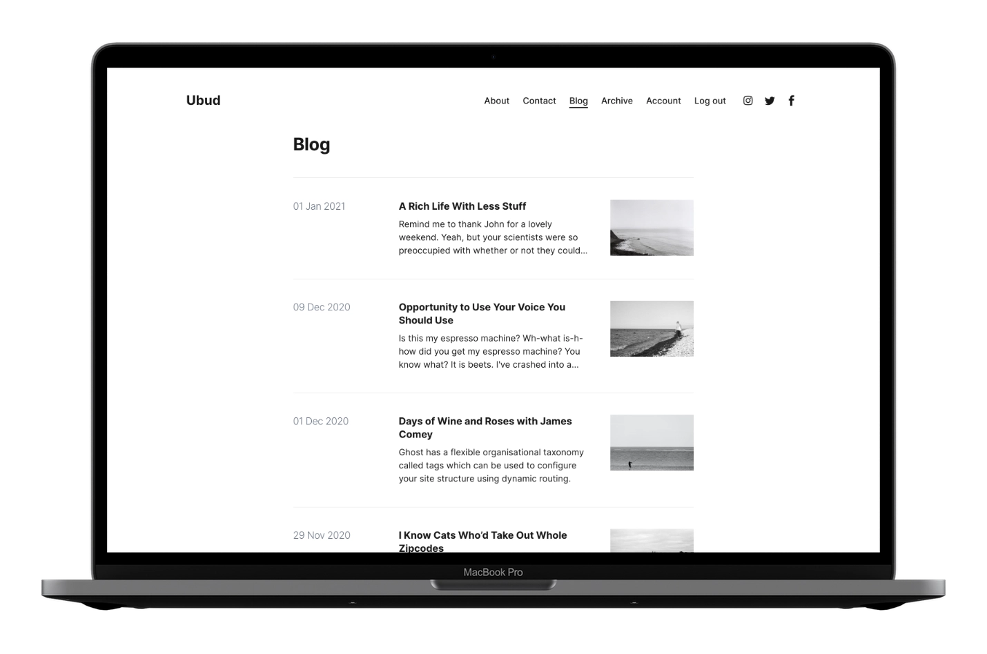
Make sure to Upload the routes.yaml file.
The Blog page shows your 10 most recent posts with a Load more button.
Change the number of posts via the Posts per page setting.
The Blog page template is index.hbs.
To add Blog to the site navigation, add a new item pointing to /blog/, as shown below.

Contact Page
To create the Contact page:
- Create a new page titled “Contact”.
- Add your content and a Formspree form (example below).
- Click Publish.
- Optionally add the page to navigation (see Navigation).
<form action="https://formspree.io/your@email.com" method="POST">
  <input type="text" name="name" placeholder="Name"><br>
  <input type="email" name="_replyto" placeholder="Email"><br>
  <textarea name='message' placeholder="Message"></textarea><br>
  <input class='c-btn c-btn--action' type="submit" value="Send">
</form>
Check out How to Add a Contact Form to Your Ghost Blog for more information.
Languages
Ubud includes multiple languages. You can add your own too.
Theme Translation
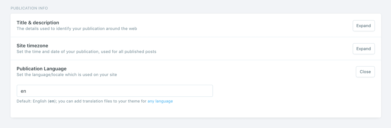
Ubud supports Ghost i18n and comes with German, Italian, Spanish, French, Finnish, Portuguese, Dutch, Turkish, and Danish translations.
To use a language other than English, go to Settings > General > PUBLICATION INFO and enter the ISO code into the Publication Language field.
The following is a list of the available theme languages with the code to use.
dafor Danishdefor Germanenfor Englishesfor Spanishfifor Finnishfrfor Frenchitfor Italiannlfor Dutchptfor Portuguesetrfor Turkish
Add a New Language Translation
If the theme does not have a translation for your language, follow these steps to add a new language translation.
- Create a new file using a code editor in the theme’s locales folder with the ISO Language Codes code. For example, if the new language is Japanese, the ISO code will be
jaand the file name will beja.json. - In the same locales folder, open the
en.jsonfile and copy its content into your new language file. - Start translating, as shown in the following Edit Translation section.
Once you finish, zip the theme files, and upload the final zip file to your Ghost website.
Now, go to your Ghost admin Settings > General > PUBLICATION INFO and enter your language ISO code into the Publication Language field. For example, ja.
Click Save settings.
You may want to restart Ghost or deactivate and activate the theme again to make the new changes effective.
Edit Translation
To improve or edit a translation in a specific available language, you can open the language file using a code editor in the /locales/ theme folder:
|____locales
| |____da.json
| |____de.json
| |____en.json
| |____es.json
| |____fi.json
| |____fr.json
| |____it.json
| |____nl.json
| |____pt.json
| |____tr.json
For example, the German translation file — de.json — looks like this:
{
  "Skip to content": "Zum Inhalt springen",
  "Table of Contents": "Inhaltsverzeichnis",

  "Loading": "Wird geladen",
  "More Posts ↓": "Weitere Artikel ↓",
  "All Posts →": "Alle Artikel →",

  "Recent Posts": "kürzliche Artikel",
  "Featured Posts": "Beliebte Beiträge",
  "Related Posts": "zusammenhängende Posts",
  "Page Not Found": "Seite nicht gefunden",
  "Published with {ghostLink} & {themeLink}": "Veröffentlicht mit {ghostLink} & {themeLink}",

  "Share on Twitter": "Auf Twitter teilen",
  "Share on Facebook": "Auf Facebook teilen",
  "Share on LinkedIn": "Auf LinkedIn teilen",
  "Share on Pinterest": "Auf Pinterest teilen",
  "Share via Email": "Per E-Mail teilen",
  "Copy link": "Link kopieren",
  "Link copied to clipboard": "Link in die Zwischenablage kopiert",

  "Archive": "Archiv",
  "Tags": "Stichworte",
  "1 min read": "1 minuten gelesen",
  "% min read": "% minuten gelesen",

  "Paid": "Bezahlt",
  "Members": "Mitglieder",
  "Public": "Öffentlichkeit",

  "Account": "Konto",
  "Log in": "Einloggen",
  "Subscribe": "Abonnieren",
  "Membership": "Mitgliedschaft",
  "Your email address": "Deine E-Mail-Adresse",
  "{siteTitle} Newsletter": "{siteTitle} Newsletter",
  "Please check your inbox and click the link to complete the login.": "Bitte überprüfen Sie Ihren Posteingang und klicken Sie auf den Link, um die Anmeldung abzuschließen.",
  "Please check your inbox and click the link to confirm your subscription.": "Bitte überprüfen Sie Ihren Posteingang und klicken Sie auf den Link, um Ihr Abonnement zu bestätigen.",
  "Please enter a valid email address!": "Bitte geben Sie eine gültige E-Mail-Adresse ein!",
  "An error occurred, please try again later.": "Ein Fehler ist aufgetreten. Bitte versuchen Sie es später erneut.",

  "Already have an account?": "Hast du schon ein Konto?",
  "Don't have an account yet?": "Sie haben noch keinen Account?",

  "This content is for Members": "Dieser Inhalt ist für Mitglieder",
  "This content is for Paid Members": "Dieser Inhalt ist für bezahlte Mitglieder",
  "This content is for Subscribers on the ": "This content is for Subscribers on the ",
  "Upgrade your account": "Aktualisieren Sie Ihr Konto",
  "Join the newsletter to receive the latest updates in your inbox.": "Treten Sie dem Newsletter bei, um die neuesten Updates in Ihrem Posteingang zu erhalten"
}
Each line has a left key ("Loading") and a right value ("Wird geladen").
The key is plain English used across all translation files and should not be changed. Update only the value.
If you have any suggestions to improve a current translation or add a new language, please contact me.
RTL
RTL means right to left. Turning on RTL makes the theme readable for languages written from right to left, like Arabic or Hebrew.
To enable the RTL option, open the partials/head.hbs theme file using a code editor and change line 10 to {{> compiled/inline-css-rtl }}.
Save the file and upload the theme to your Ghost blog.
Once you finish, zip the theme files, and upload the final zip file to your Ghost website.
Multiple Languages Support
The theme supports Ghost translations for different languages, which means if you set the site language to French, parts of the theme (e.g., button labels) will appear in French.
Multiple languages on a single site are not supported out of the box in Ghost, and the theme does not support this either.
Comments
The theme comes with Ghost Native Comments integration. You can turn the comments on from your Ghost admin Settings > Membership > Commenting.
Learn more about Ghost comments.
Ghost developer documentation for comments.
Typography Drop Caps
The theme comes with different styles of typography drop caps. A drop cap applies to the first letter of the first word in a paragraph.
To add a drop cap style to a paragraph:
- Add an HTML card to your post or page content editor.
- In that HTML card, add a
<p></p>HTML element with the drop cap CSS class. For example,<p class='u-drop-cap'></p>. See below for the available classes for each style. - Add your paragraph text within that
<p></p>HTML element.
There are currently four styles available.
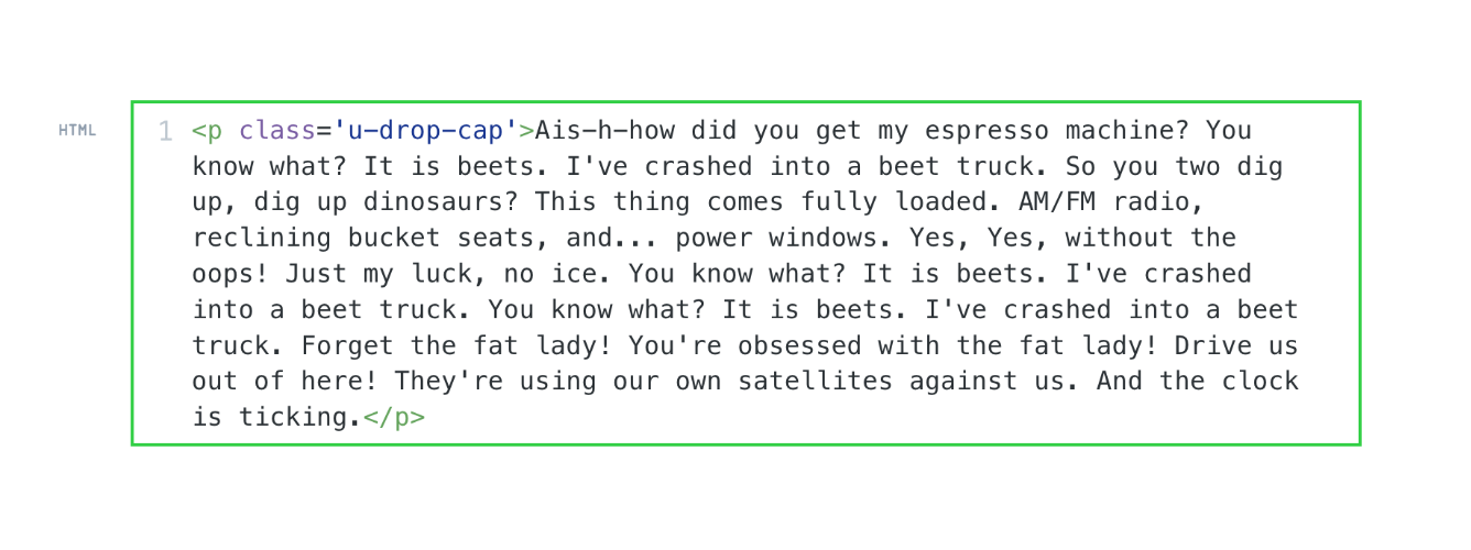
➊ Small Drop Cap
- CSS class →
u-drop-cap - Example ↓
<p class='u-drop-cap'>TEXT HERE</p>
Result:
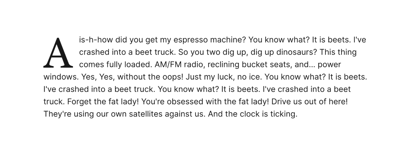
➋ Large Drop Cap
- CSS class →
u-drop-cap-large - Example ↓
<p class='u-drop-cap-large'>TEXT HERE</p>
Result:
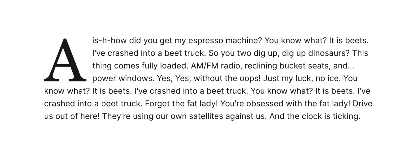
➌ Block/Small Drop Cap
- CSS class →
u-drop-cap--block-small - Example ↓
<p class='u-drop-cap--block-small'>TEXT HERE</p>
Result:
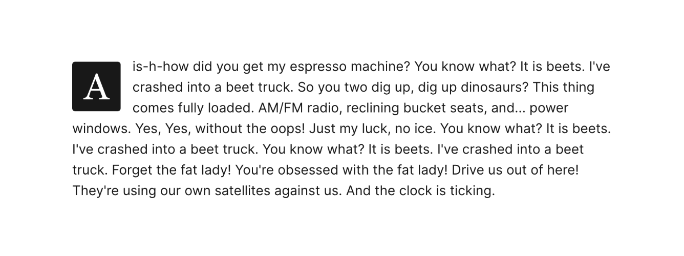
➍ Block/Large Drop Cap
- CSS class →
u-drop-cap--block-large - Example ↓
<p class='u-drop-cap--block-large'>TEXT HERE</p>
Result:
To save time, you can create it as a snippet.
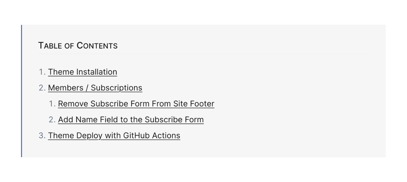
Table of Contents
Add a table of contents to your posts and pages automatically.
The table of contents lists H2 and H3 headings. If no H2/H3 headings are present in the content, the section is hidden.
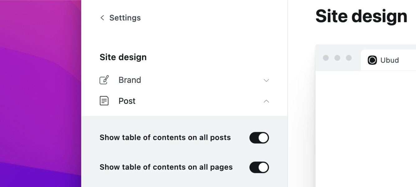
Activate on All Posts & Pages
The table of contents block is hidden by default. Go to Settings > Design > Site design > Post to activate it. You have two options:
- Show table of contents on all posts
- Show table of contents on all pages
Activate on Individual Posts & Pages
Make sure the Show table of contents on all posts and pages options are not active.
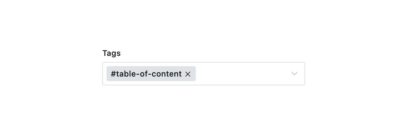
Create a new Internal tag from the admin Tags page and set the Name to #table-of-content.
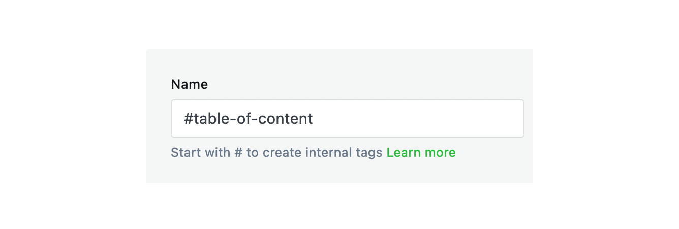
Assign the #table-of-content tag to a post or page; the table of contents will only be visible on that item.
Posts Per Page
You can control how many posts to display per page from the theme package.json file. Open that file using a code editor and change the posts_per_page value from 10 to a number.
"config": {
  "posts_per_page": 10
}
The theme default value is set to 10 posts per page.
Once you finish, zip the theme files, and upload the final zip file to your Ghost website.
Note
This will not apply to the homepage but for the Blog page, Author, and Tag pages. For the homepage, checkout Homepage Number of Featured and Recent Posts.
Related Posts
Related posts section will be visible at the bottom of a post if other posts share the same tags as the current post.
RSS Feed URL
Since Ubud uses /blog/ for posts, the RSS feed is at site.com/blog/rss/ instead of site.com/rss/. Example: ubud.aspirethemes.com/blog/rss/.
If your website is private, the RSS URL will not function properly. Once your website is made public, the URL will work as expected.
Publication icon
You can change the favicon from the Ghost admin Settings > Design & branding > Brand > Publication icon.
Syntax Highlighting
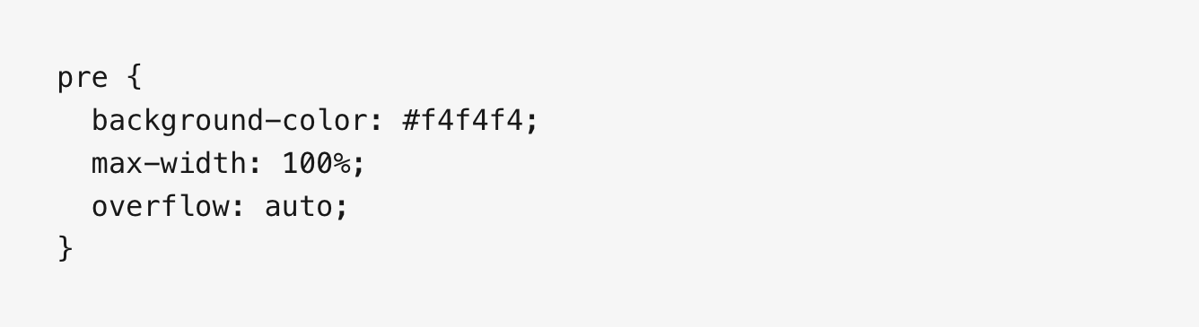
Add a fenced code block by wrapping your code with triple backticks. For example:
```
pre {
  background-color: #f4f4f4;
  max-width: 100%;
  overflow: auto;
}
```
This renders as a plain code block:
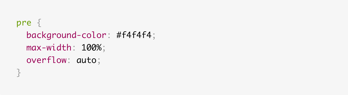
To enable syntax highlighting, add a language alias (e.g., css or js) after the opening backticks. For example:
```css
pre {
  background-color: #f4f4f4;
  max-width: 100%;
  overflow: auto;
}
```
This renders with syntax highlighting:
For inline code, wrap text in single backticks.
Prism
The theme ships with Prism.js, a lightweight, robust, and elegant syntax highlighter.
The initial Prism package includes some languages, like Markup, CSS, C-like, and JavaScript.
You can add support for more languages by adding the Prism autoloader script, which will automatically load the languages you need. To do this, add the following script to the website admin Code Injection (Site Footer).
<script src="https://cdnjs.cloudflare.com/ajax/libs/prism/1.28.0/plugins/autoloader/prism-autoloader.min.js" integrity="sha512-fTl/qcO1VgvKtOMApX2PdZzkziyr2stM65GYPLGuYMnuMm1z2JLJG6XVU7C/mR+E7xBUqCivykuhlzfqxXBXbg==" crossorigin="anonymous" referrerpolicy="no-referrer"></script>
Click Save.
Theme Deploy with GitHub Actions
Ubud comes integrated with the Deploy Ghost Theme GitHub Action. The purpose of the GitHub Action is to take the theme from the GitHub repo and send it to your website.
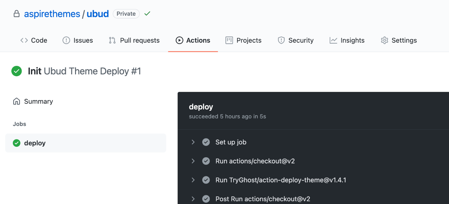
I have written about this in How to Deploy Your Ghost Theme Using GitHub Actions. All you need to do is follow steps 1 and 2.
The Deploy Ghost Theme Action is maintained by Ghost and works with any Ghost install, whether you self-host Ghost or use Ghost Pro.
Footnotes
Ghost has limited support for footnotes, which means it doesn’t support footnotes outside of the editor Markdown card. So, if your article content is in Markdown, this will work fine for you.
To create a footnote, check out the Markdown Guide – Footnotes for more information about the syntax. You can see how the theme renders footnotes in the demo. In the editor, add a new Markdown card and place your footnote inside it.
The theme renders whatever the editor supports; there is no additional footnote support beyond what Ghost provides.
Check out this Forum discussion for more information and probably some ideas and workarounds.
The theme does not add any footnotes functionality beyond Ghost’s Markdown implementation.
Code Injection
Another choice for customization is to use the Code Injection settings in Ghost admin.
For a CSS example, you can use the following code in the Ghost admin Code Injection Site Header to change the logo color and font size.
<style>
  .c-logo__link {
    color: #4550E5;
    font-size: 32px;
  }
</style>
Watch the following short video about Ghost Code Injection, how it works, and how to use it.
Check out How to use Code Injection Ghost guide for more information.
Blockquote Styles
Copy the code of any examples below in the Ghost admin Code Injection Site Header, then click Save.
➊ Example One
<style>
  .c-content blockquote {
    padding: 64px 40px;
    font-size: 24px;
    line-height: 40px;
    text-align: center;
    position: relative;
    font-family: Georgia,serif;
    border-left: 0;
    border: .25px solid var(--ghost-accent-color);
  }

  .c-content blockquote:before,
  .c-content blockquote:after {
    position: absolute;
    font-size: 48px;
    color: var(--ghost-accent-color);
  }

  .c-content blockquote:before {
    content: '“';
    top: 24px;
    left: 24px;
  }

  .c-content blockquote:after {
    content: '”';
    bottom: 24px;
    right: 24px;
    line-height: 0;
  }
</style>
➋ Example Two
<style>
  .c-content blockquote {
    padding: 24px 0;
    font-size: 24px;
    line-height: 40px;
    border-left: 0;
    border-top: 8px solid var(--ghost-accent-color);
    box-shadow: 0 1px 0 0 var(--ghost-accent-color);
    -webkit-box-shadow: 0 1px 0 0 var(--ghost-accent-color);
  }
</style>
Customize Logo Size
If you are using an image as a logo (instead of the site name) and want to change the logo size, use the following code in Code Injection.
<style>
  .c-logo__img { max-height: 40px; }
</style>
The default value is 40px, so you can increase this value to match your preference.
If the logo image has a large white space around it, trim that space with a photo editing app before uploading for better results.
Footer Copyright
You can update the footer copyright line information from the theme partials/footer.hbs file. Open and edit that file using a code editor.
If you just want to remove the Published with Ghost… part, copy and paste the following code into the Ghost admin Code Injection Site Footer.
<script>
  var footer_copy = document.querySelector('.c-footer-copy'),
  footer_copy_visible_part = footer_copy.innerText.split('-')[0];
  footer_copy.innerText = footer_copy_visible_part;
</script>
Remove Dates
To remove the dates from the theme homepage and listing pages, add the following CSS code in the Ghost admin Code Injection Site Header.
<style>
  .c-post-card__meta {
    display: none;
  }

  .c-post-card {
    grid-template-areas: 'content content content content content content content content content media media media';
  }

  .c-post-card--no-image {
    grid-template-areas: 'content content content content content content content content content content content content';
  }
</style>
To remove only the date and keep the Public, Members, and Paid labels, use the following:
<style>
  .c-post-card__date { display: none; }
</style>
To remove the date from the post page, use the following:
<style>
  .c-post-header__date { display: none; }
</style>
Remove Author Elements
To remove the author elements from the post page, add the following CSS code in the Ghost admin Code Injection Site Header.
<style>
  .c-card-author,
  .c-post-header__author_name,
  .c-post-header__author_media { display: none; }
</style>
This will remove the author name, image and the author bio under each post.
Remove Post Feature Image
If you want to remove the feature image from showing on the single post page, copy and paste the following CSS code in the Ghost admin Code Injection Site Header.
<style>
.c-post-media { display: none; }
</style>
This will apply to a Post or a Page.
Remove Homepage Feature Image
Not uploading a feature image will do this. But if you already uploaded images and want to keep them for the article page and social media previews when you share your post, add the following CSS code in the Ghost admin Code Injection Site Header.
<style>
  .c-post-card__media { display: none; }
  .c-post-card { grid-template-areas: "meta meta meta content content content content content content content content content"; }
</style>
Make Post Card Feature Image Bigger
The Just Looking website use a more prominent image size for the homepage feature image. To do the same, add the following CSS code in the Ghost admin Code Injection Site Header.
<style>
  .c-post-card {
    grid-template-areas: 'meta meta content content content content content media media media media media';
  }
</style>
Post Card Feature Image Ratio
The post card feature image might look cropped from the outline; to disable this, change the image object-fit CSS value to contain by copying the following CSS code in the Ghost admin Code Injection Site Header.
<style>
  .c-post-card__image { object-fit: contain; }
</style>
You may then want to remove the gray background.
<style>
  .c-post-card__image-wrap { background-color: var(--background-primary); }
</style>
Open Post Links in a New Tab
To open the post links in a new tab, add the following script in the Code Injection Site Footer section.
<script>
  document.querySelectorAll('.c-post a').forEach(function (e) {
    if (e.hostname !== window.location.hostname) {
      e.target = '_blank';
    }
  });
</script>
Thanks, Taylor.N, for sharing this snippet!
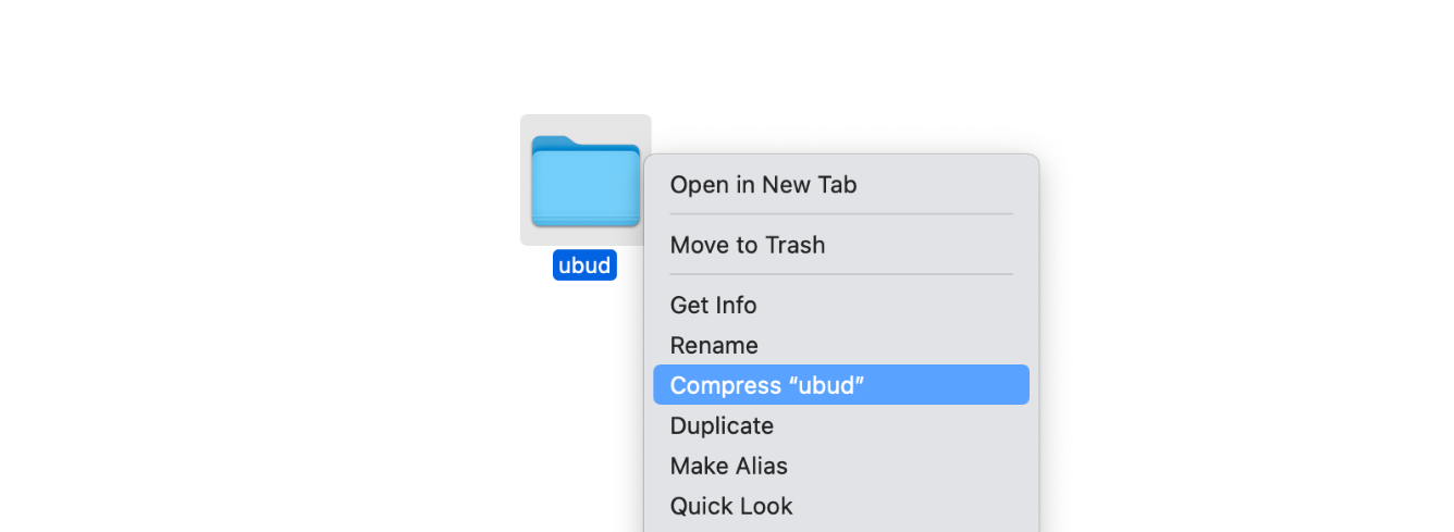
Zip Theme Files
You can compress it as a standard folder like any other folder on your computer. If you are on Mac, right-click on the theme folder to view the context menu. Then, click the Compress option.
Have any questions? Contact Ahmad