6 Newsletter Website Examples Built with Ghost
A newsletter website needs to answer two questions before a visitor subscribes: what will arrive in their inbox, and is the writing worth returning for? The introduction explains the offer; the published articles let readers judge it for themselves.
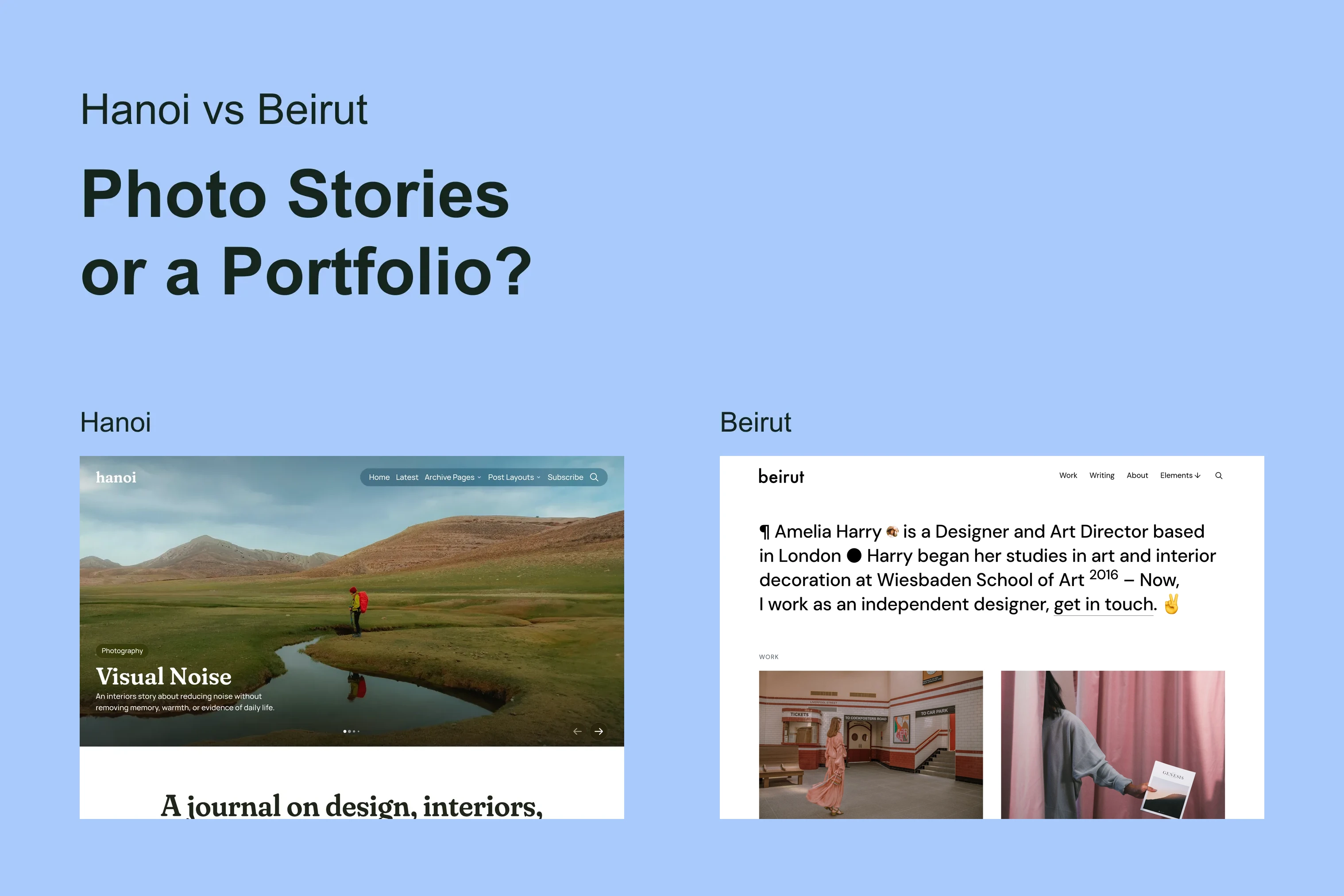
These six publications from the customer showcase use Ubud and Penang. Their writing, subscription offers and customizations belong to each publisher.
The Subscription Offer
The subject alone may not explain the offer. Name the intended reader, what the newsletter helps them do, or the writer whose perspective they will follow.
USERWEEKLY
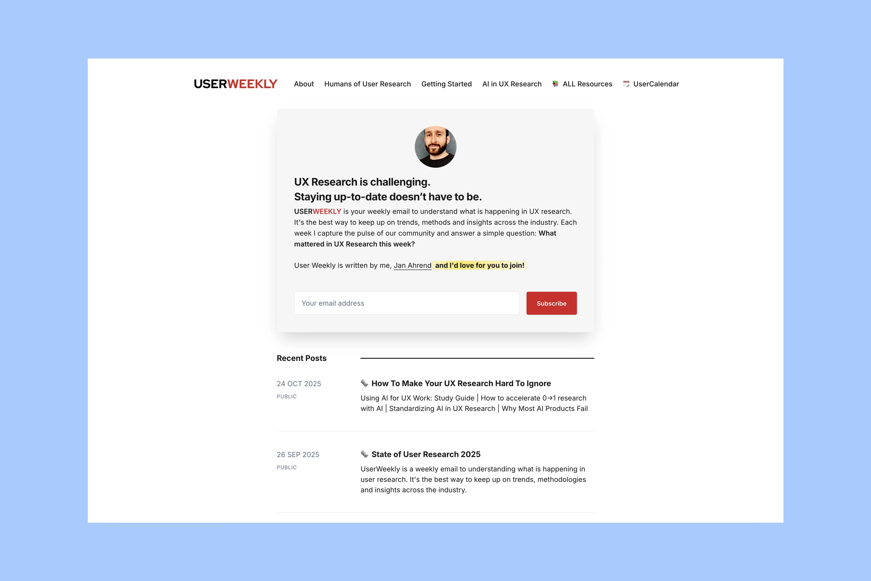
USERWEEKLY is a newsletter for people working in UX research. Its introduction names the difficulty of keeping up with the field and places an email signup directly below that explanation.
Theme: Ubud.
Liberating Narratives
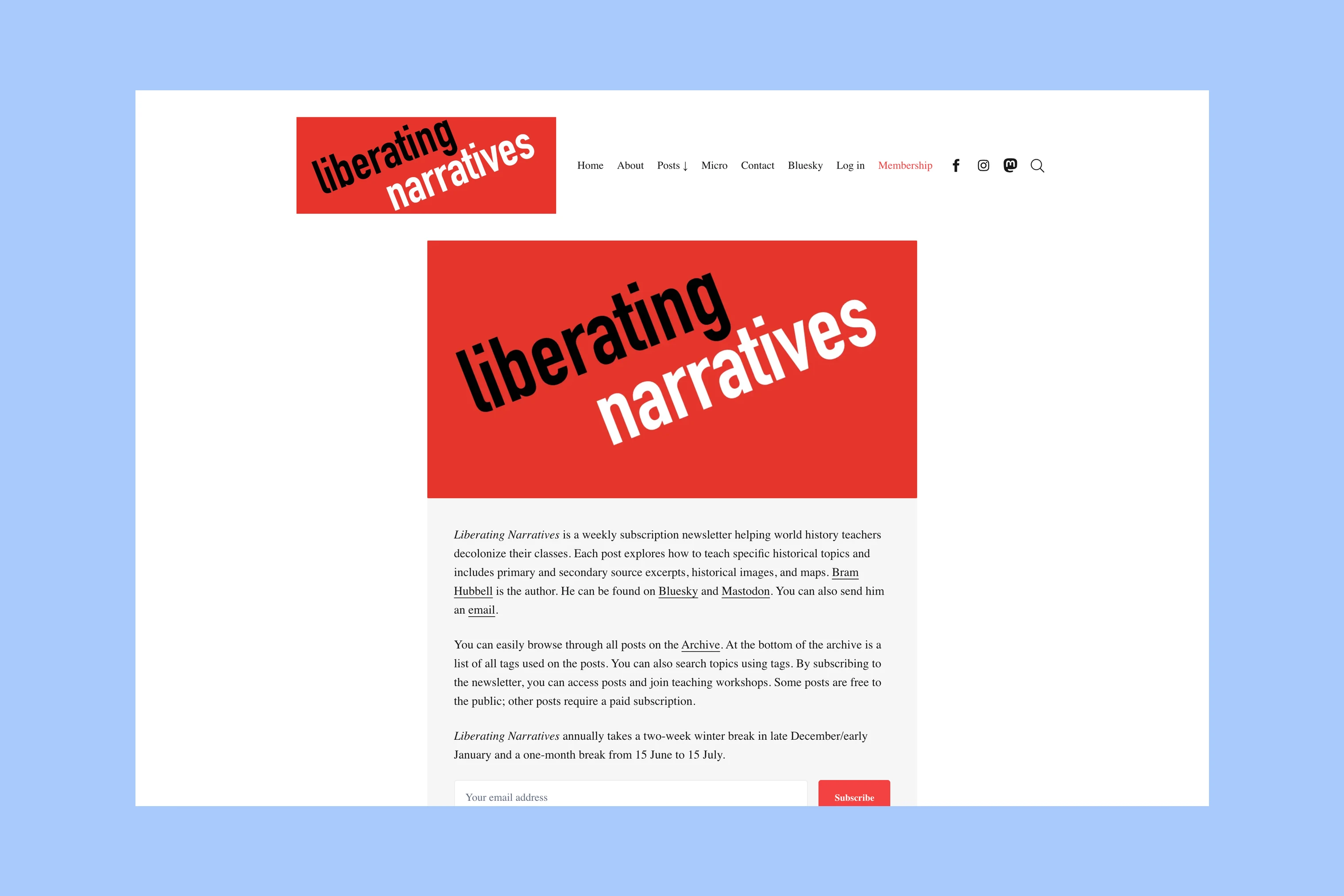
Liberating Narratives is Bram Hubbell’s newsletter for world history teachers. Its introduction explains the content, paid access, and planned publishing breaks, giving prospective subscribers a concrete picture of the offer.
Theme: Ubud.
The Wool Channel
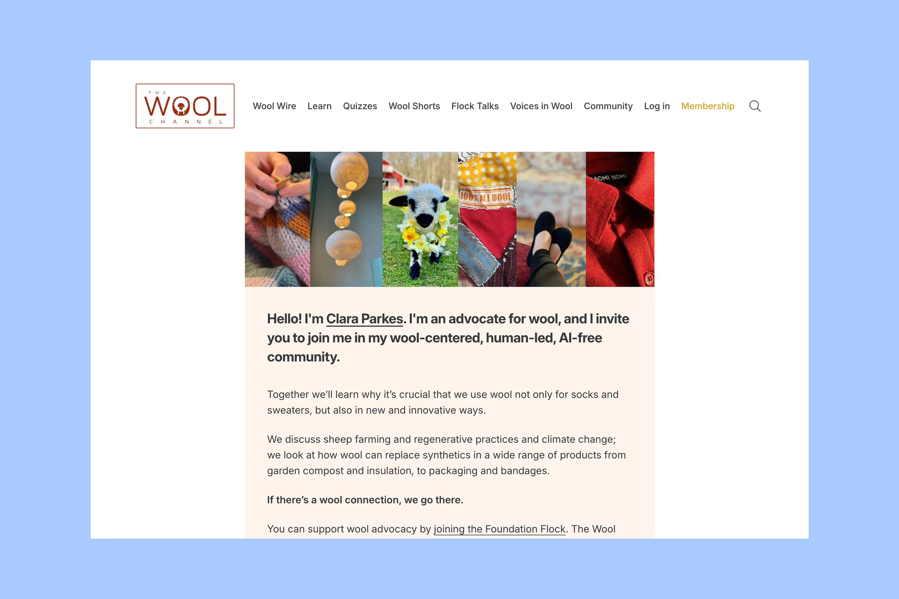
The Wool Channel is Clara Parkes’ publication about wool and its community. Her personal introduction connects the writer with the subject before visitors explore learning material, newsletter options, and membership content.
Theme: Ubud.
Econ Dev Show
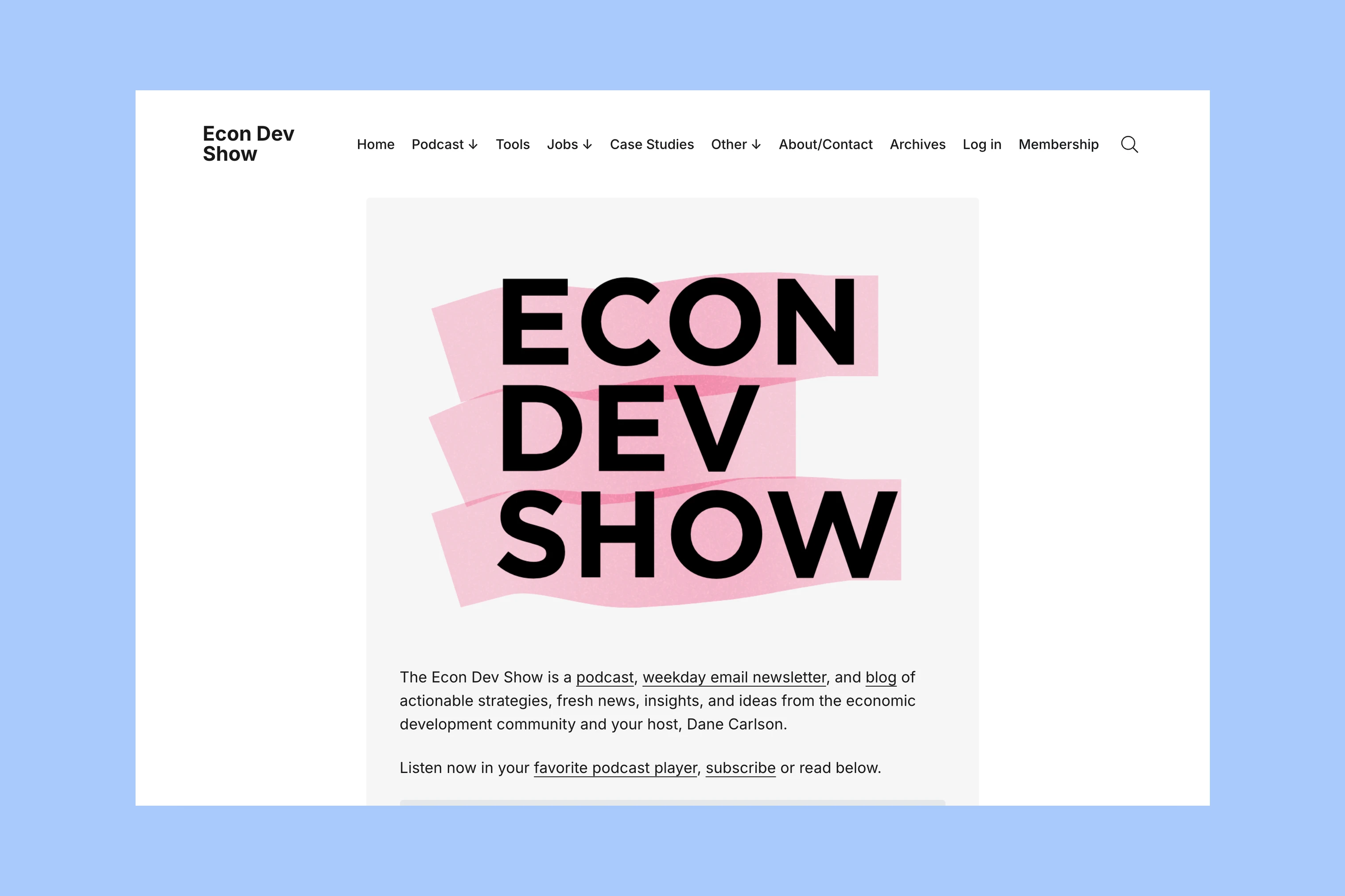
Econ Dev Show combines an economic development podcast, newsletter, and blog. Links to listen, subscribe, and read let visitors choose how they want to follow the publication.
Theme: Ubud.
Issues and Subject Archives
A newsletter can publish regular editions alongside longer subject guides. Distinguishing those collections helps visitors find a recent issue or explore a topic in more depth.
The Sustainable Investor
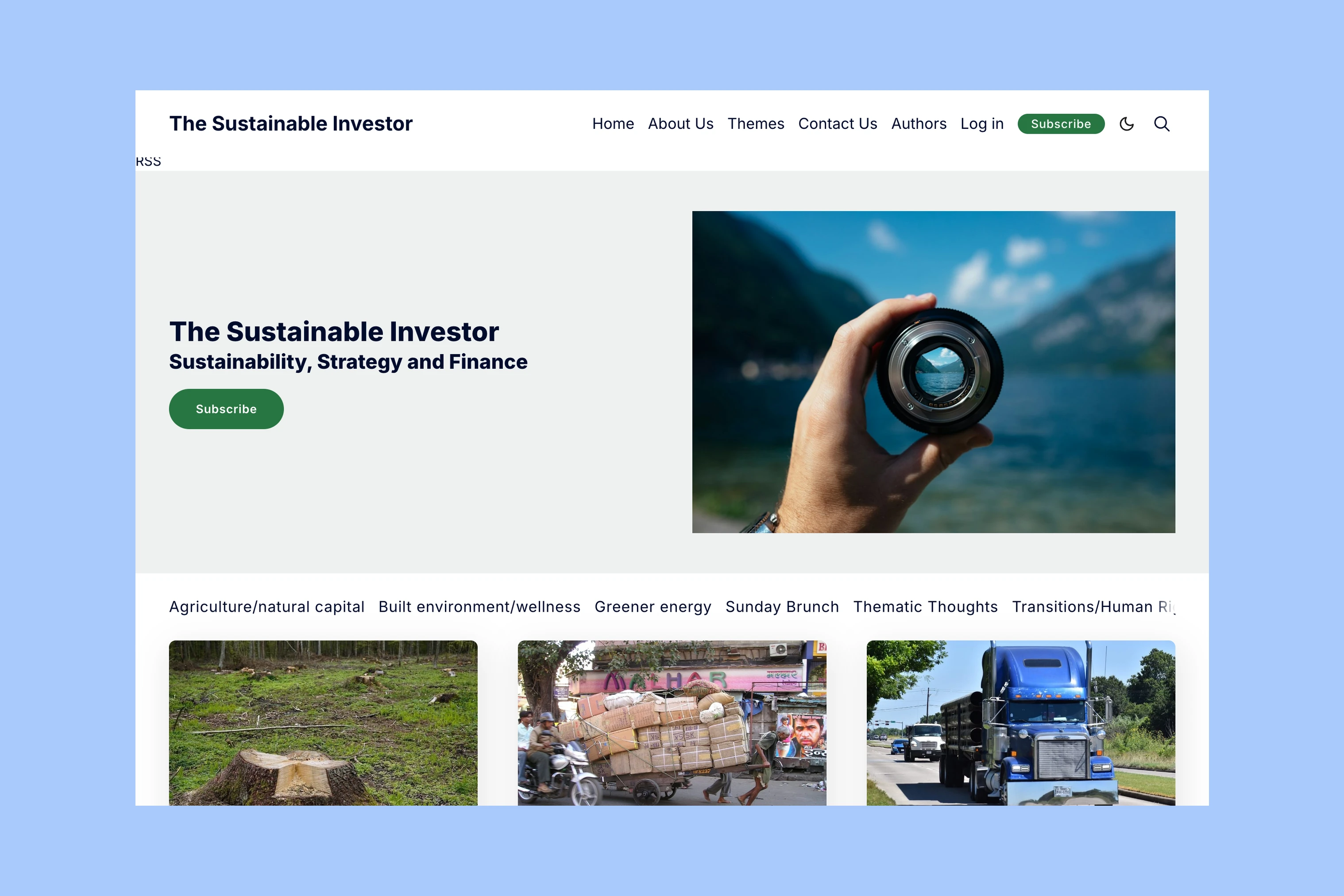
The Sustainable Investor covers sustainability, strategy, and finance. Its recurring Sunday Brunch editions sit alongside subject navigation, giving readers routes into both the newsletter and the wider archive.
Theme: Penang.
Hotel Revenue Insights
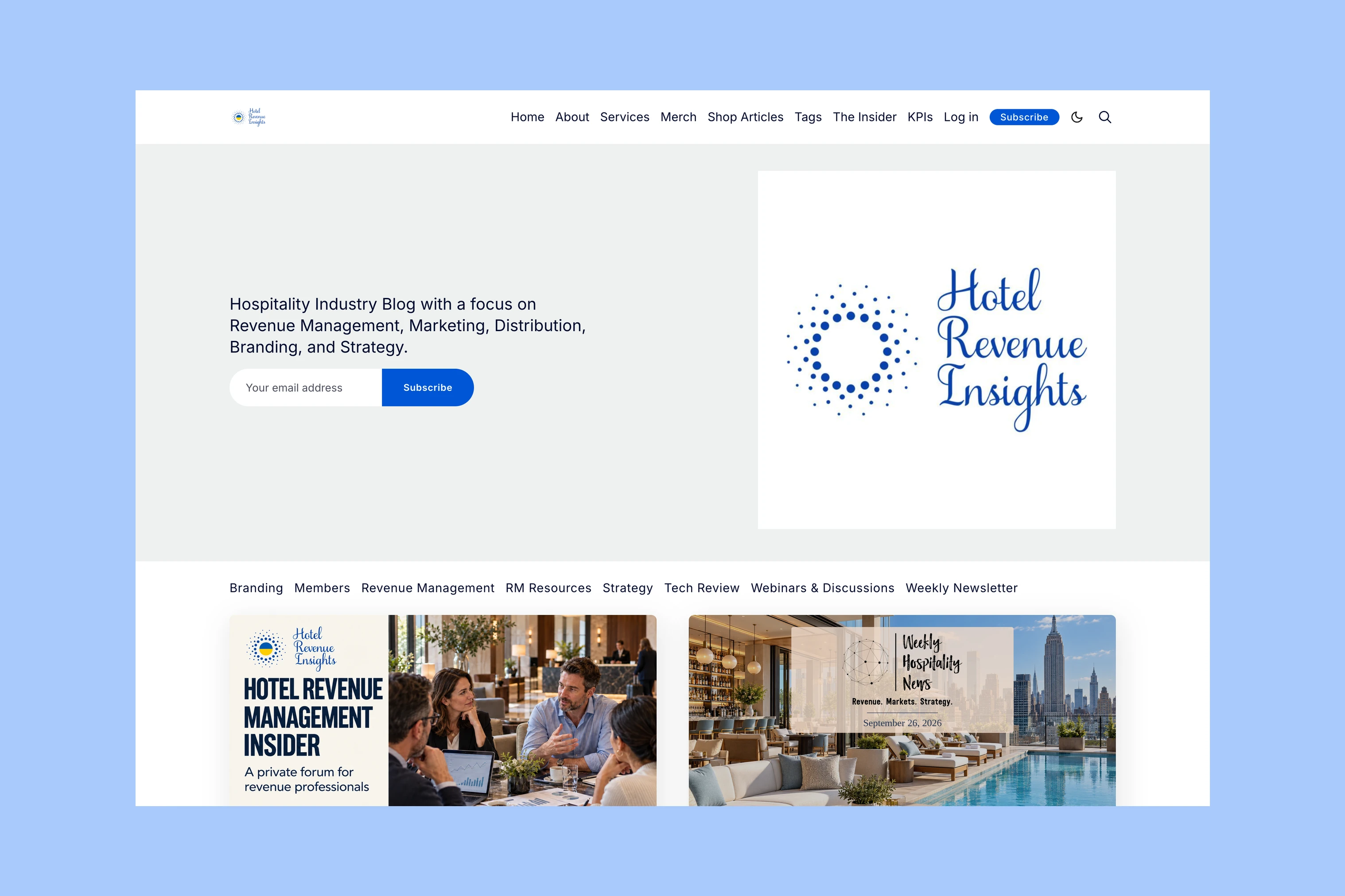
Hotel Revenue Insights publishes hospitality writing about revenue management, branding, strategy, and related topics. A dedicated Weekly Newsletter category separates its recurring digest from longer subject guides.
Theme: Penang.
The Offer and Archive
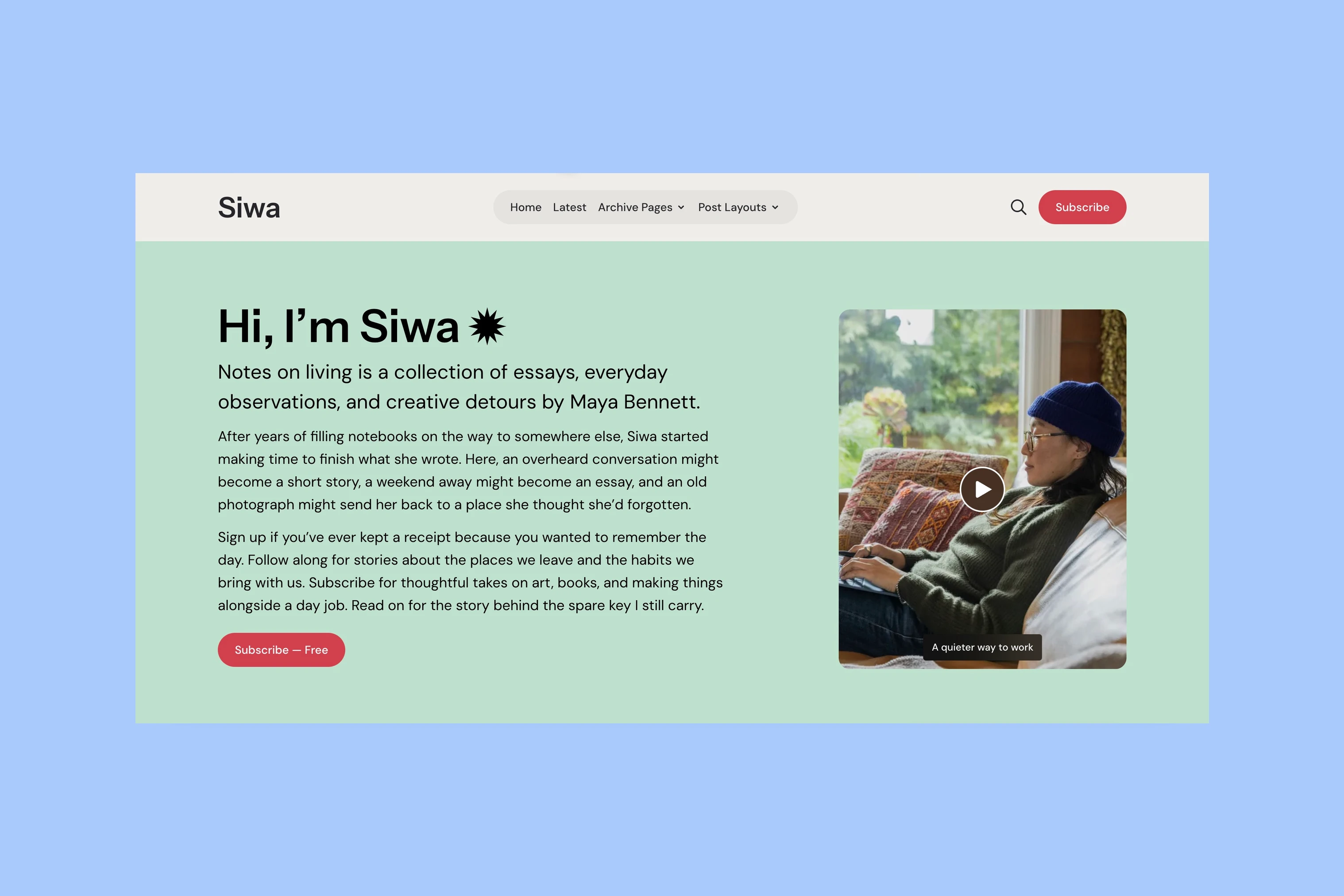
Compare Ubud when the introduction and offer deserve the first screen. Penang adds a visible row of subject links, useful when visitors need to choose between recurring issues and other coverage.