3 Photography Website Examples Built with Ghost
A photography website can begin with a sequence of pictures, offer stories to choose from, or introduce the person behind the camera. These three Ghost sites show those different starting points. The choice affects what visitors see before they open an individual post.
The examples come from the Aspire Themes showcase. These are publishing layouts; client proofing, print sales and booking services need their own setup.
Ahmad Ajmi
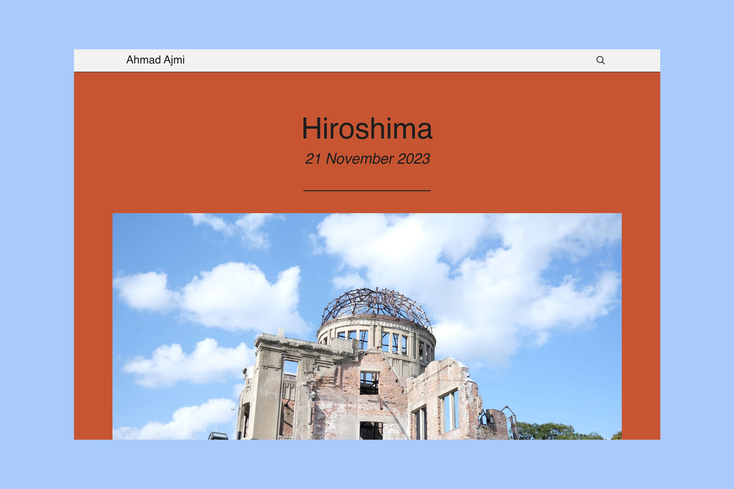
Ahmad Ajmi, Aspire Themes’ founder, publishes a photography journal with posts about Hiroshima, Petra and other places. The homepage contains the post content, including photographs and captions, so a visitor can begin viewing a journey immediately.
Theme: Hakone.
LOVE n PHOTO
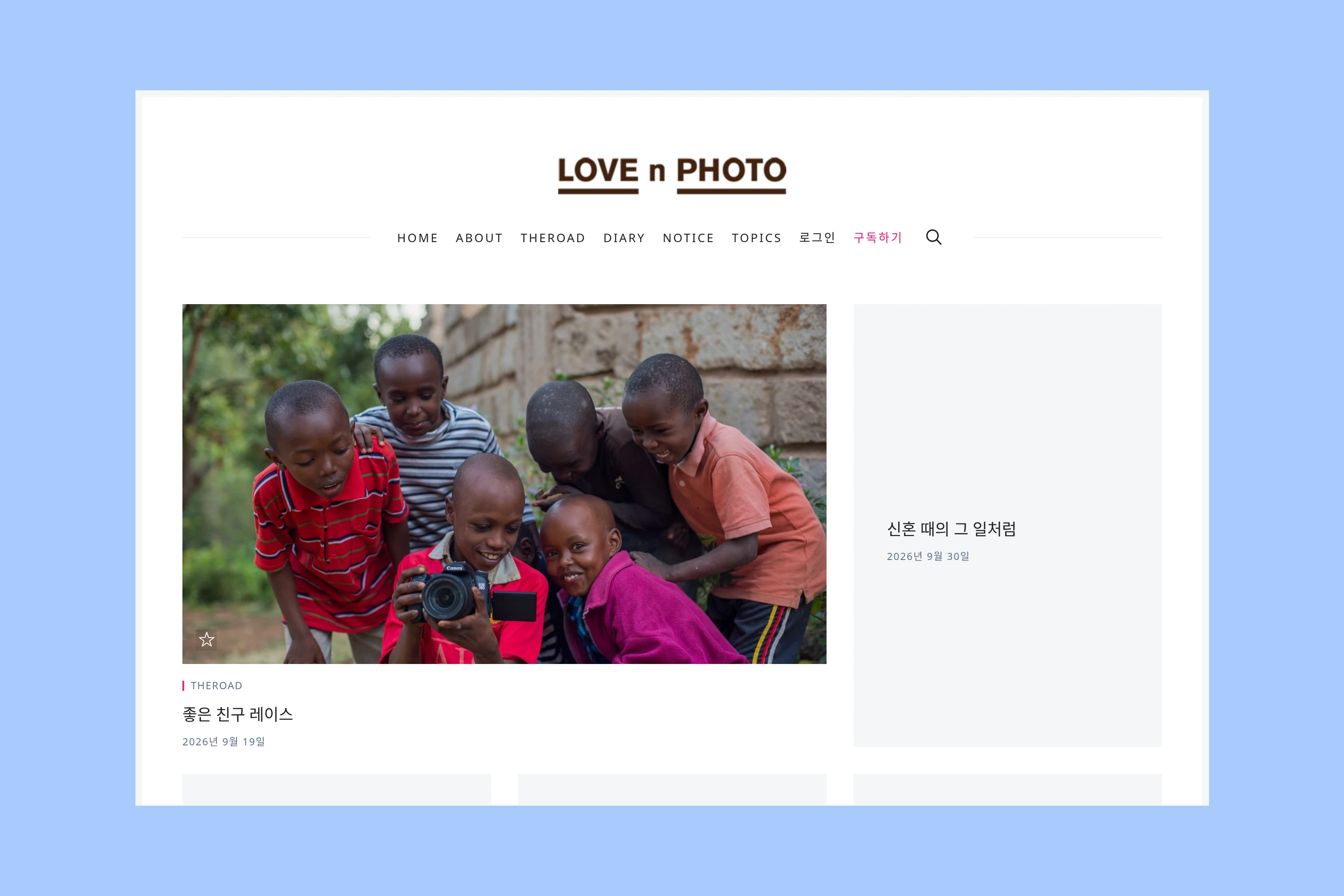
LOVE n PHOTO combines photographs and Korean-language writing in a post grid. Its prominent lead image gives one story more space, while nearby cards let the visitor choose another entry. The homepage also links to topic collections, including Gallery and Nature. A grid like this suits a publication whose visitors need to choose between stories before viewing a complete sequence; a post without a feature image can still appear as a text card.
Theme: Nubia.
Alex Roddie
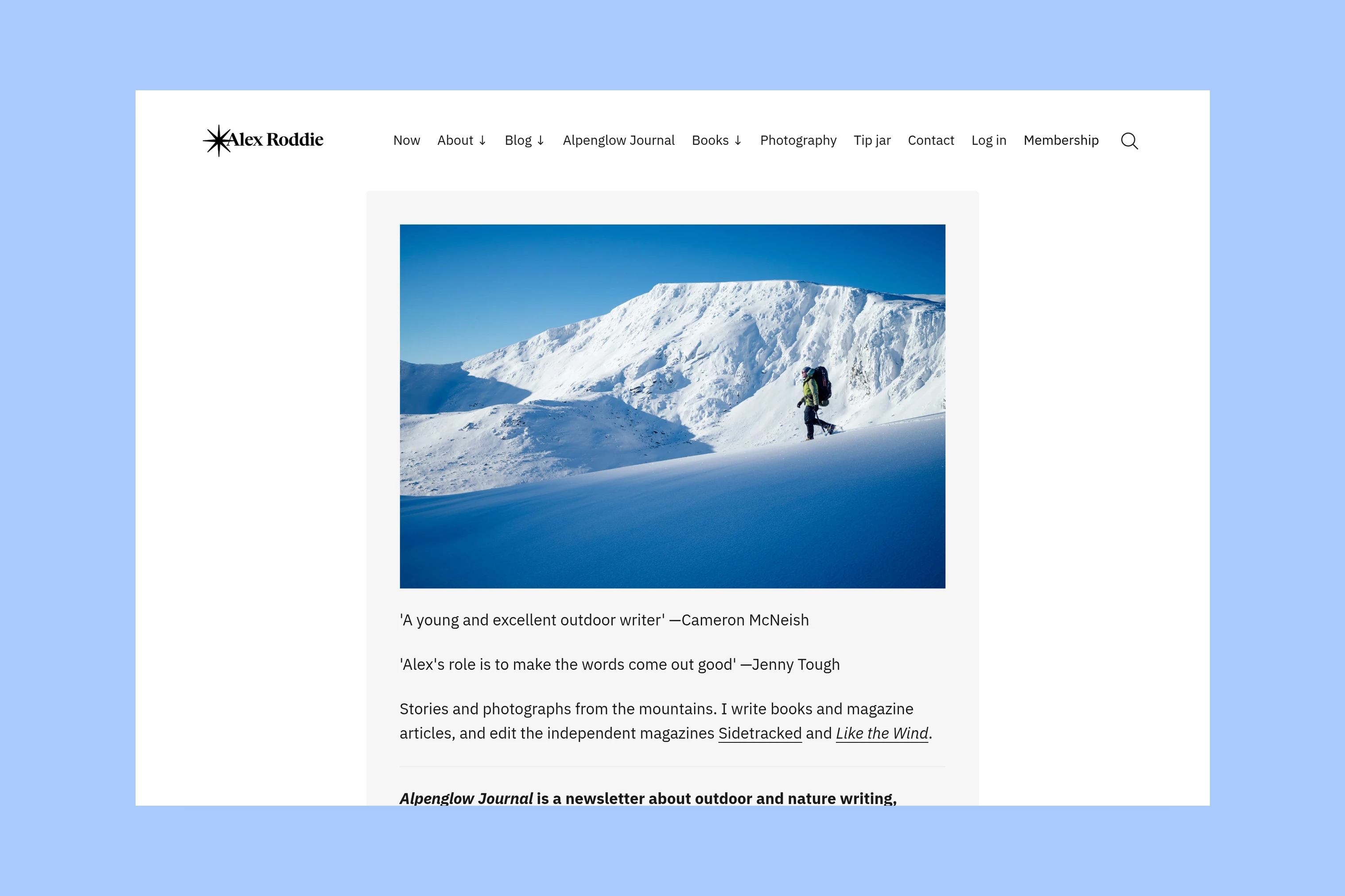
Alex Roddie’s homepage introduces his outdoor writing and photography with a mountain image and a description of his work. Navigation leads to Photography, Books and a blog archive, giving a visitor routes beyond the introduction. The page also promotes Alpenglow Journal through Substack: that newsletter service and its embed are separate from the Ghost theme. This arrangement suits a photographer whose publication also needs to explain commissions, books or writing before presenting recent posts.
Theme: Ubud, with customer typography, navigation and content customizations.
Match the Homepage to the First Visit
Before choosing, browse a photo post in each demo on a phone and a desktop. Check the sequence, captions and route to another series. The public demos contain sample content; they do not let you upload your photographs. After installing a theme on your own site, check crops and loading with your photographs before publishing.
Explore Hakone for a reading feed, Nubia for a visual grid or Ubud for an introduction followed by writing. The showcase provides more live publications to compare.
More from the Blog
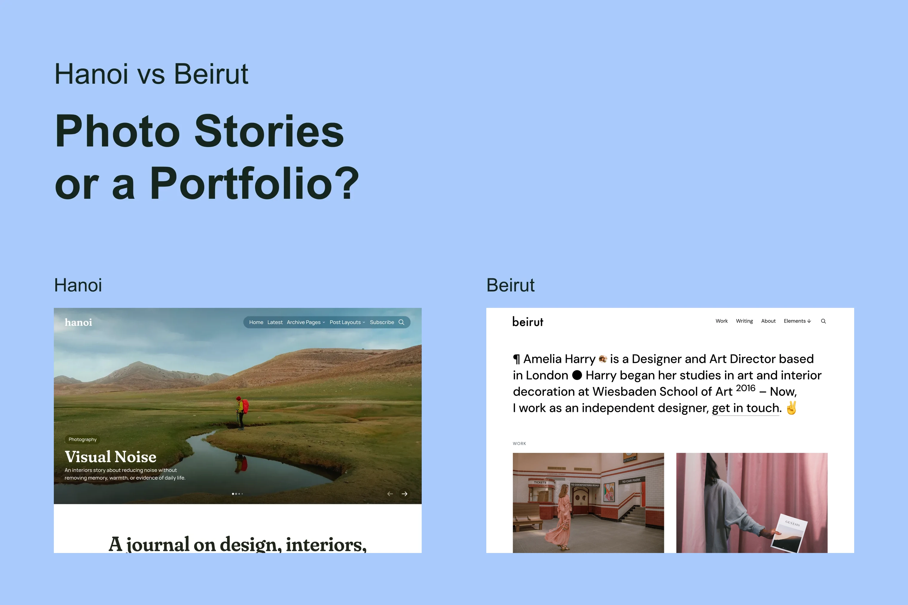
Latest Ghost Themes
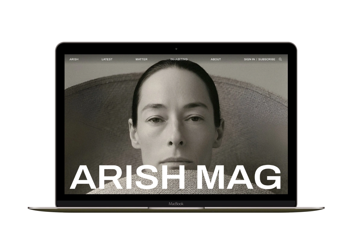
Arish
For visual magazines that lead with photography, film, and selected stories.
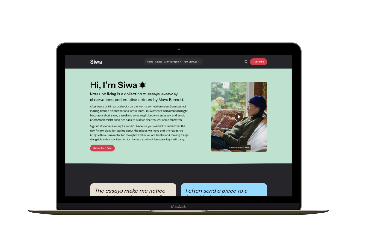
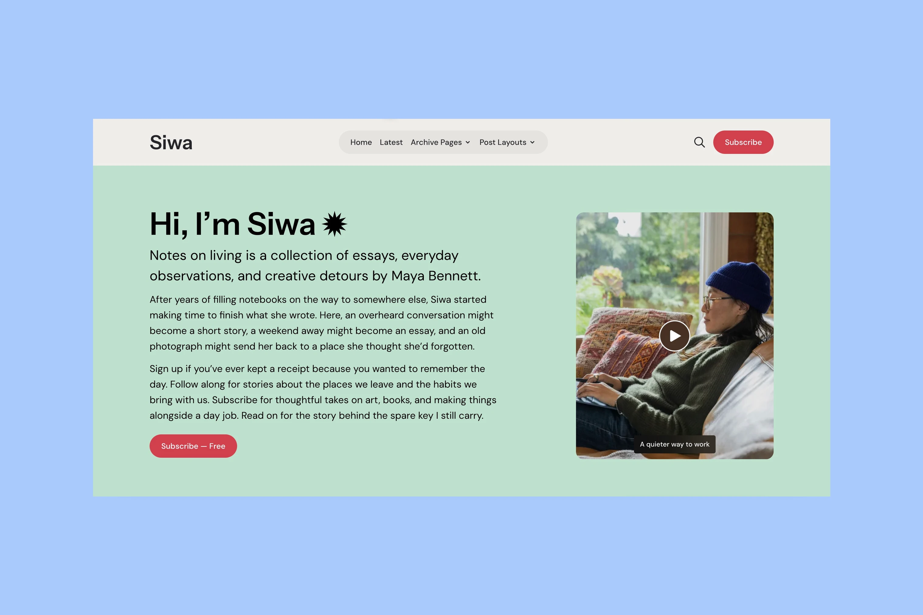
Siwa
A personal publication that introduces the writer before inviting readers into the stories.
Hanoi
An image-led magazine for creative stories, rich navigation, and long-form reading.
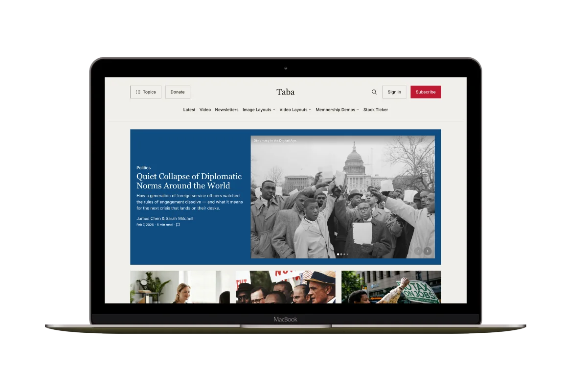
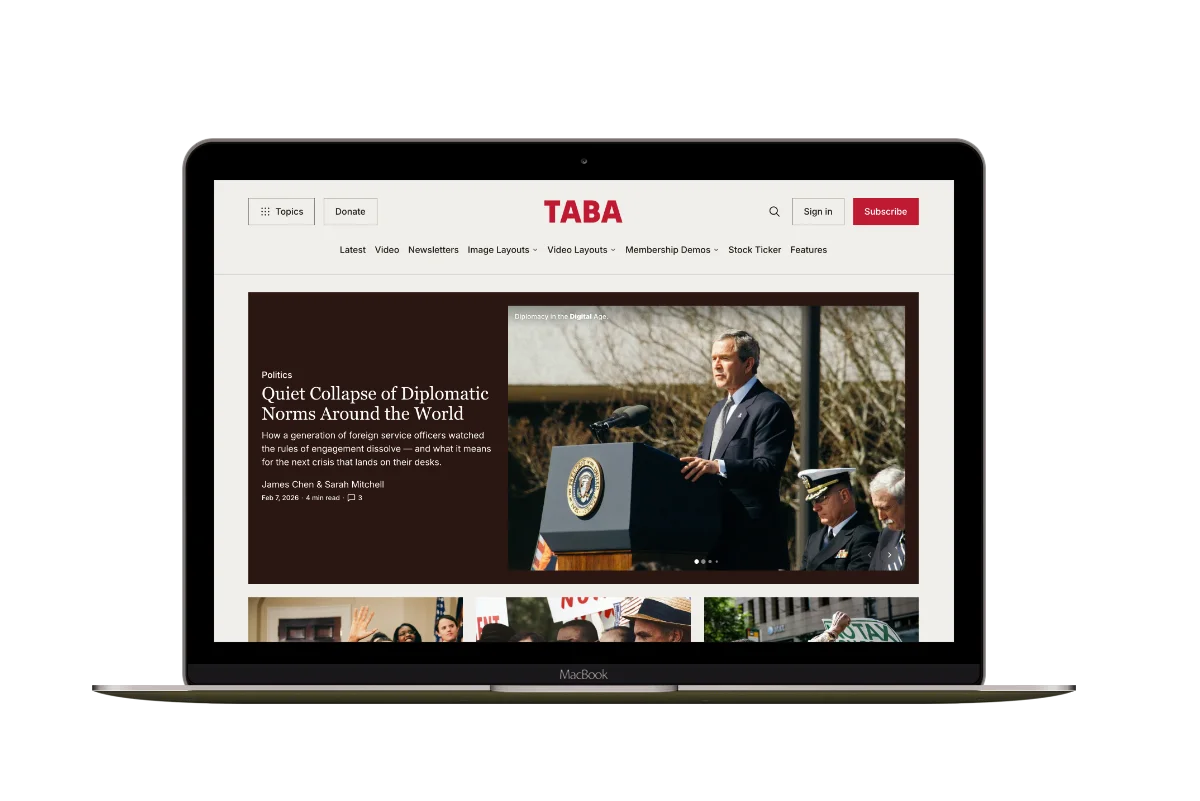
Taba
A newsroom front page for coverage across topics, video, and story formats.
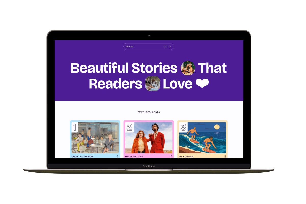
Marsa
A flexible publication homepage for featured stories, topics, and newsletters.
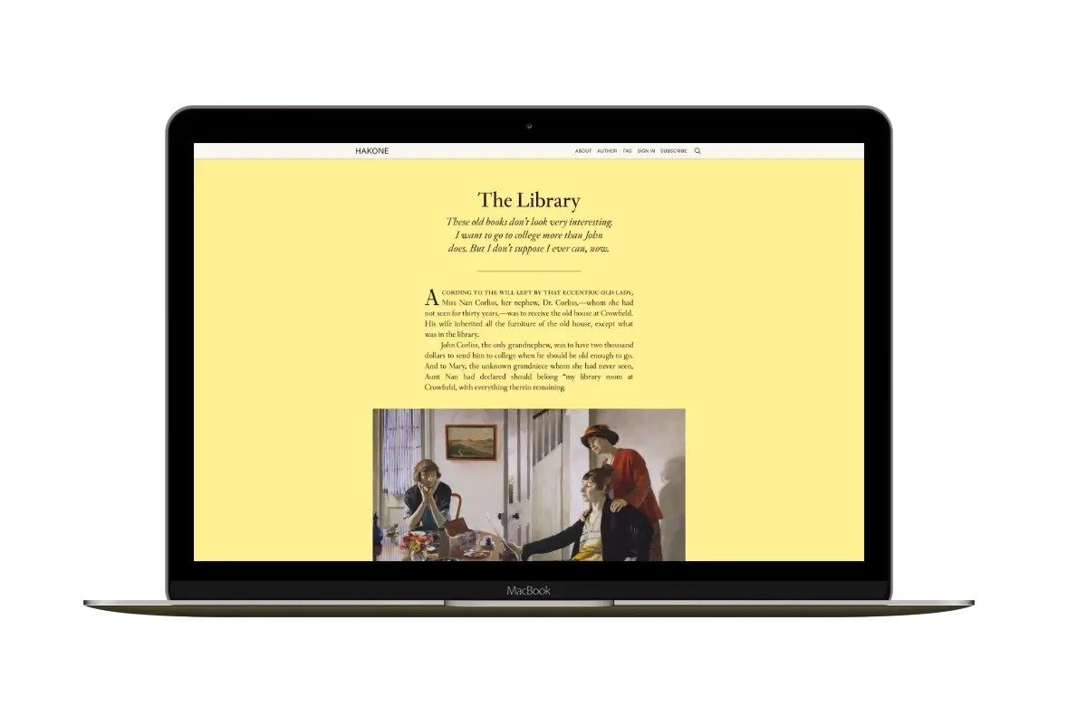
Hakone
For writers who want readers to browse complete posts on the homepage.