Designing Hanoi: From the Cover Story to the Archive
The first screen of the Hanoi demo belongs to a story. A photograph fills the opening, with the title and excerpt placed over it. Before a visitor has browsed the magazine’s topics, they have something specific to read.
For a visual magazine, photographs have several jobs. They introduce a subject, distinguish one story from another, and sometimes become the story itself. Hanoi changes their scale and position as the reader moves through the publication.
Hanoi is a Ghost theme I make at Aspire Themes. These examples use its sample magazine.
The Cover Story
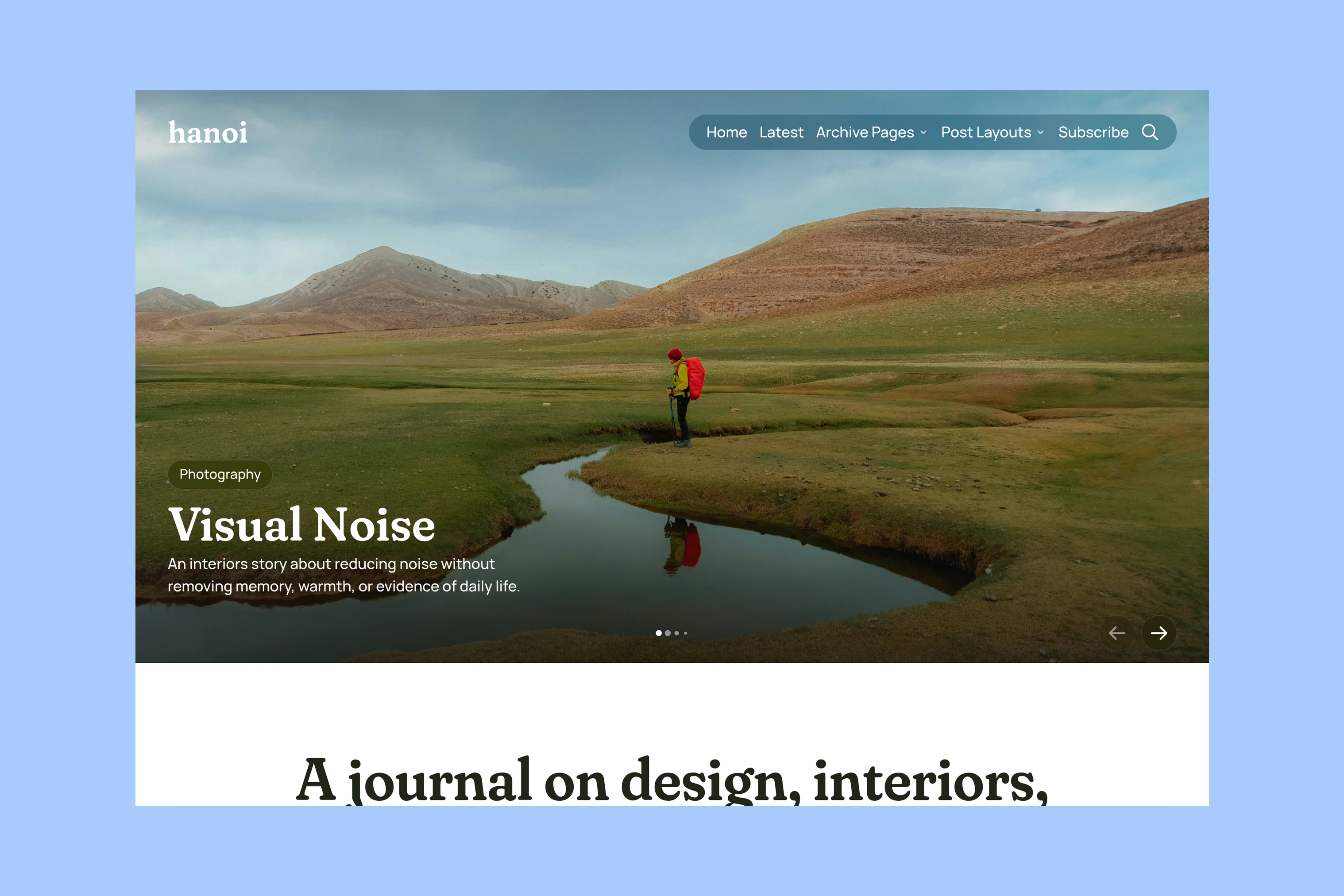
The opening can hold up to five Featured stories. Each selection takes the same large stage, with controls for moving between them. The first story sets the initial impression; the others let an editor offer more than one starting point without putting several equally large panels on screen at once.
That arrangement asks something of the photograph. It needs to work as a broad crop, and the words still need to remain readable over it. A closely framed subject may suit a different article opening better. The large lead is useful when the picture and title can carry the first encounter together.
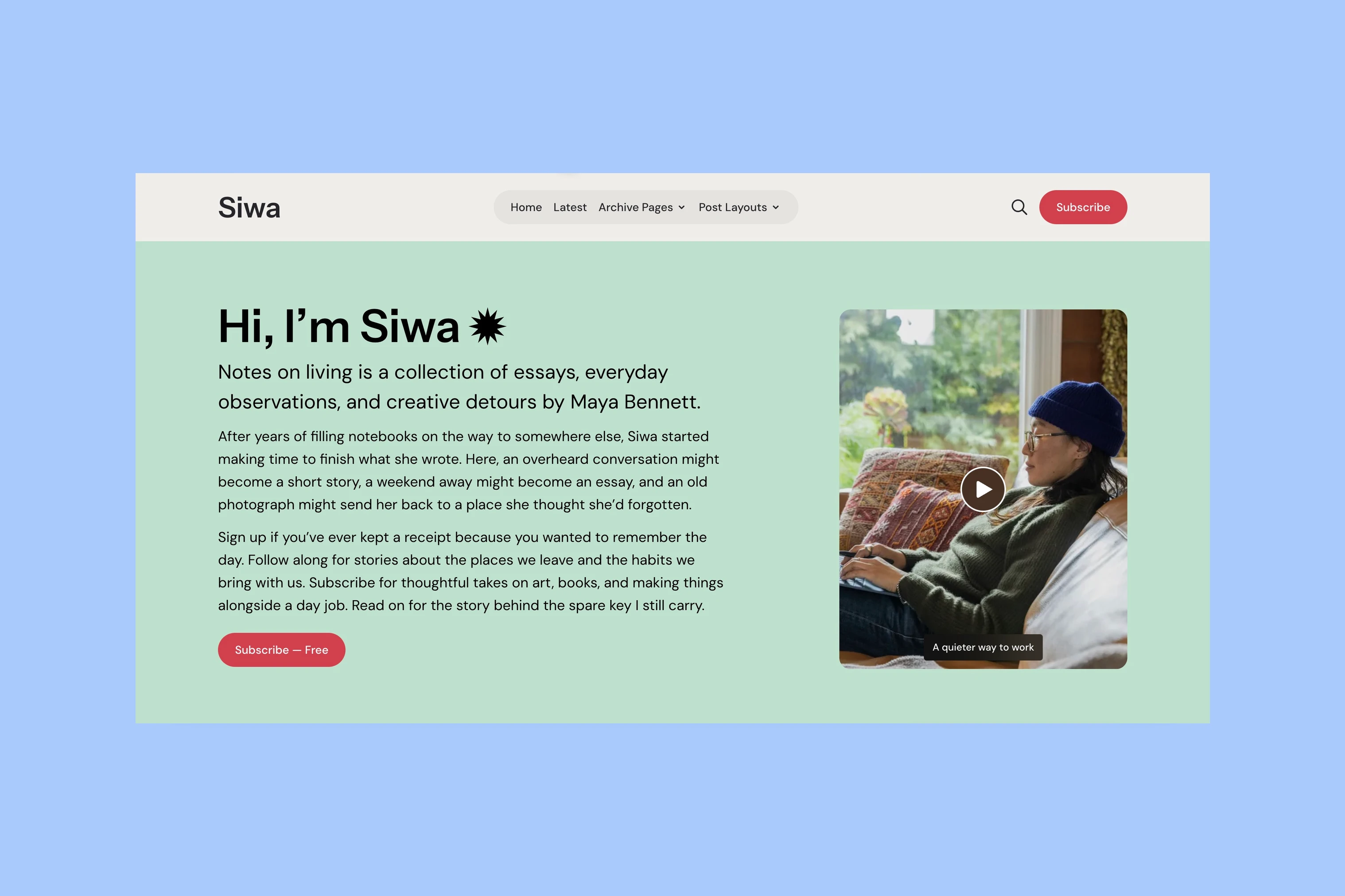
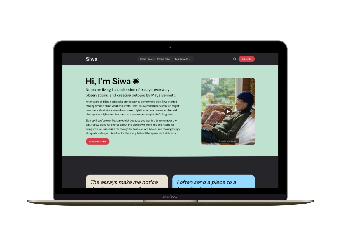
The editorial introduction follows the lead. This order lets the work introduce the magazine before its own description explains what holds the stories together. Where Siwa introduces its writer first, Hanoi starts with a piece of the publication.
Topics and Recent Stories
A cover story offers an editorial choice. The next reader may want a subject of their own. Homepage topic cards pair tag names with images, giving someone interested in food, travel or interiors a route beyond the lead.
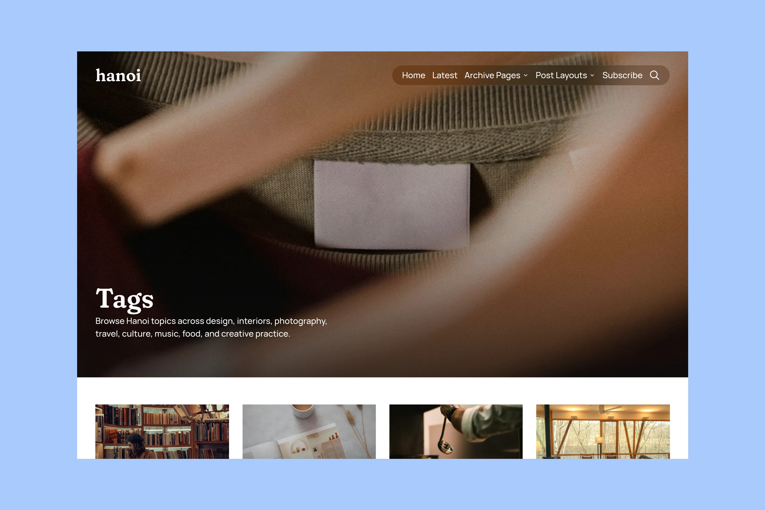
The Tags directory extends that approach to a separate browsing page. The name identifies the subject; the image gives it a visual character. A publisher can select the homepage topics rather than putting every tag in that space.
Latest Stories follows the homepage topics, broadening the selection to recent work. The five Featured selections are excluded from that feed when present, so the lead does not immediately reappear as another card. Farther down, Editor’s Pick gives one additional story a distinct place. These changes in scale separate a subject choice, a recent story and an editorial recommendation.
Navigation Previews
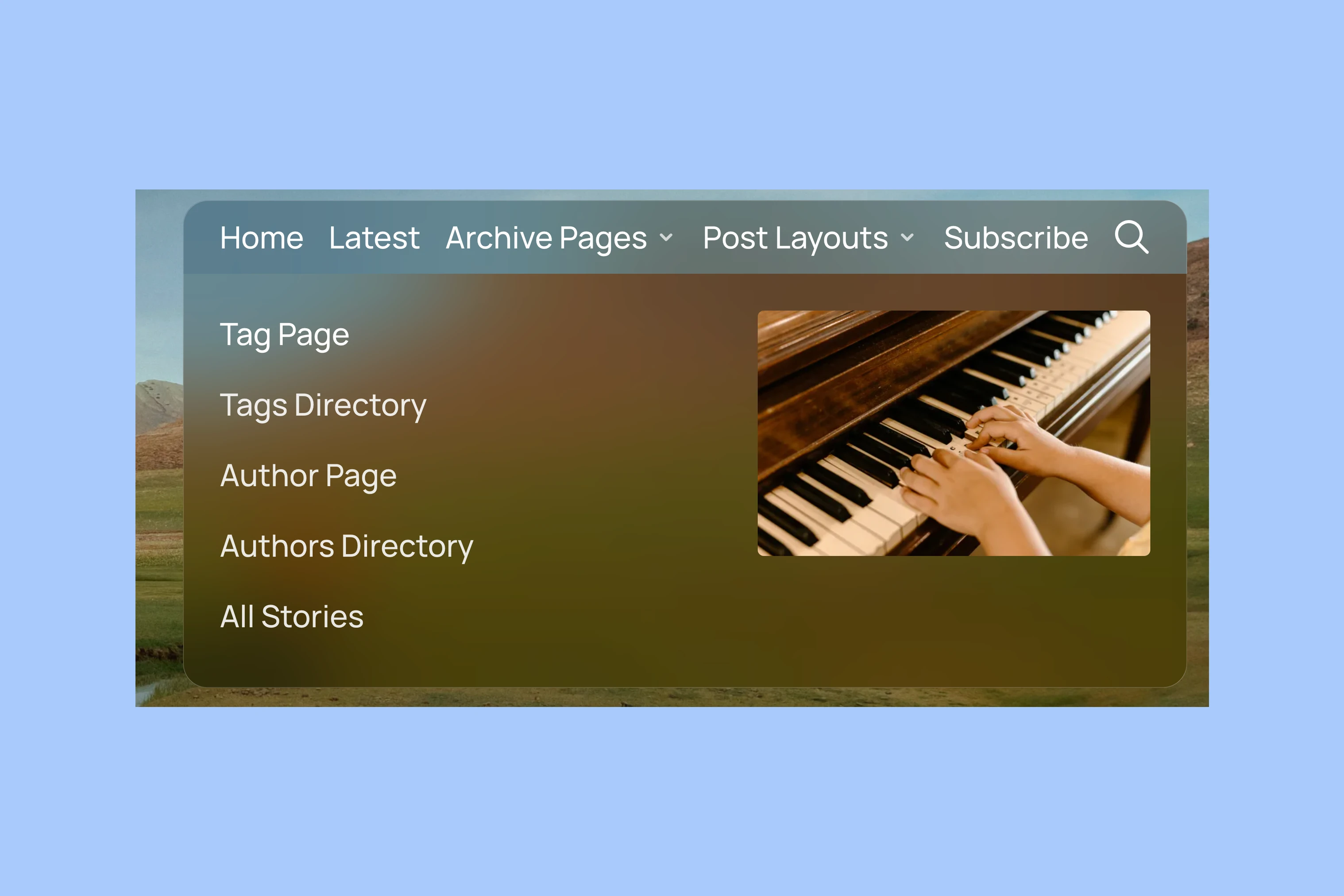
Hanoi’s desktop dropdown places an available image beside its text links. Internal posts, pages, tags and authors can supply that preview; supported video stories can add muted movement. A reader gets a glimpse of the destination while the link remains the way to reach it.
On mobile, the navigation keeps its links in a drawer without the desktop preview panel.
Article Openings
Once a reader chooses a story, the photograph can take another role. Hanoi’s Default, Hero, Fullscreen, Split and Video layouts give the publisher different ways to begin the article.
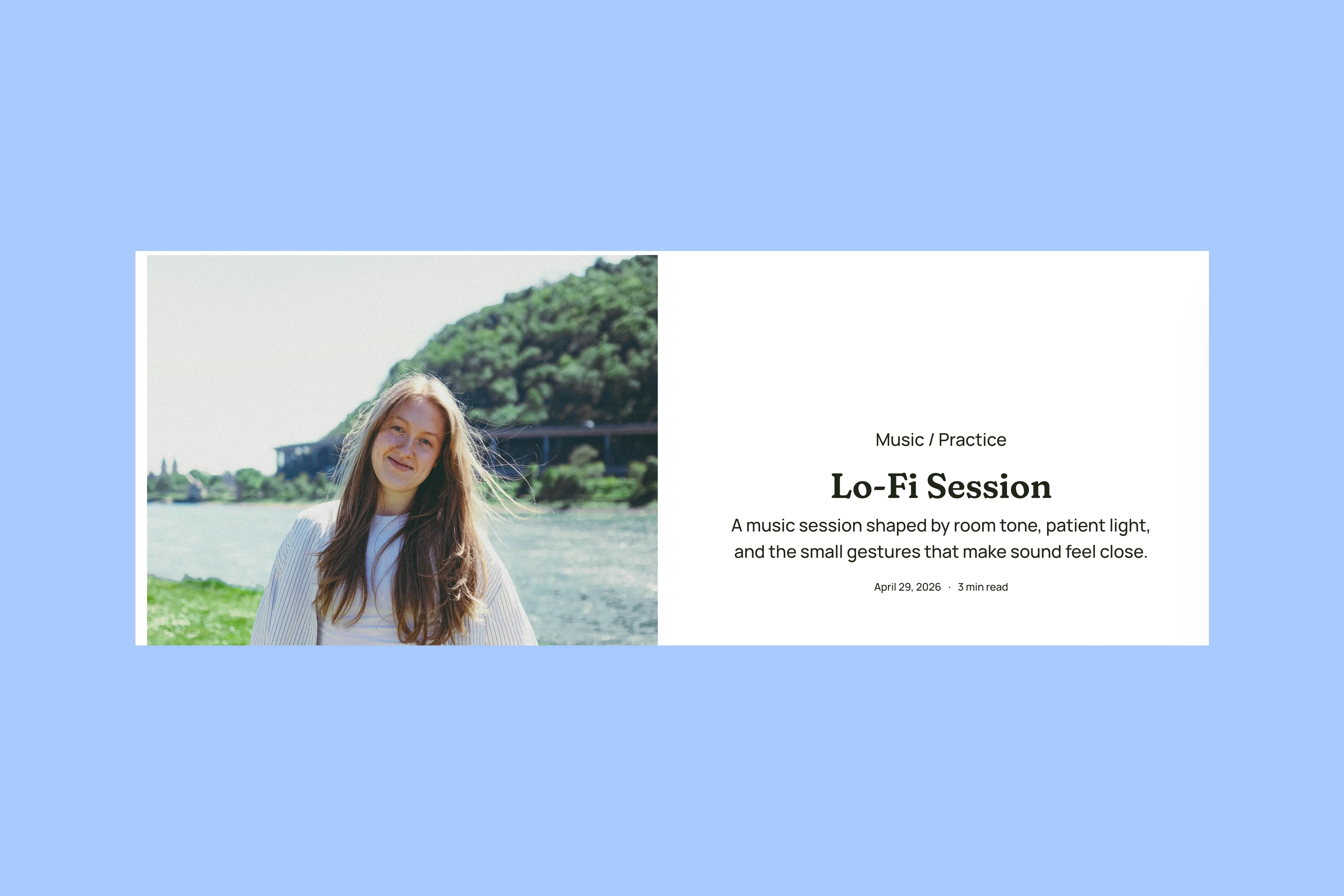
Split places the image and introduction alongside each other. Both can be read together: the photograph supplies context while the title and excerpt explain the piece. A Fullscreen opening gives the cover more of the first view, which suits a photograph that needs room before the writing begins.
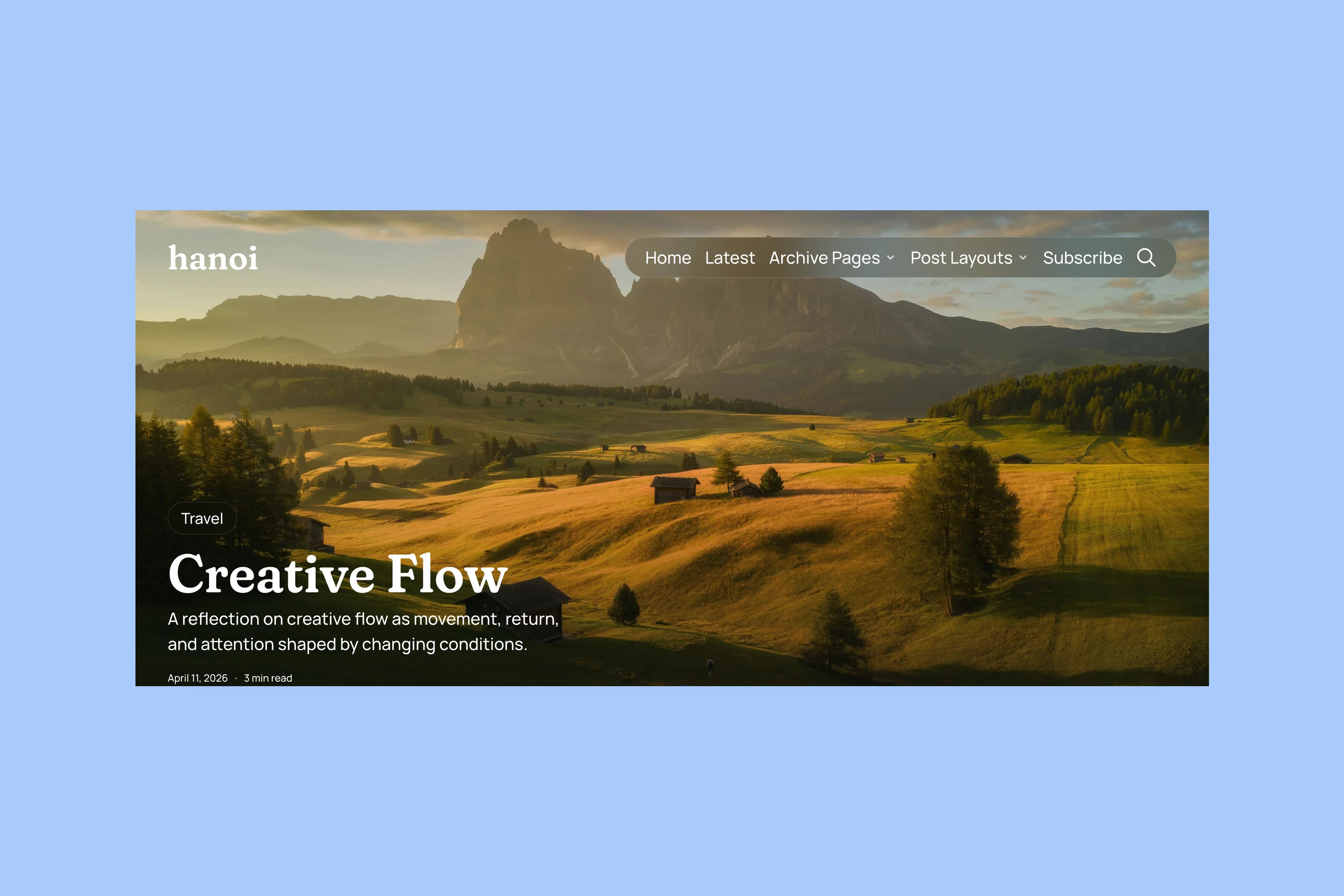
The Video layout makes playback the opening media. Its expanding presentation gives motion a larger stage as the reader scrolls. This is a different commitment from a muted preview in navigation: the visitor has now opened the story and can choose to watch it.
An essay can use the Default layout while a photographic report uses a larger opening image.
Reading Tools
The cover attracts attention; the article still needs to hold readable text. After the opening, controls for listening, text size, comments and sharing stay near the writing.
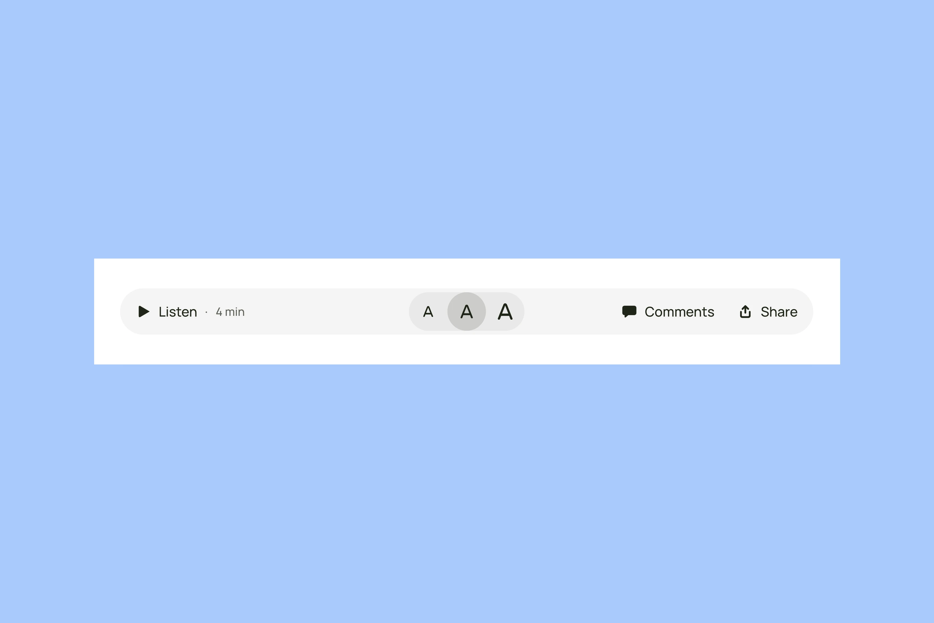
Text-size controls let the reader adjust the article rather than relying on the publisher’s preferred size. Listen uses browser speech support, so the available voice depends on the reader’s device. It is an alternative way to follow the text, not a recorded narration.
The lightbox opens photographs in a larger viewer over the article, so readers can inspect a photograph or gallery and return to the text.
The Archive
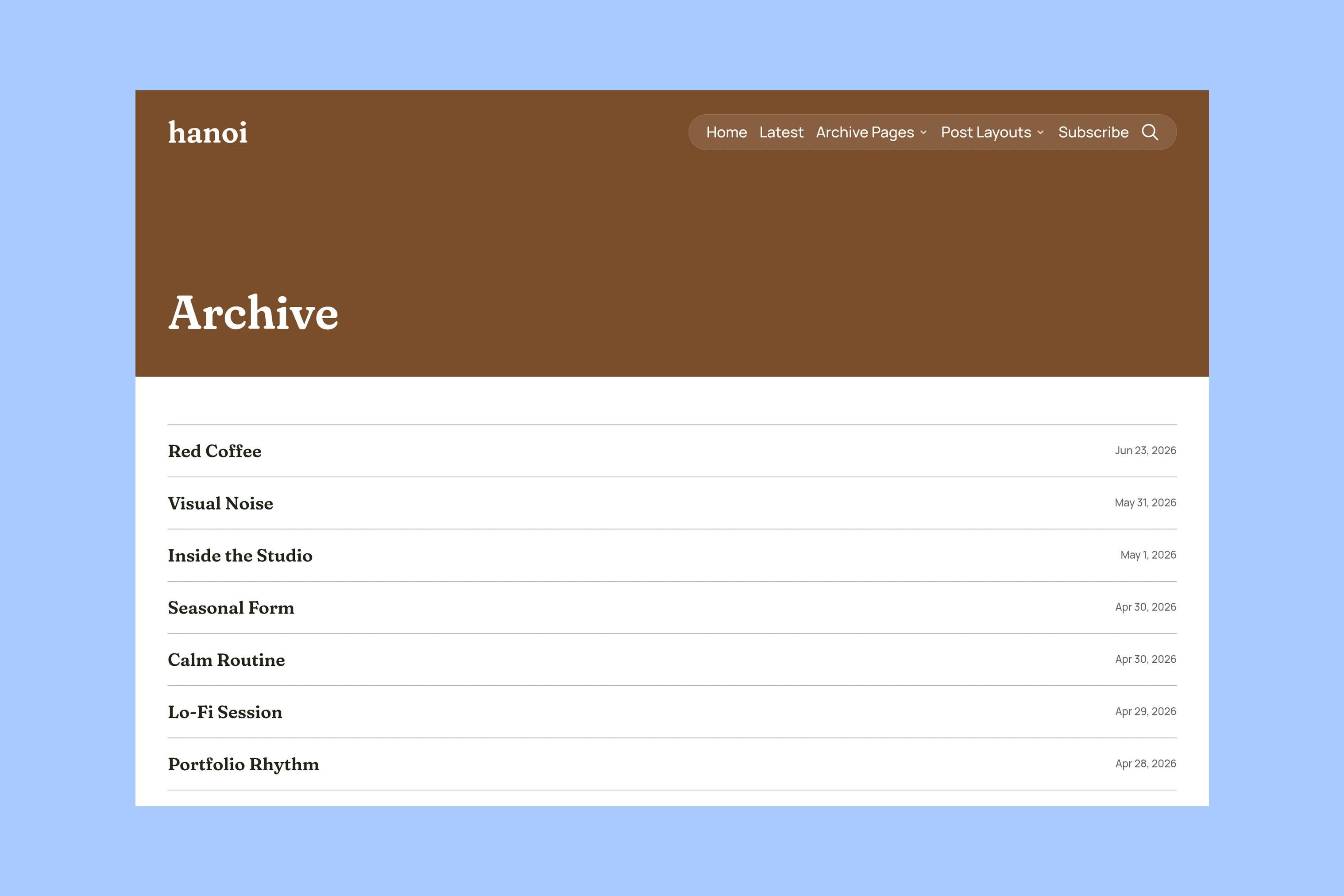
The Archive collects titles and dates in a compact list, with image previews available for recognition. The reader can scan the words without opening a grid of large photographs. Latest offers the more visual alternative for browsing recent work.
More from the Blog
Latest Ghost Themes
Arish
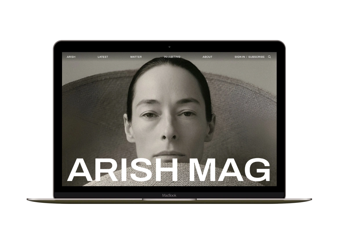
For visual magazines that lead with photography, film, and selected stories.
Siwa
A personal publication that introduces the writer before inviting readers into the stories.
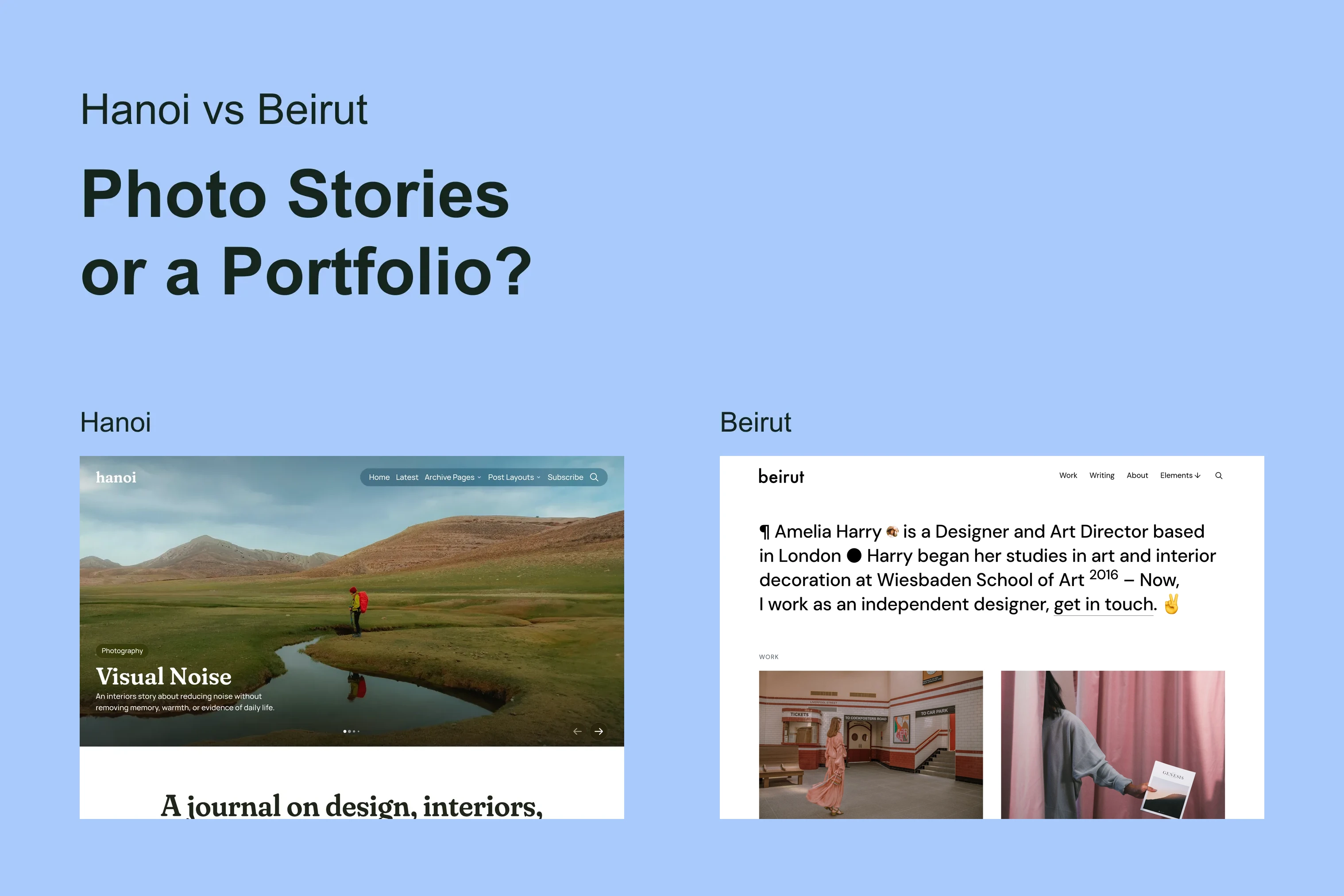
Hanoi
An image-led magazine for creative stories, rich navigation, and long-form reading.
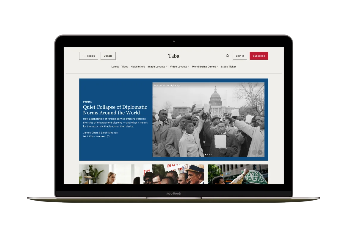
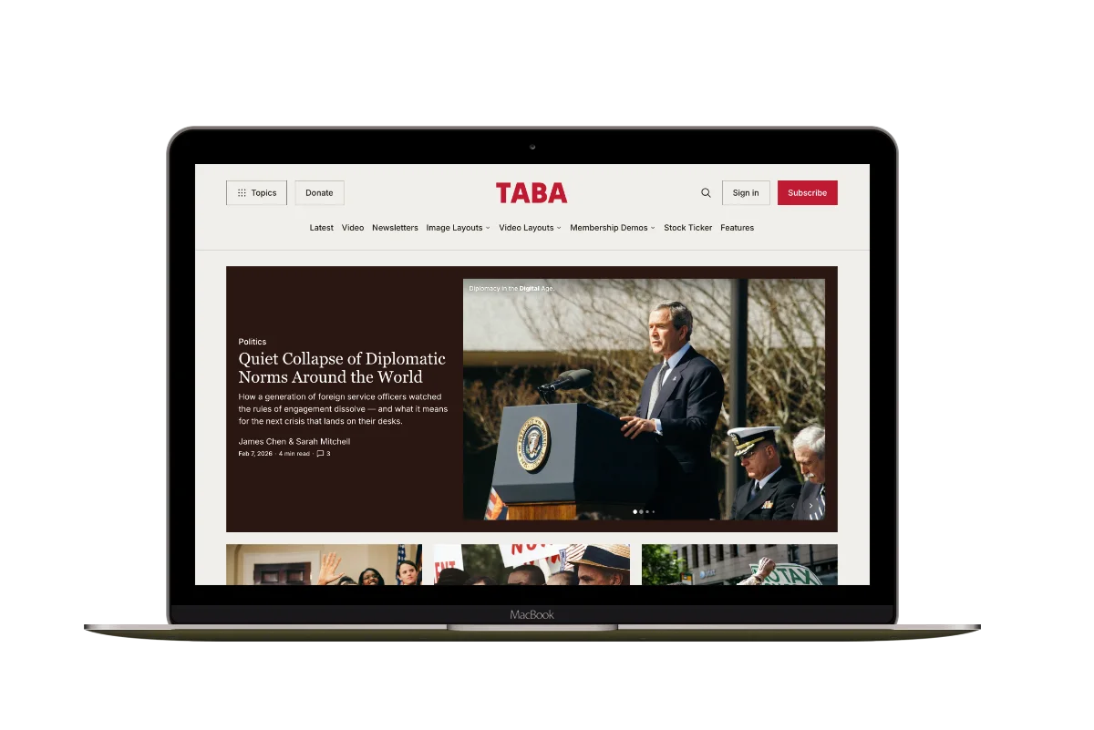
Taba
A newsroom front page for coverage across topics, video, and story formats.
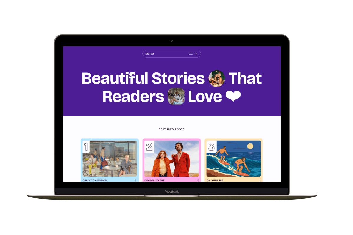
Marsa
A flexible publication homepage for featured stories, topics, and newsletters.
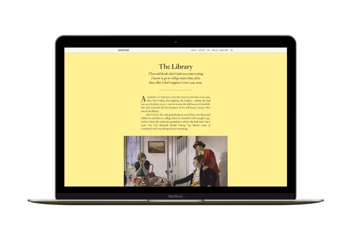
Hakone
For writers who want readers to browse complete posts on the homepage.