Designing Taba: Giving a Busy Front Page a Clear Order
A magazine that covers several subjects has more than one answer to “what should I read?” There is the lead story, the latest report, a subject the reader follows, and a video they might want to watch. A front page needs to distinguish those answers before the reader opens anything.
On the Taba demo, the lead gets a large image and its own text panel. Three supporting stories follow. Further down, recent posts, topics, an editorial pick and video coverage offer different ways to continue. The page changes its arrangement as the reason for choosing a story changes.
Taba is a Ghost theme I make at Aspire Themes. The screenshots use its sample publication.
Featured and Latest
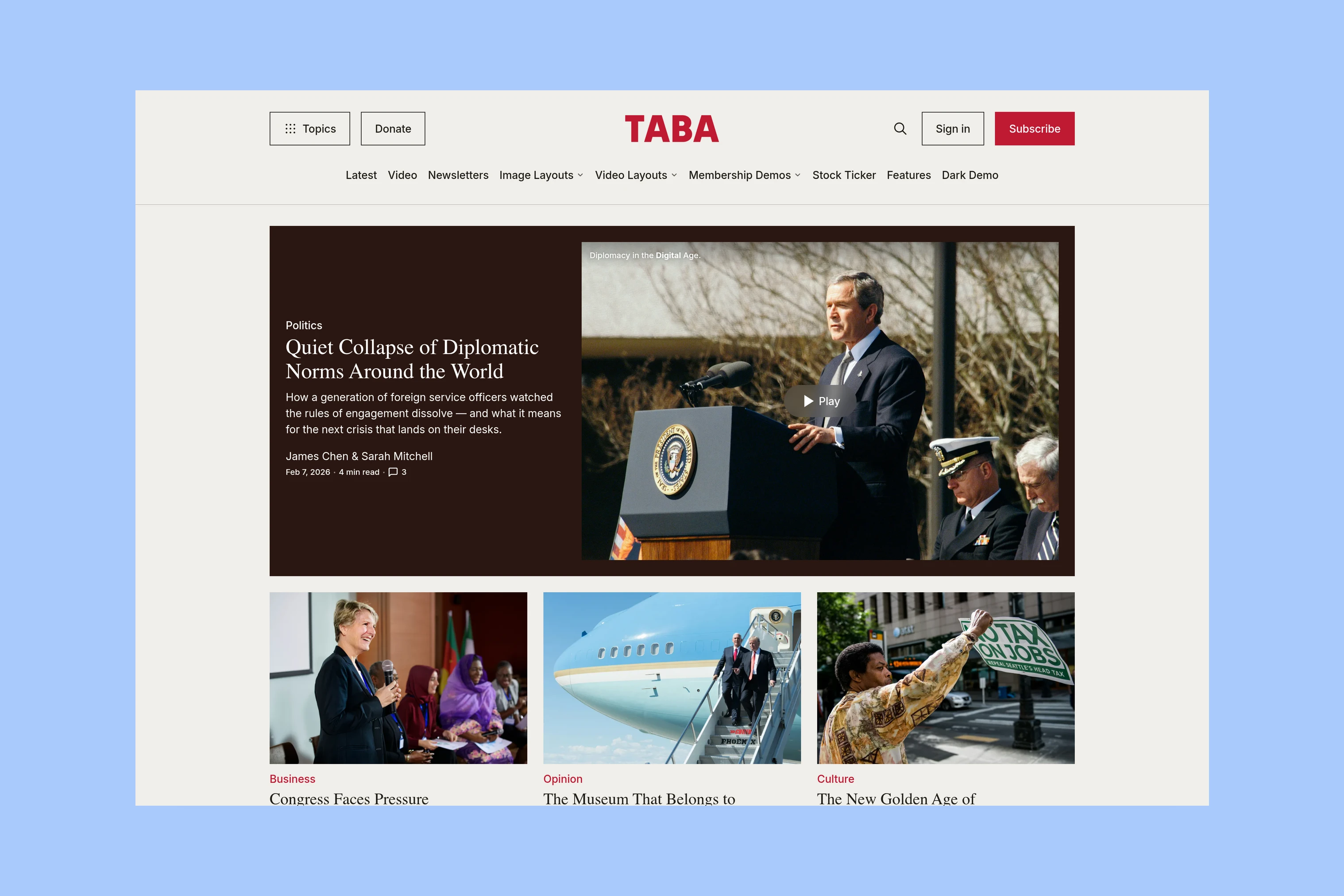
Taba’s Featured section holds one large lead and up to three supporting stories. The lead pairs media with a title and excerpt, giving the editor room to explain why that story deserves attention. The smaller cards let other selections remain visible without taking the same space.
Latest then answers a different need: what has been published recently? Keeping it separate from Featured gives editorial selection and publication order their own roles. A story can be important without being the newest thing on the site.
Topic Sections and Columns
Recent work can range across subjects. A reader following one of those subjects needs a collection that stays together.
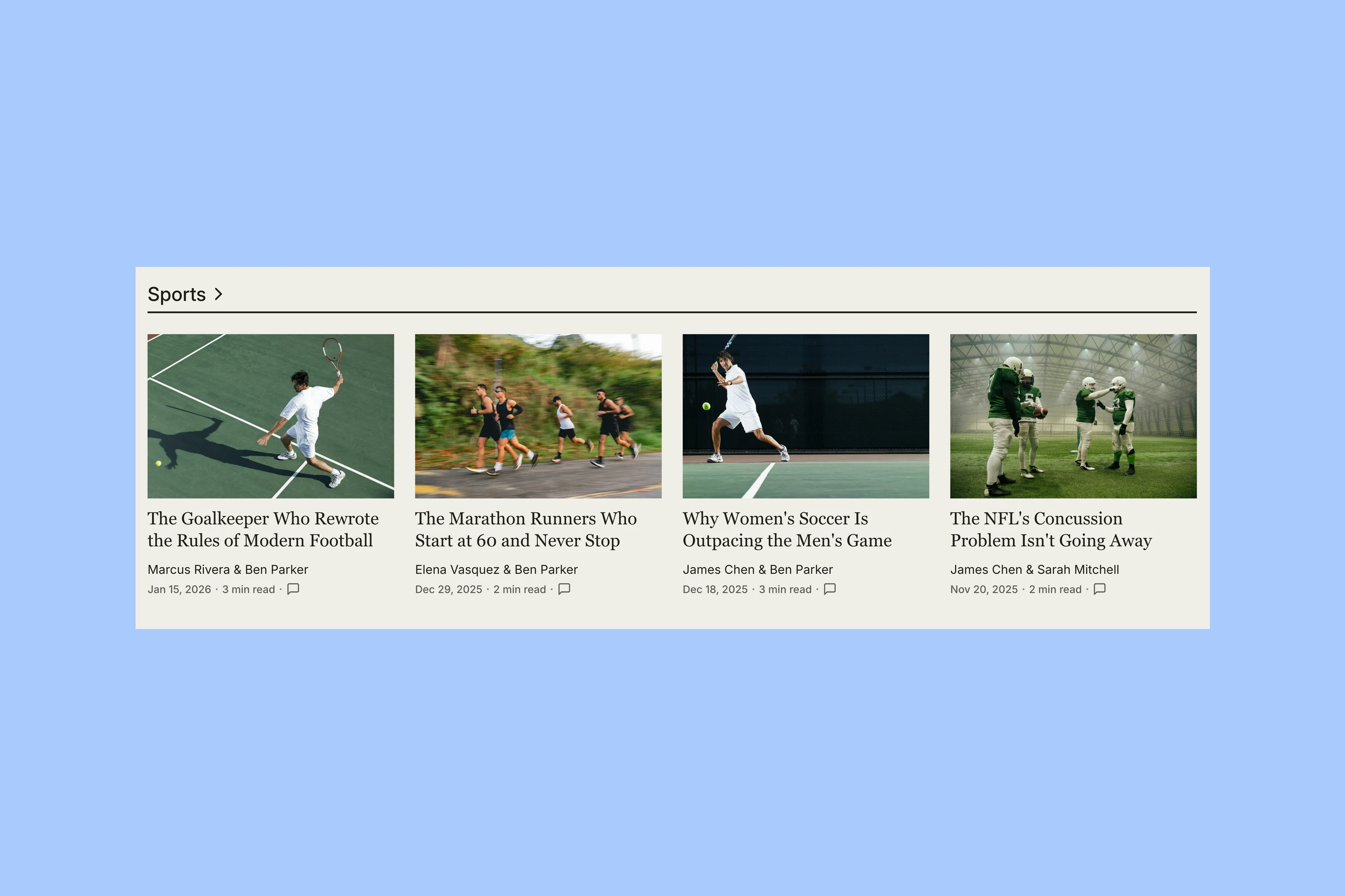
Homepage topic sections give selected subjects a heading and a row of up to four stories. The heading links to the topic’s archive. A single subject can therefore offer an immediate selection and a route into its wider coverage.
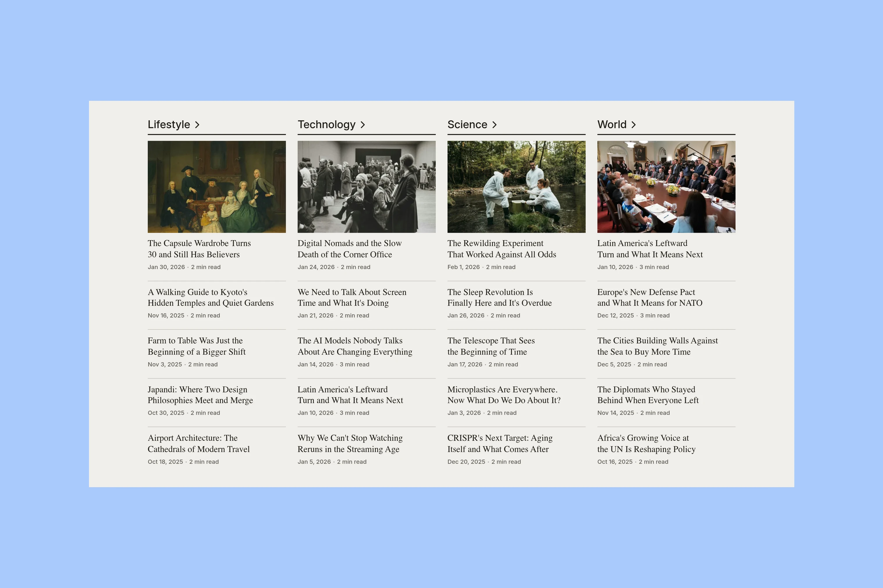
Topic columns use the space differently. Each column starts with an image-led story and follows it with a compact list of titles. Several subjects can sit alongside one another without each requiring a full-width section. The two lists of homepage topics are independent: a publisher can give a major beat a broad section and place other regular subjects in columns.
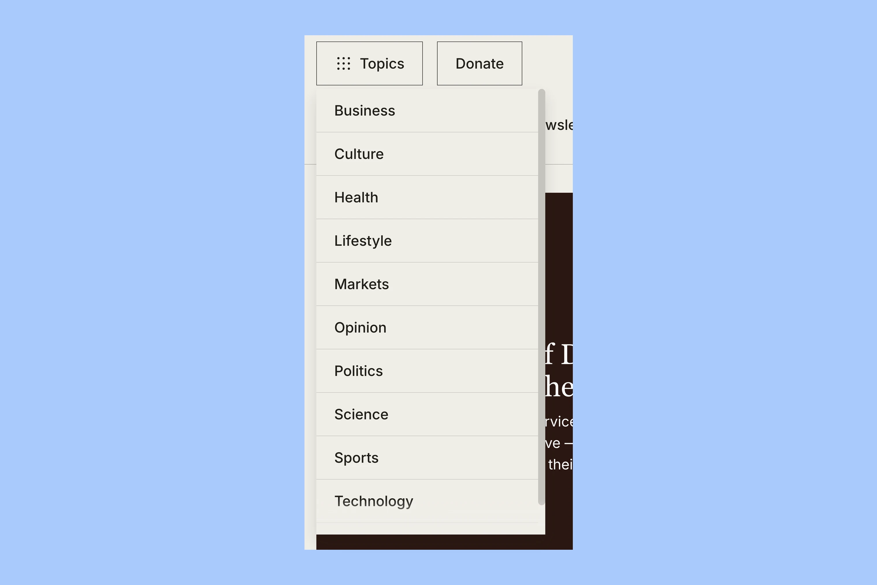
The header’s Topics menu keeps subjects within reach after the reader leaves the front page. The homepage can stay selective because it is not the only route into the archive.
Editors’ Pick and Video
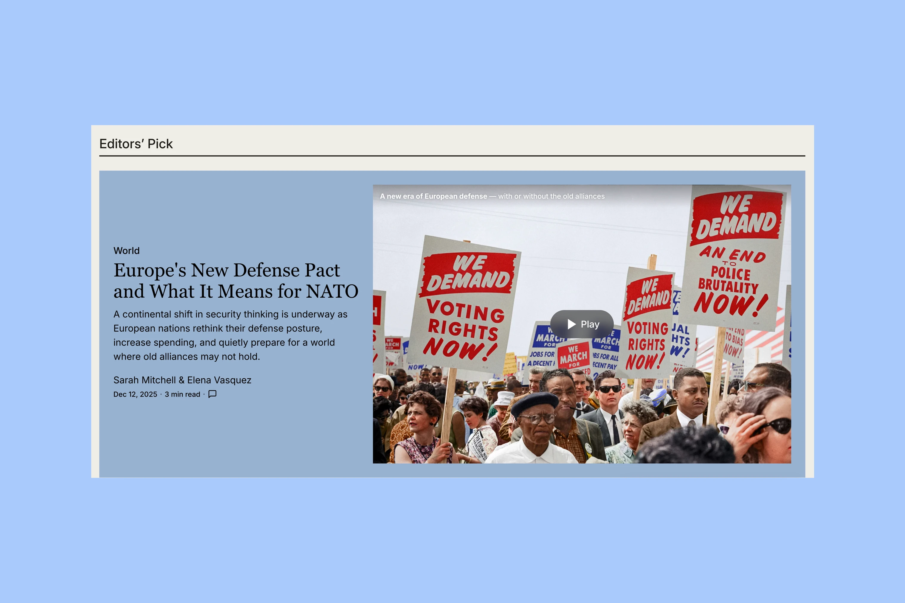
Between topic coverage and the lower columns, Editors’ Pick gives one selected story another large presentation. It excludes the four Featured selections, allowing the recommendation to introduce something beyond the opening group.
Video has a different reason to be separate. The homepage Video section collects video-tagged stories, while the standard Featured and topic groups exclude those entries. A visitor choosing to watch can find that format together, instead of discovering only after opening a card that the main story is a video.
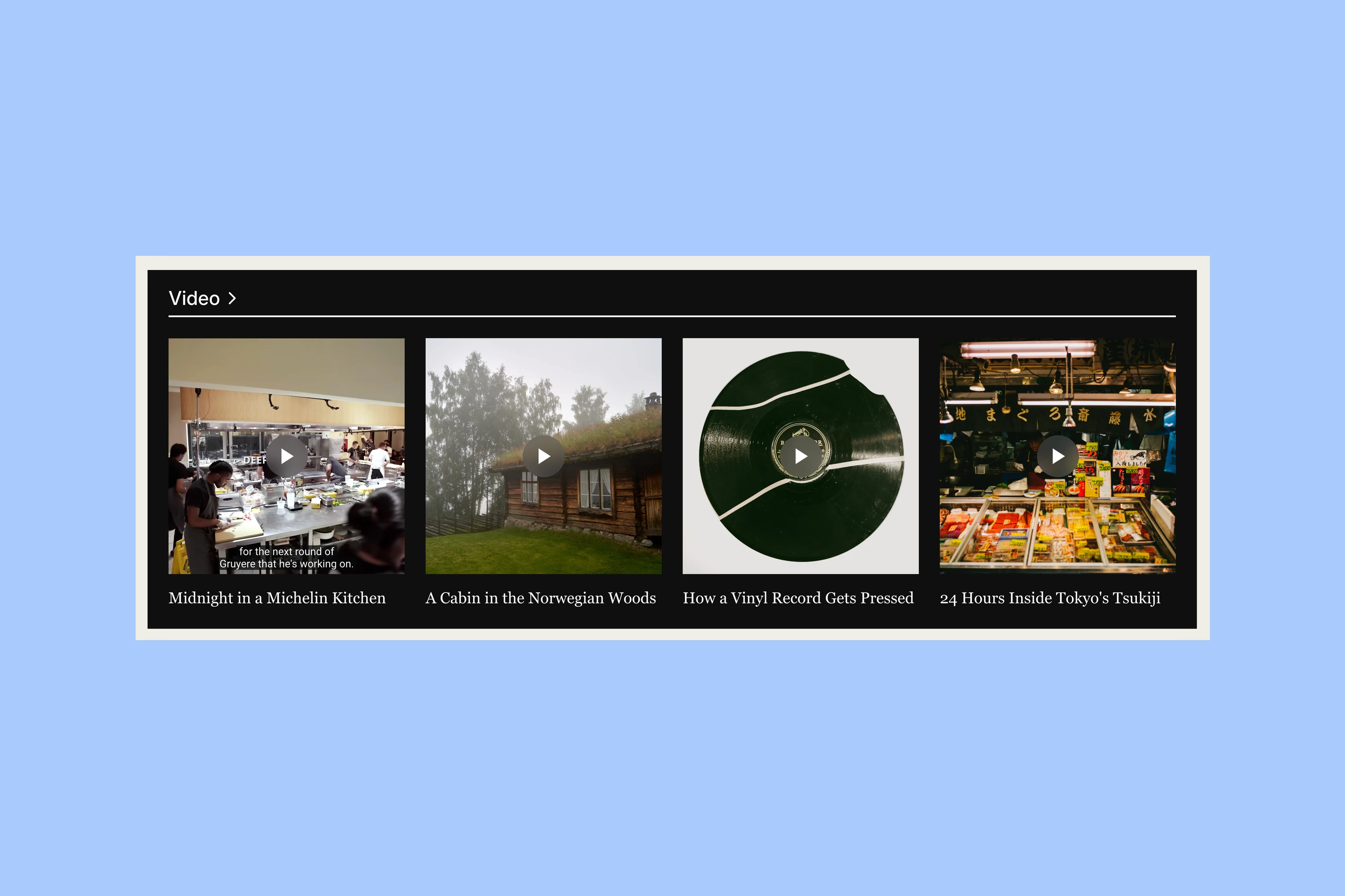
The video archive continues that route. The separation is useful when video is a recurring part of the publication. A magazine publishing mainly written stories can let its topic coverage do more of the work.
Article Openings
Taba’s article templates let editors choose how much of the opening to give to photographs, galleries or video.
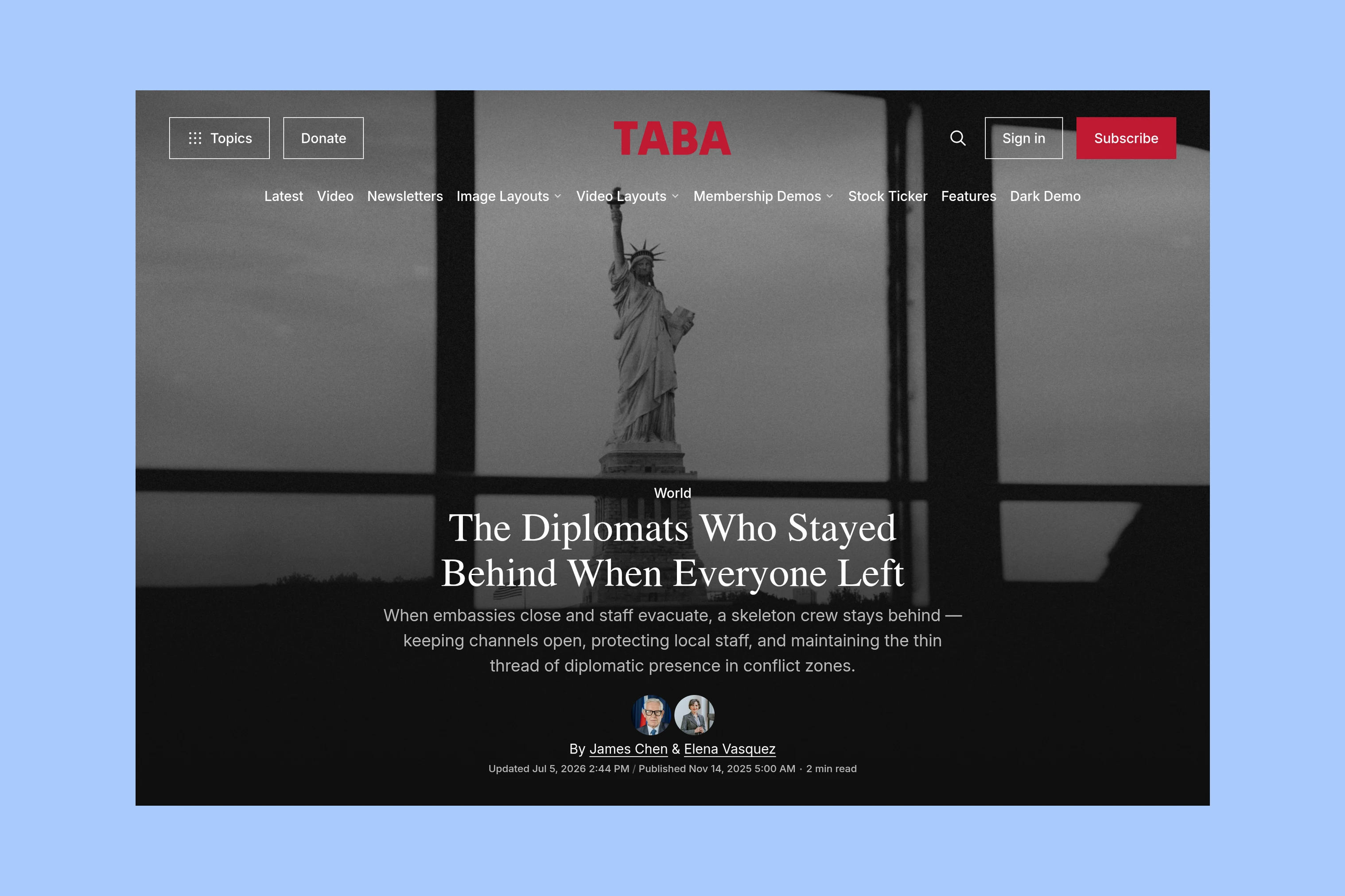
Image Cover gives a photograph a large opening presence, with the story title over the image.
A report with one supporting image does not need the same opening as a photographic feature. The distinction lets the editor give a major visual story more space while retaining a simpler arrangement for everyday writing.
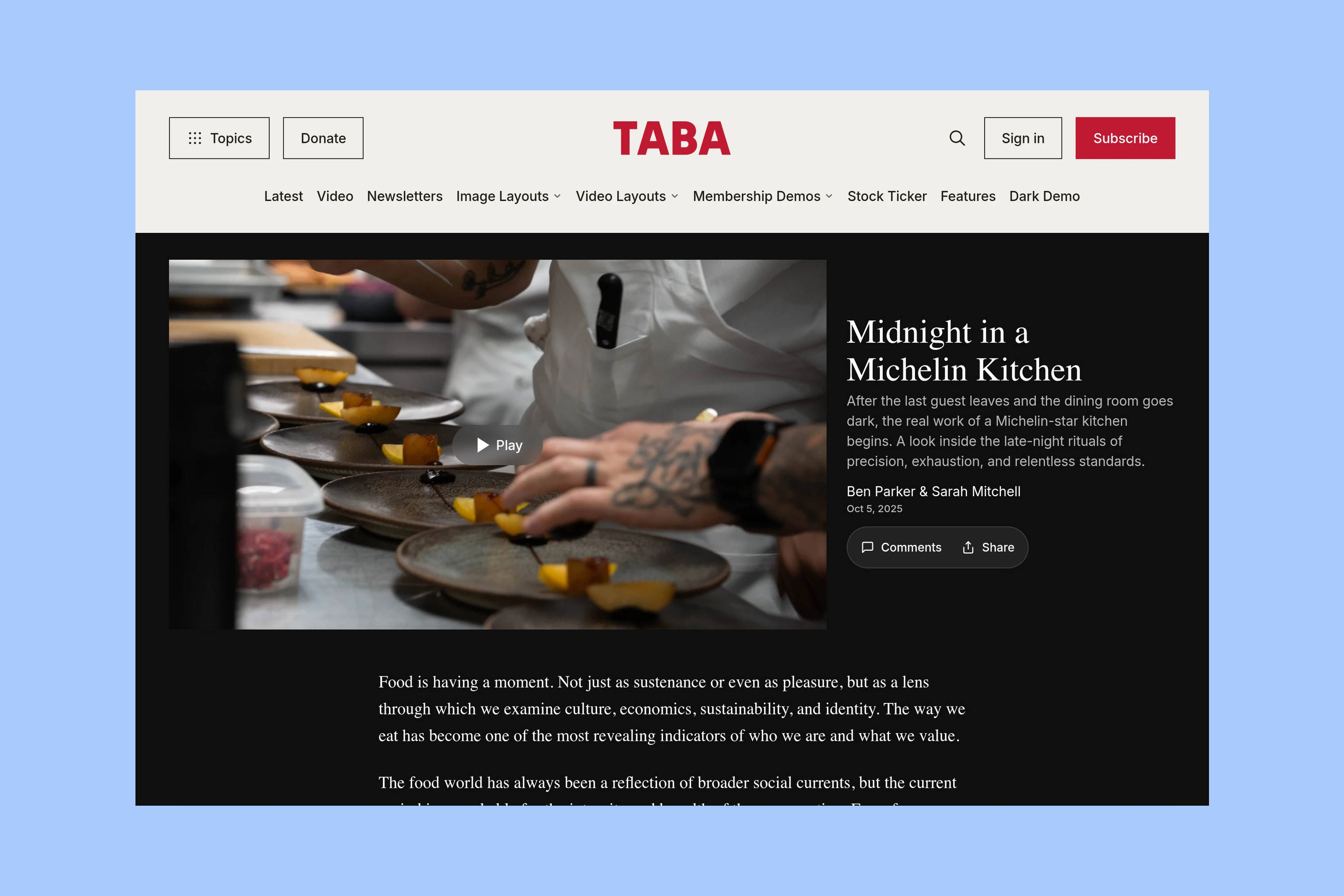
The Video Theater layout gives the player a large stage before the written story. It suits a feature whose main material is something to watch.
For a comparison of these layouts with a consistent written-article opening, see Tripoli vs Taba.
Reading Tools
A front page needs many routes. Once a reader opens an article, that density can recede so the text has room.
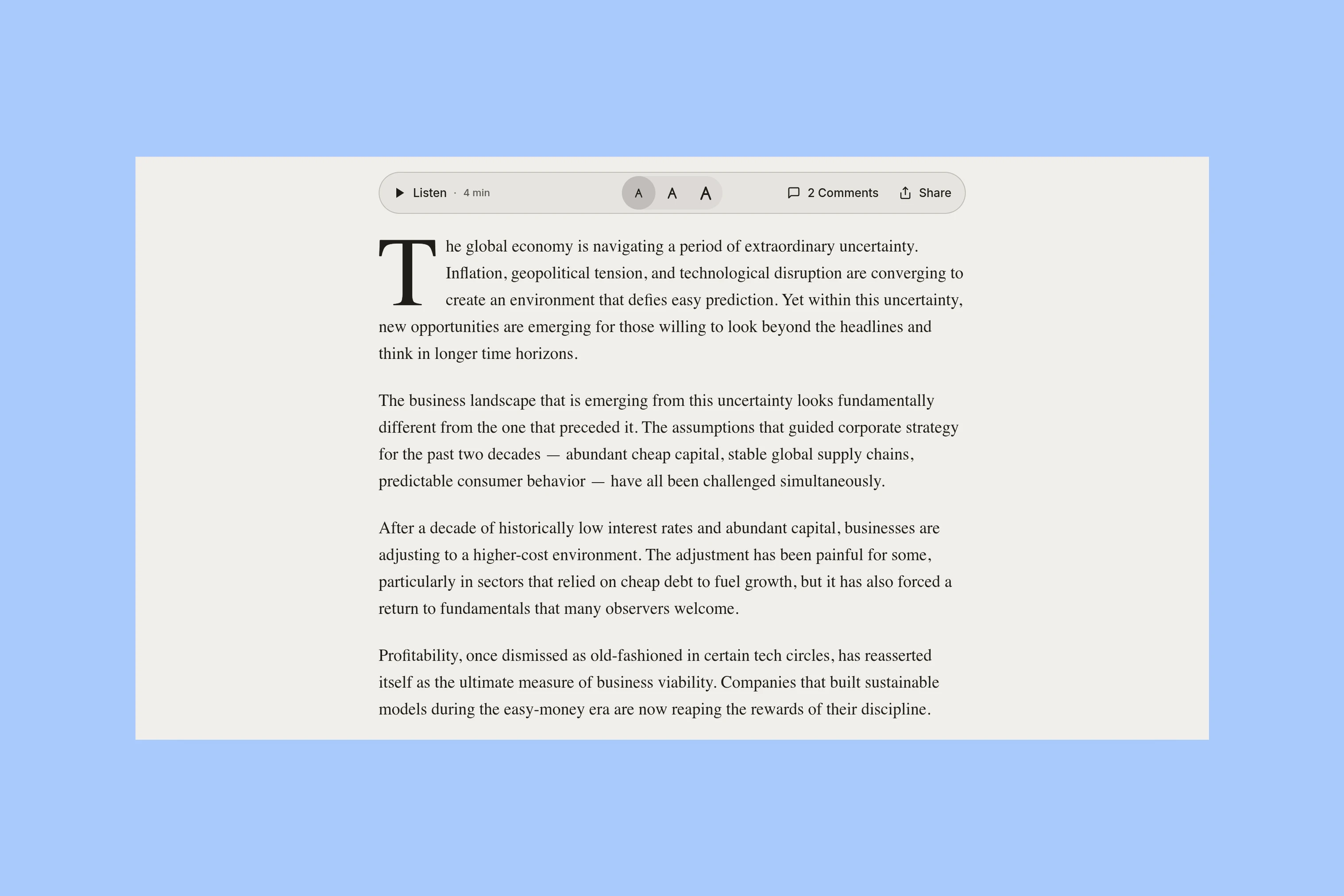
Text-size controls, browser voice playback and sharing sit with the article. Reading progress gives a sense of position in a longer piece. Listen relies on browser speech support; it does not mean the publisher has recorded an audio edition.
Newsletter Choices
A broad magazine may publish more than one newsletter. Asking a reader to subscribe becomes clearer when the site explains what each one contains.
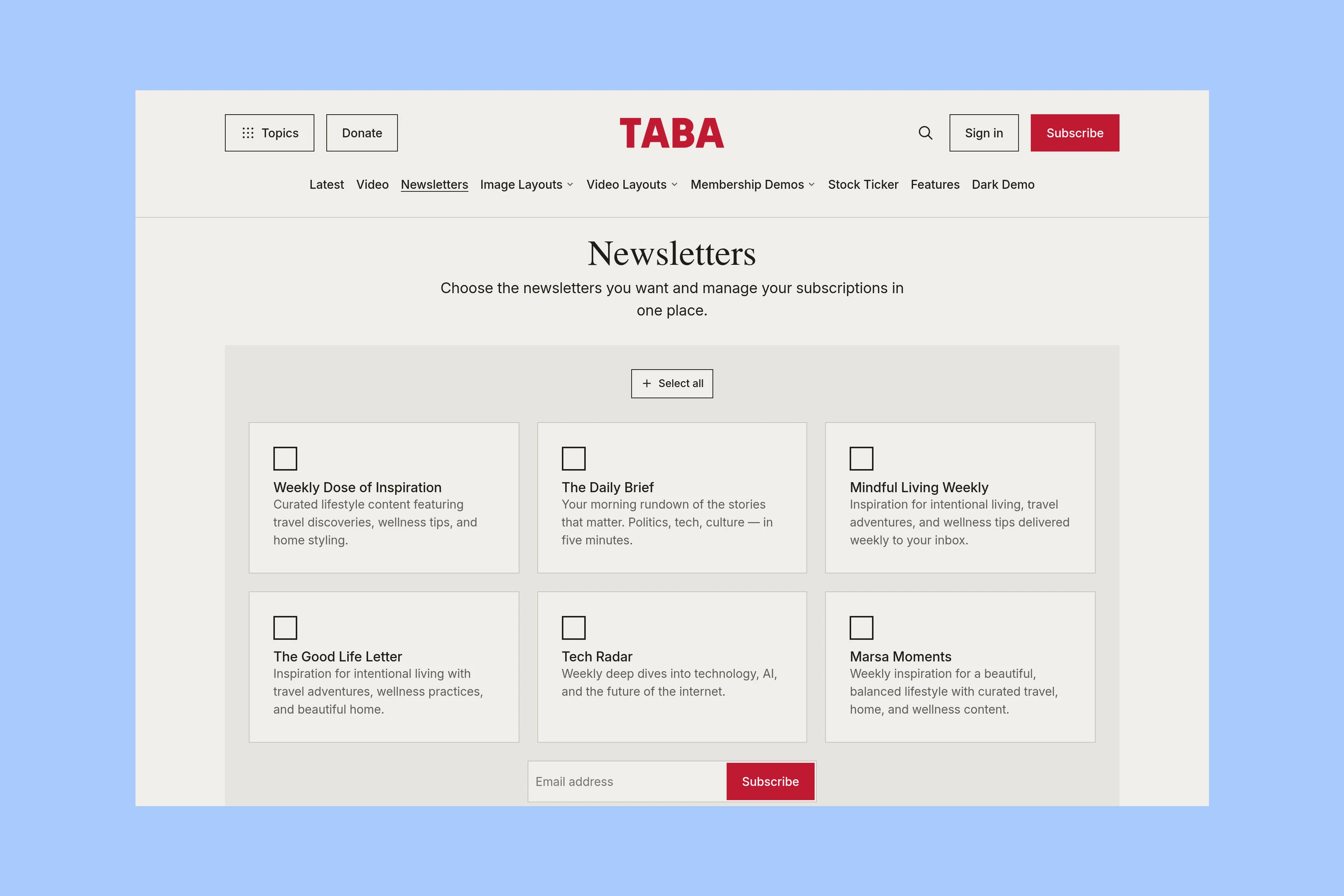
Taba’s newsletters page presents the publication’s Ghost newsletters as separate choices with descriptions. A signed-out visitor selects what to receive; a signed-in member can manage preferences through Ghost Portal. These choices depend on the newsletters the publisher has configured.
Readers can follow one newsletter without subscribing to every subject the magazine covers.
More from the Blog
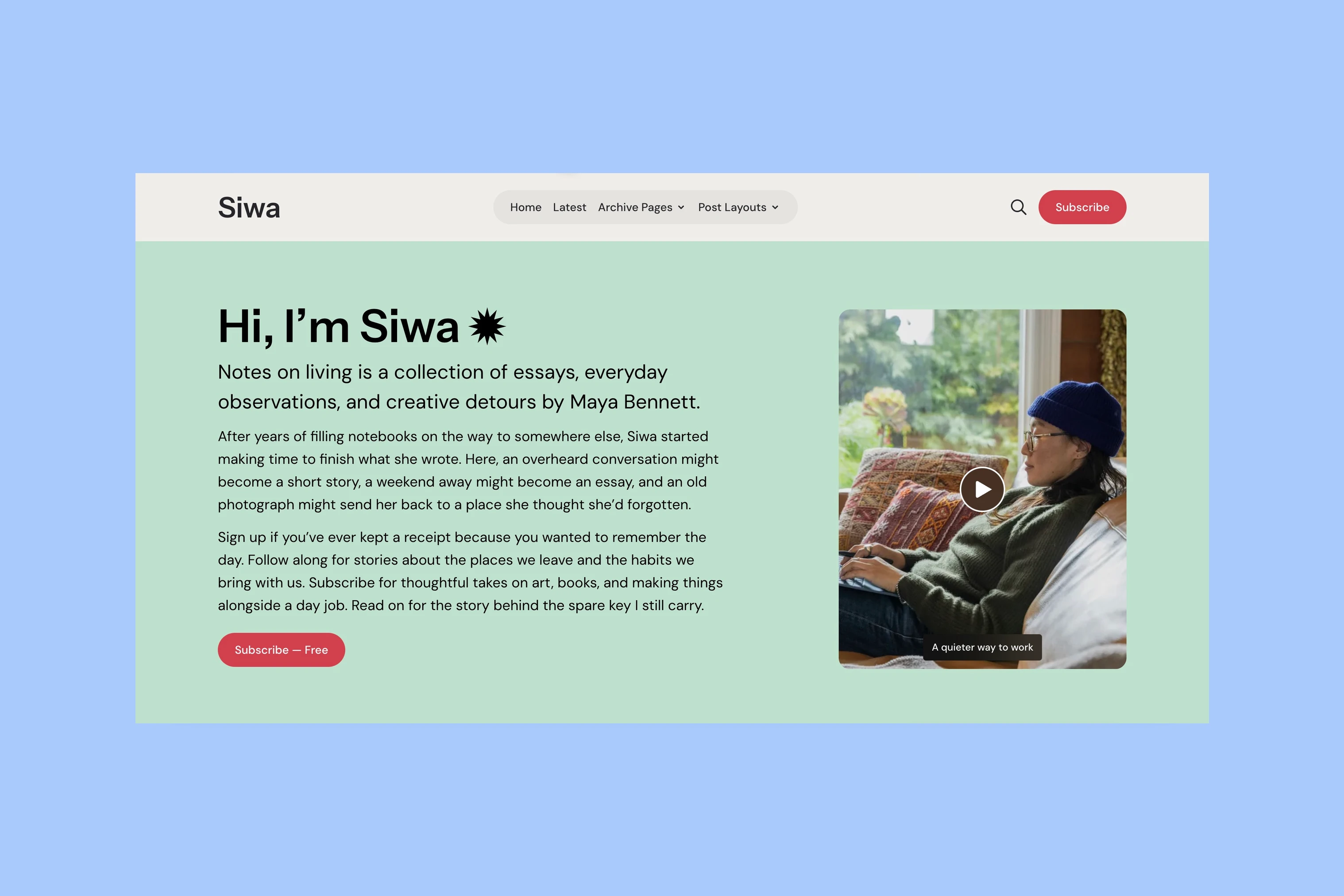
Latest Ghost Themes

Arish
For visual magazines that lead with photography, film, and selected stories.
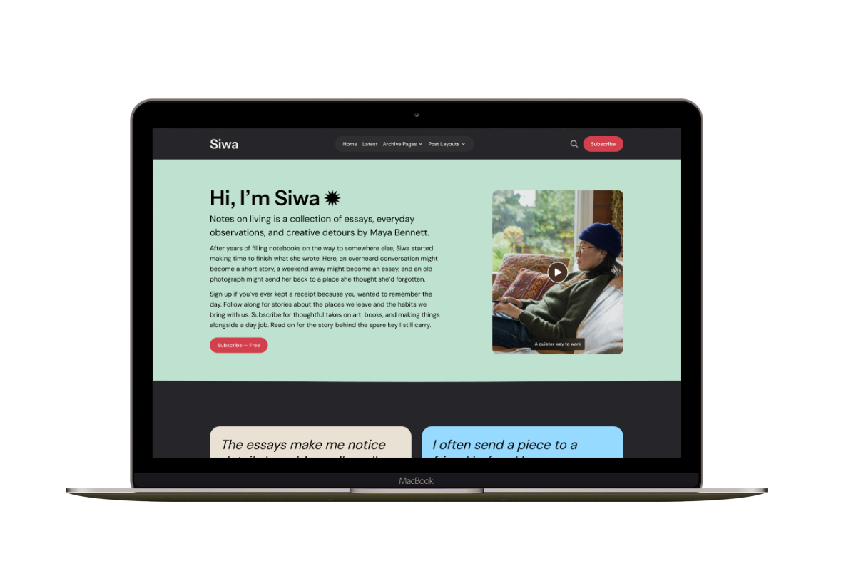
Siwa
A personal publication that introduces the writer before inviting readers into the stories.
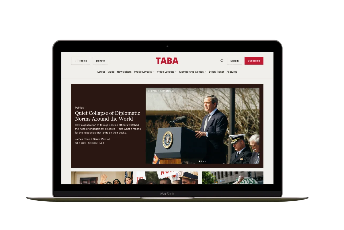
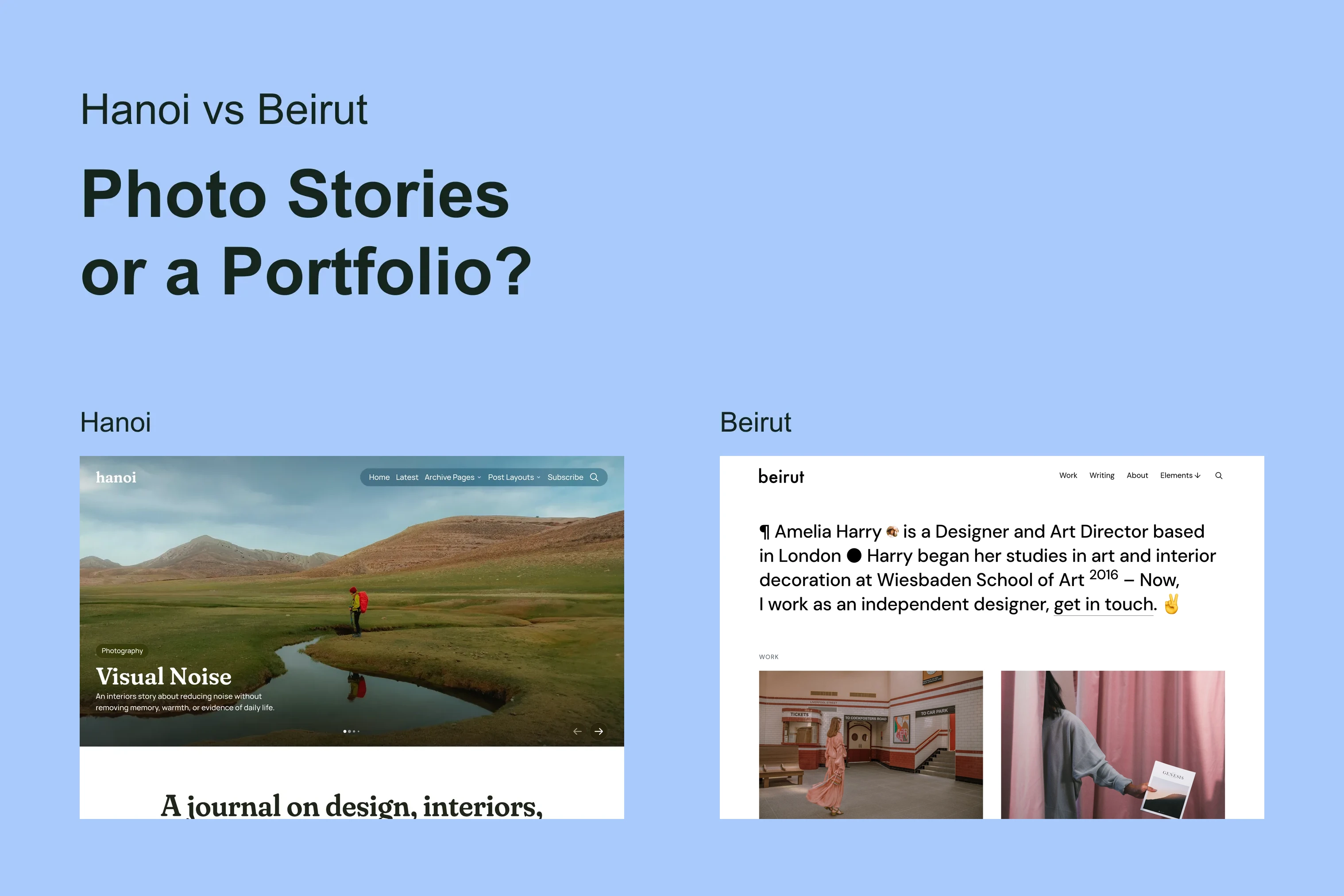
Hanoi
An image-led magazine for creative stories, rich navigation, and long-form reading.
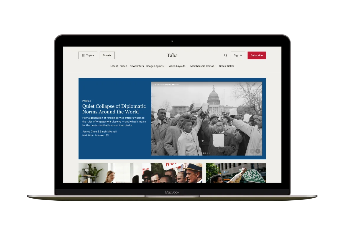
Taba
A newsroom front page for coverage across topics, video, and story formats.
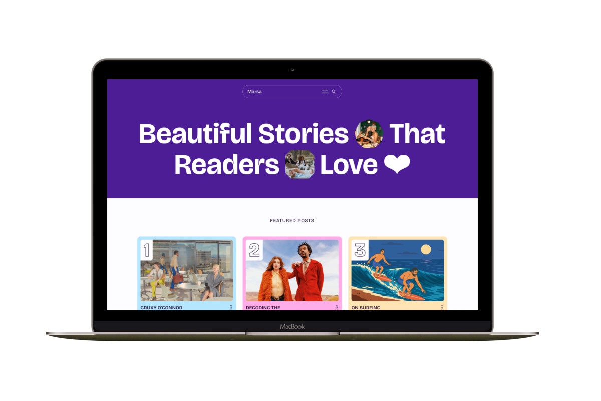
Marsa
A flexible publication homepage for featured stories, topics, and newsletters.
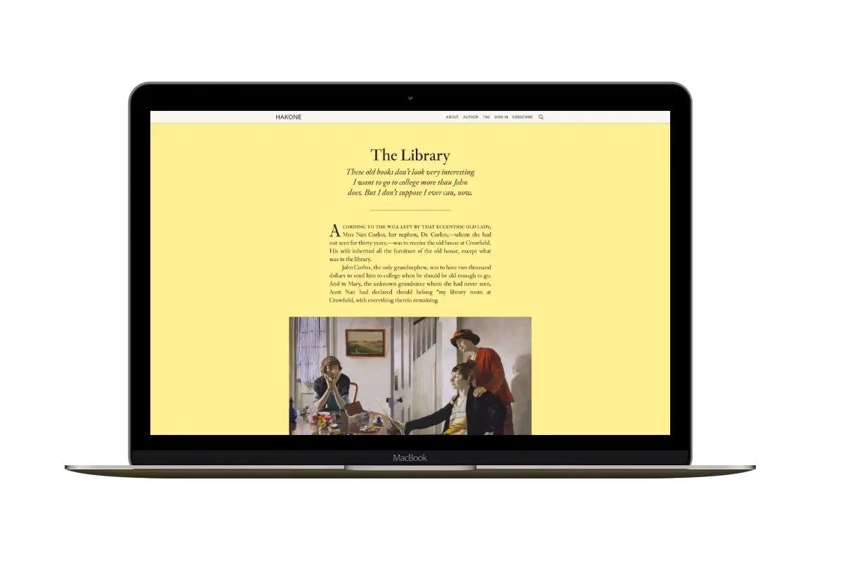
Hakone
For writers who want readers to browse complete posts on the homepage.