Designing Siwa: From First Visit to Newsletter
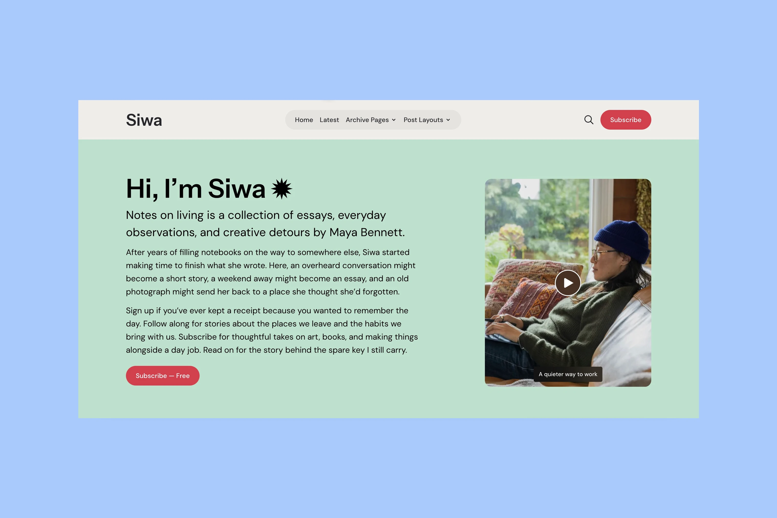
Before you reach the stories on the Siwa demo, you meet the publication. A large introduction sits beside a portrait video, with enough room for a few paragraphs and a direct invitation to subscribe. Below it, selected stories lead into the latest writing. Farther down, the newsletter has its own introduction and choices.
A personal publication needs room to introduce its writer, but visitors may arrive ready to read or subscribe. Siwa gives the introduction space while keeping those other routes visible. The same balance continues through its story layouts and newsletter section.
Siwa is a Ghost theme I make at Aspire Themes. The examples here use its sample publication, rather than a customer site.
The Introduction
The homepage opens with words before it opens with a collection of posts. The heading, short introduction and longer body have distinct roles: identify the publication, explain what it offers, and give the writer space to say more.
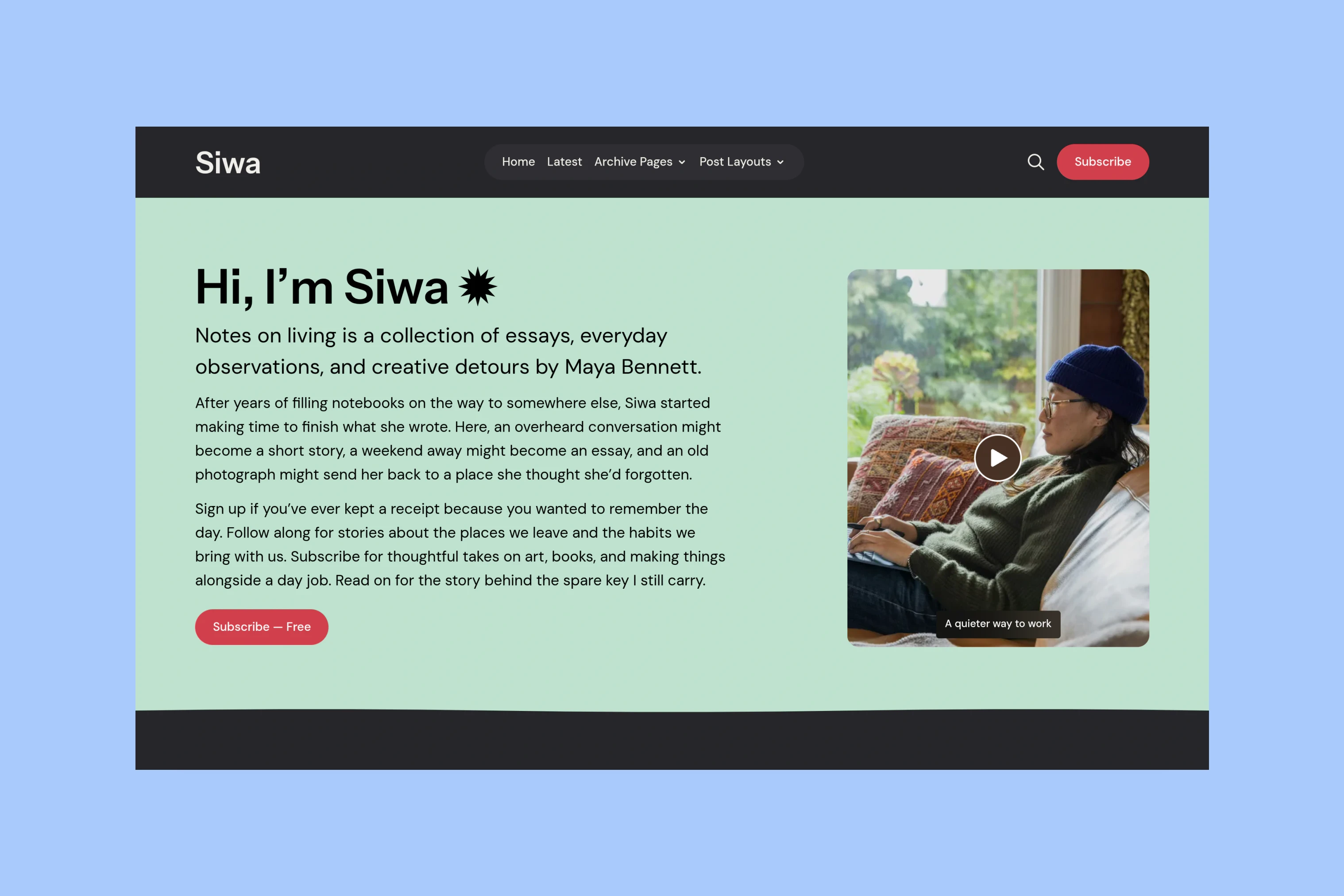
The media column is narrower than the text column. A portrait can accompany the writing without pushing it into a small caption. On a smaller screen, the columns stack; with no image or supported introduction video, the text takes a single column.
This flexibility also shapes how the section is edited. Its content comes from a Ghost page, so the publisher can use the editor for paragraphs, links and buttons. The introduction can grow or become shorter as the publication changes. It is not limited to a fixed sentence in a theme setting.
Video uses the same space as the portrait. A Play control opens it with sound in a lightbox, a viewer over the page, leaving the visitor to choose when to watch. The introduction can establish a voice in writing or let the visitor hear it, while preserving the same overall composition.
Reader Quotes
The introduction tells visitors what the publication offers. Reader quotes can add another perspective before the stories begin. Siwa places them between the introduction and Featured, where the publisher’s words give way to someone else’s account of reading the work.
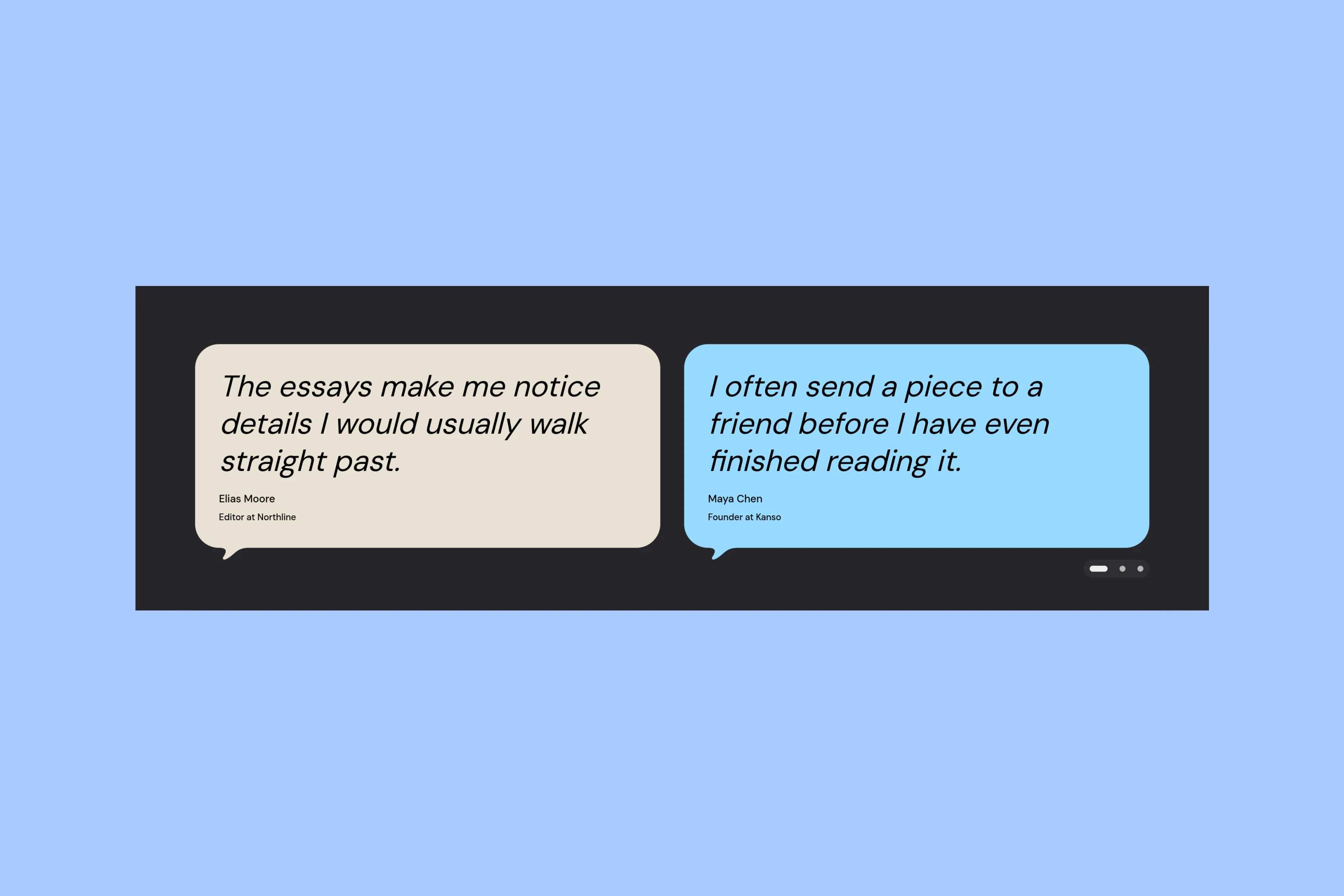
The rounded cards have a small speech-bubble tail, making a quote visually different from a story card. Each carries its own attribution and optional role. These are sample endorsements in the demo; a publisher would supply their own reader quotes.
Longer quotes remain readable without a fixed-height text box. Publishers without reader quotes can leave the section out and move directly to Featured.
Featured and Latest
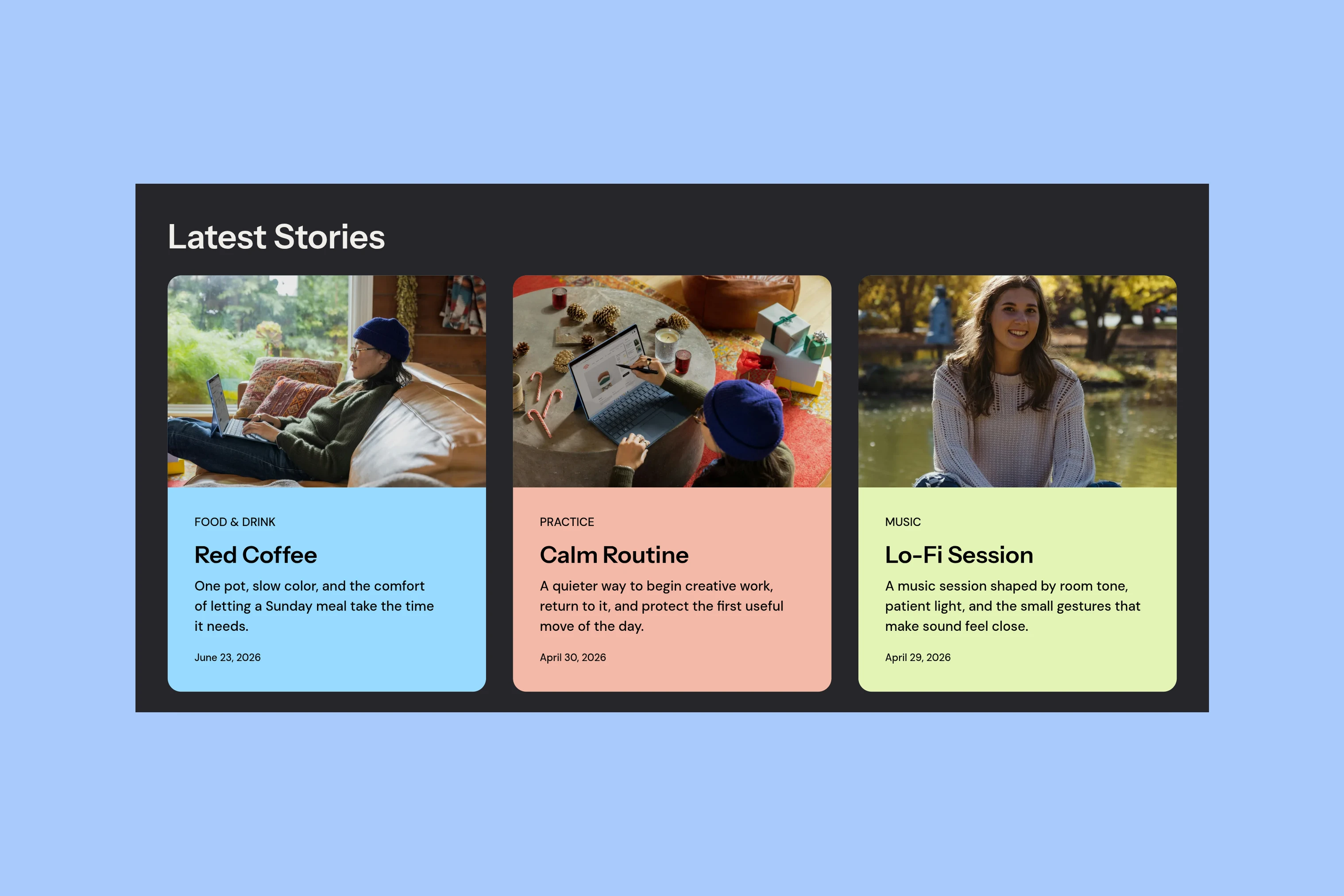
Once the introduction has established the publication, the next question is which story to open. Featured gives selected posts more space than the latest grid: a large image or video sits beside the title and excerpt, with text and media alternating sides across the cards.
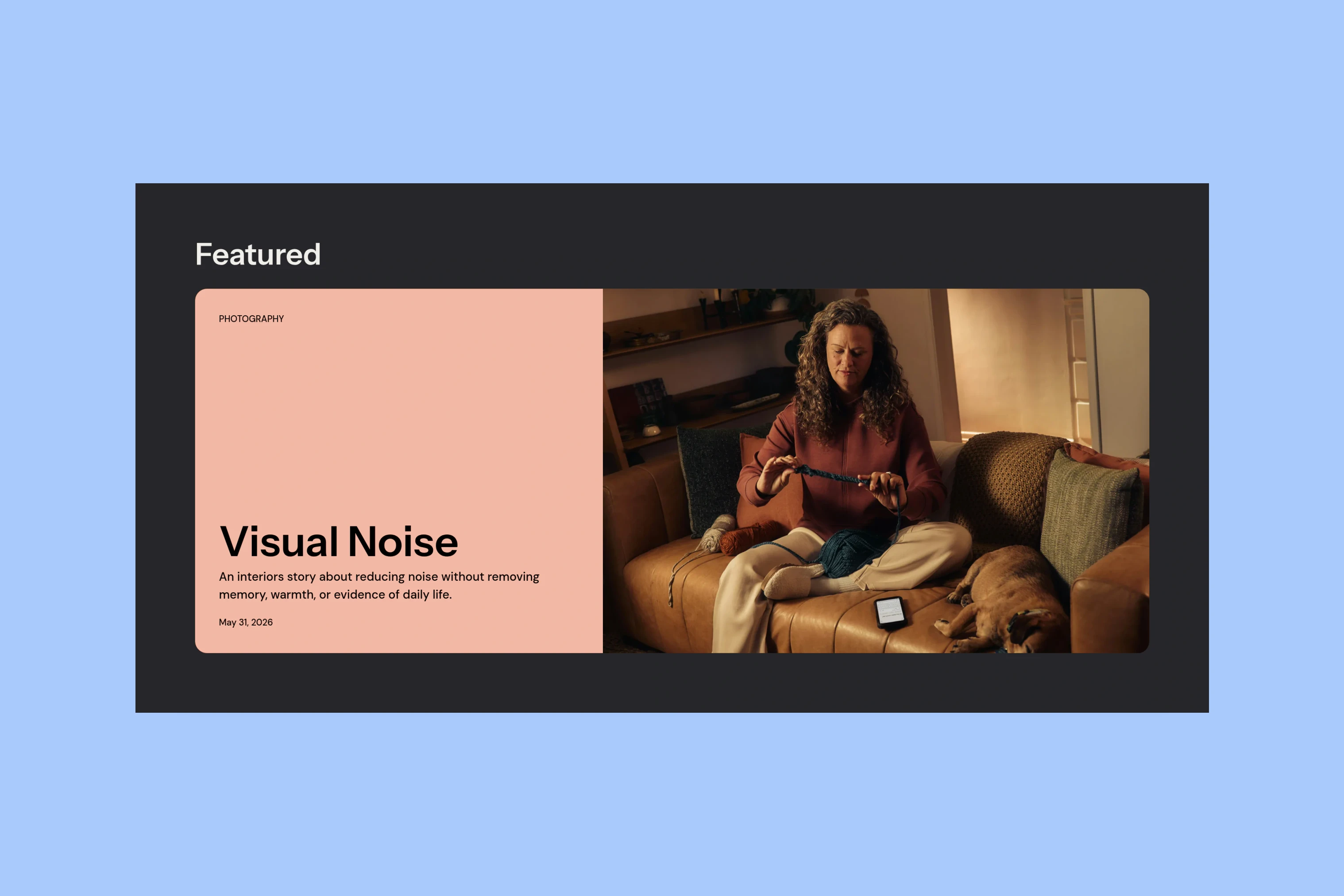
That difference in scale separates an editorial selection from a chronological feed. Featured holds up to three posts marked Featured in Ghost. The latest stories follow, excluding those selections so the homepage does not immediately repeat them.
The composition changes with the content. A Featured story without an image or supported video becomes a full-width text card. The selected story keeps its place in the sequence on smaller screens.
Navigation Previews
A small homepage selection cannot show everything a publication contains. Navigation gives readers a route to the rest, and its desktop previews add a glimpse of the destination before they leave the page.
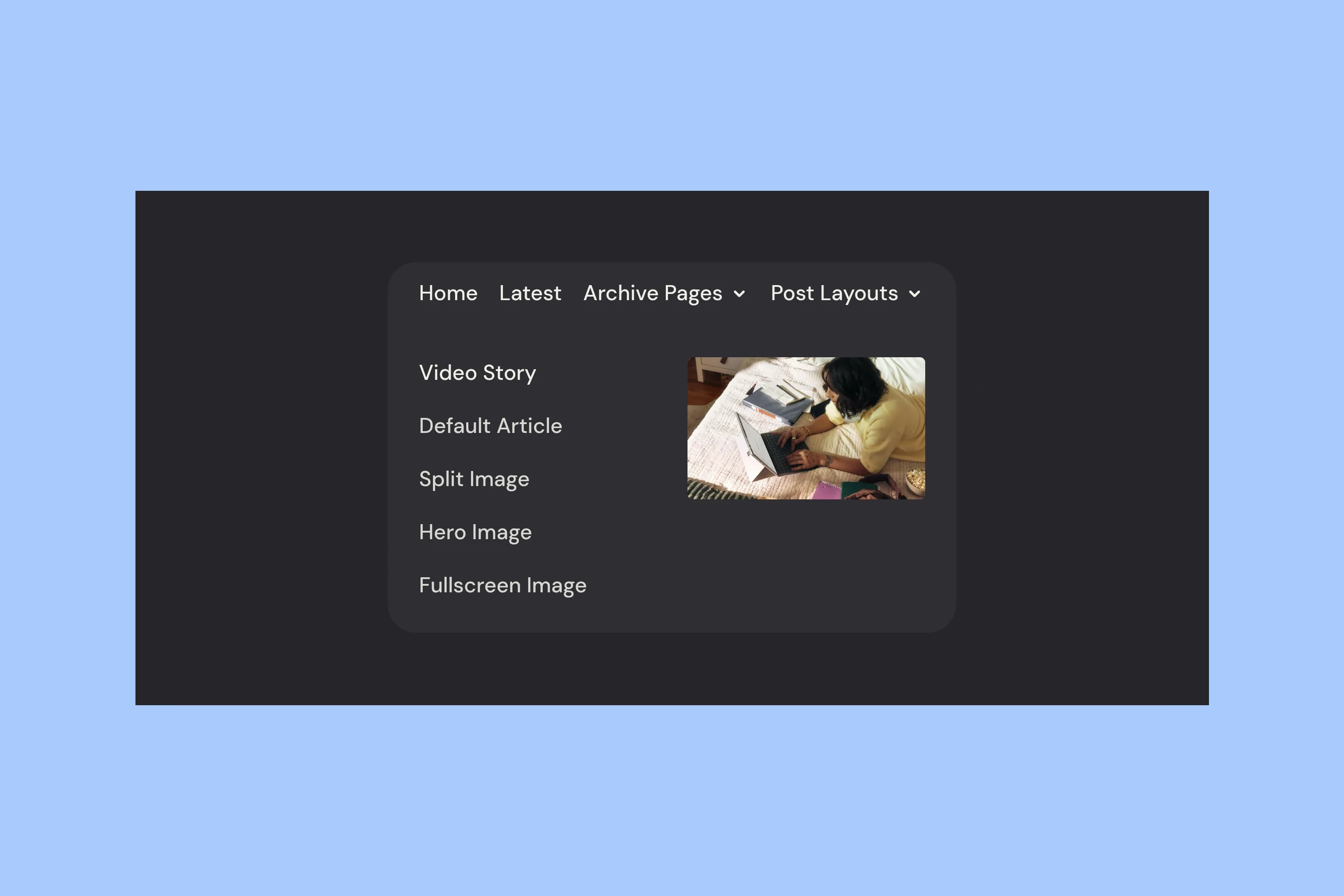
The image sits beside the links inside the same panel. A reader can move through the titles and see the associated media without opening each page. For supported video stories, that slot can show muted movement.
The menu remains a list of usable links. A missing image, an external destination or unavailable preview data does not prevent navigation. On mobile, a drawer keeps the grouped links without the preview panel.
The Archive
A preview helps when the reader is deciding what looks interesting. Finding a particular older piece calls for another view. Siwa’s Archive keeps titles and dates together in a compact list, giving the words more weight than the photographs.
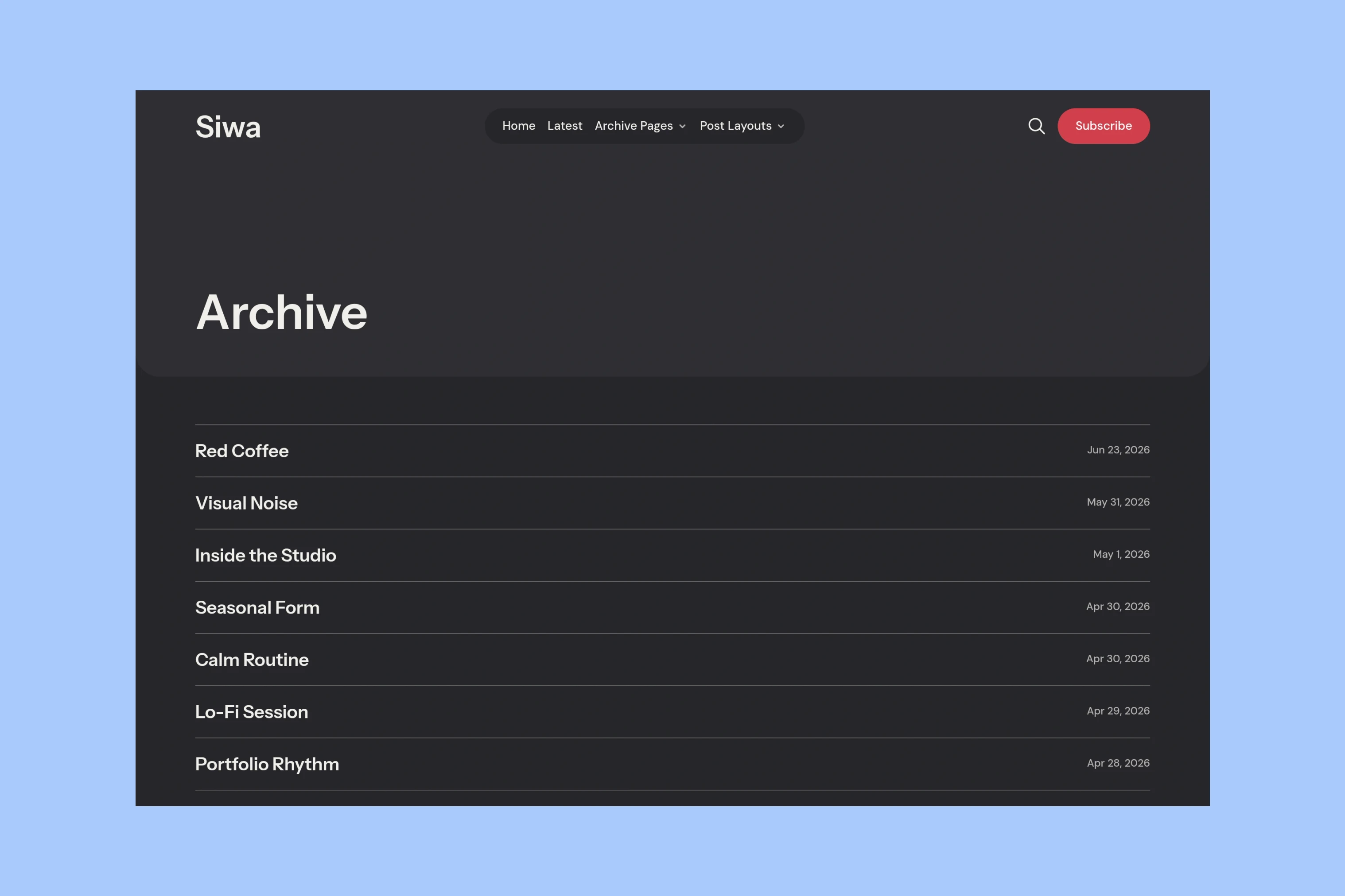
This gives a returning reader a way to scan for a title they remember. On devices with hover support, or when a row receives keyboard focus, an available feature image can appear beside it. A story without an image still has a complete title and date; pictures help recognition without becoming a requirement for the list.
Latest offers the more visual alternative, while tag and author pages let readers follow a subject or a person. These views lead to the same stories through different clues.
Article Openings
Finding a story leads to another design decision: what should the reader encounter first? A title, a photograph or a video can each provide the opening, and they ask for different arrangements.
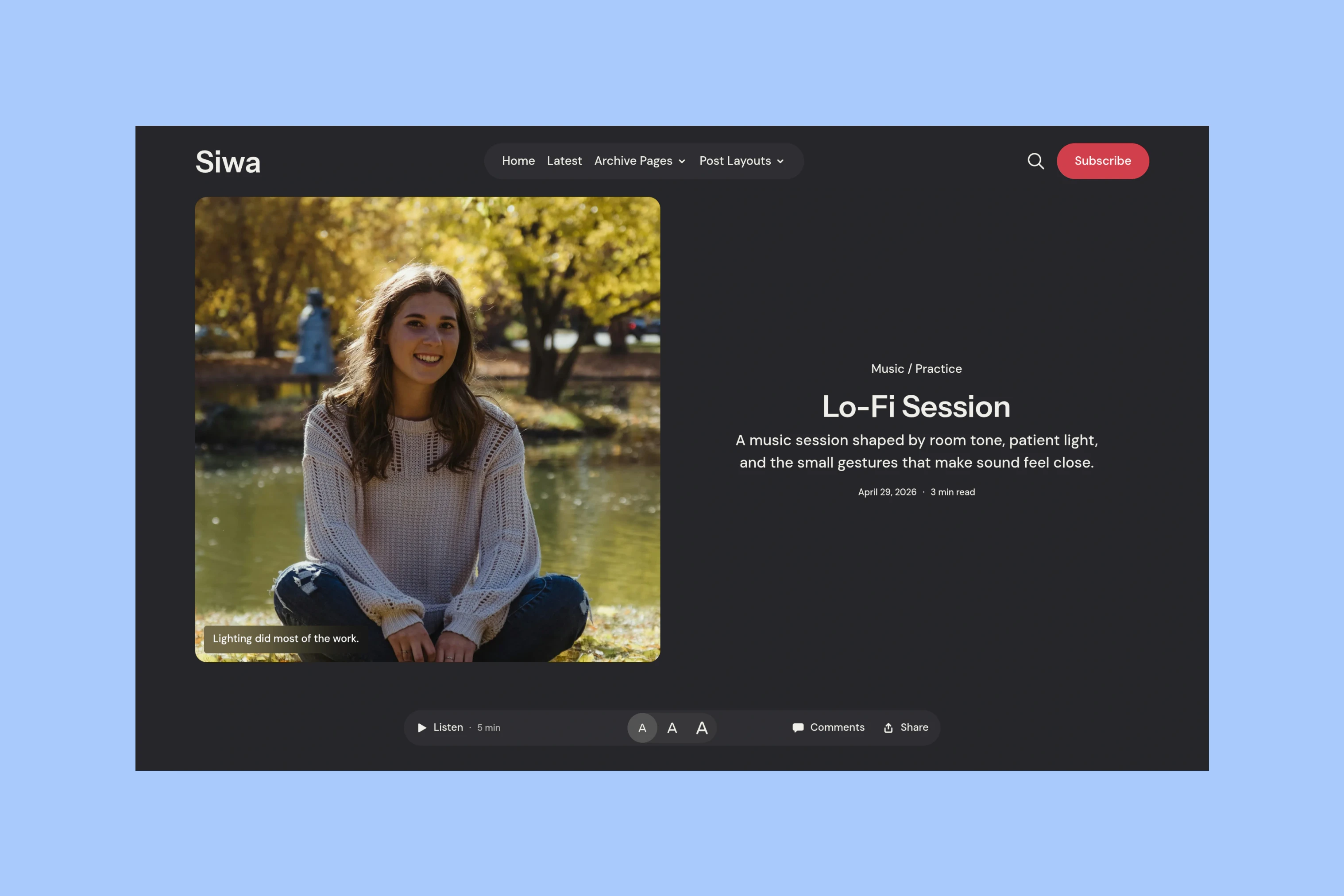
Siwa’s Default layout centers the article opening. Hero places the title over the image, Fullscreen gives the cover more of the first screen, and Split puts the photograph beside the title and introduction. Post Video reserves the opening media area for playback.
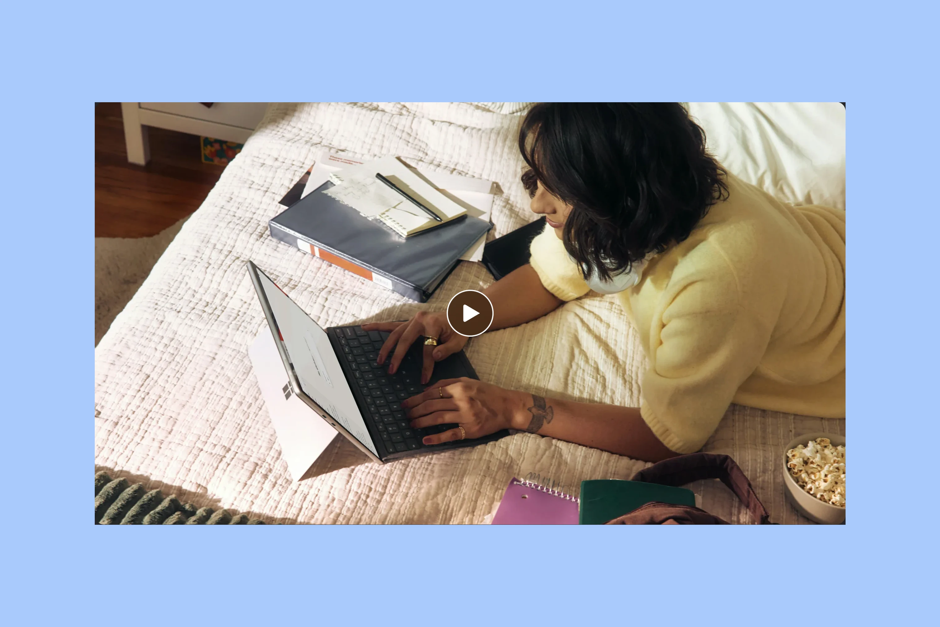
Native Ghost video, YouTube and Vimeo can appear in the introduction, story cards, navigation previews and video articles. A publisher selects Post Video when the first supported video in the content should become the primary media. Video can also remain within an ordinary article when it belongs later in the piece.
There is a distinction between a glimpse and a viewing session. Eligible card and navigation previews stay muted; primary playback begins with an explicit Play action. Reduced-motion preferences keep previews static. Movement can help a reader recognize a story without requiring every visitor to watch it.
Reading Tools
Siwa puts text size and Listen beside comments and sharing in the article’s action bar. Readers can adjust the text or listen while staying on the story.
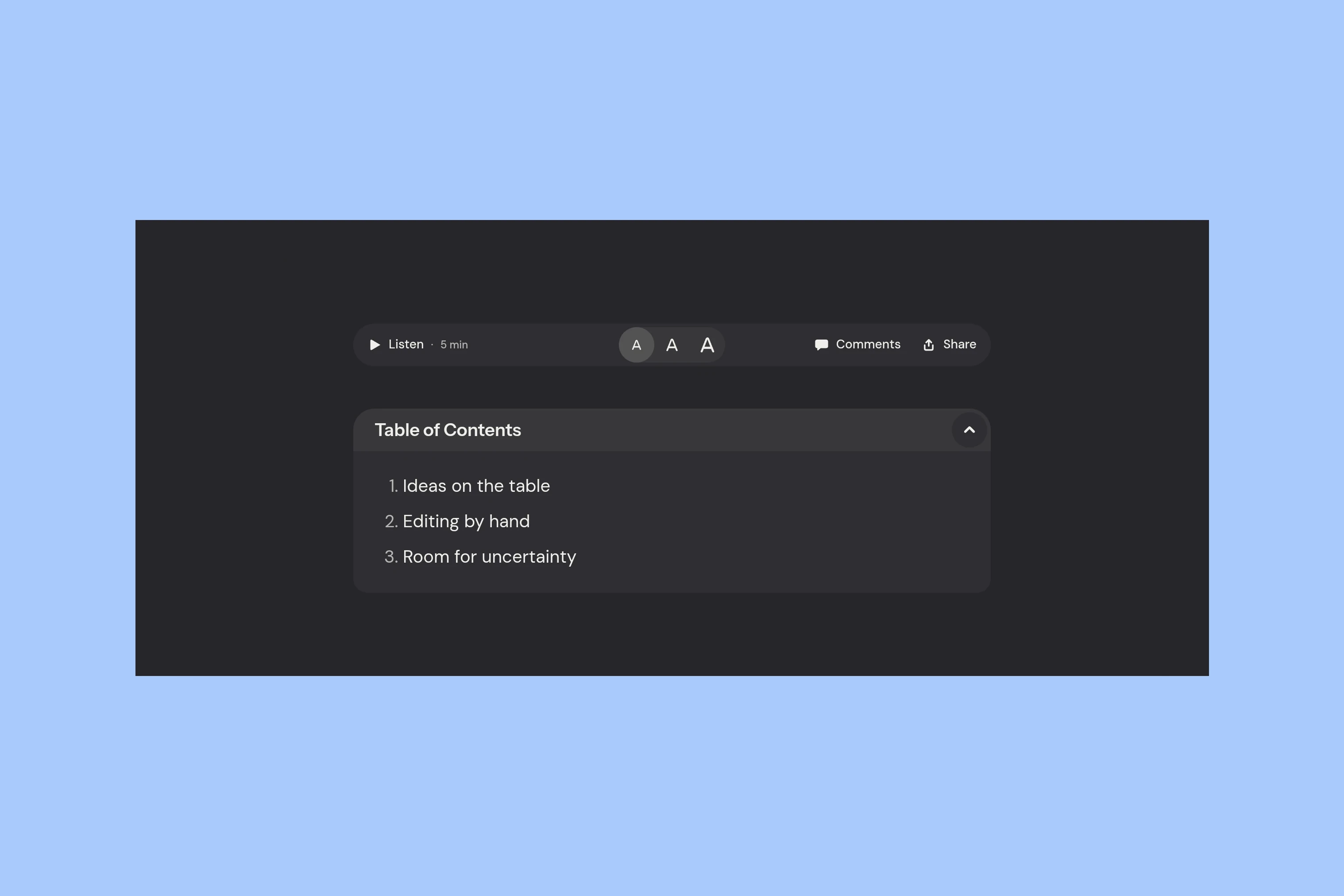
A reader can enlarge the text, and the browser remembers their choice. For a longer article, the table of contents offers a route back to a particular section. It appears only when there are headings to navigate.
Listen uses the browser’s text-to-speech support to read the story aloud. Its voice depends on the browser and device, and the control is removed when native speech is unavailable. This is a reading option, rather than a recorded audio edition supplied by the publisher.
The same approach extends to photographs and conversation. Unlinked images and galleries open in a fullscreen viewer; linked images keep their destinations. Available comments open beside the article in a side panel. A reader can look closer or respond while keeping their place in the story.
Page and Story Colors
These different openings still need to feel like parts of one site. Siwa separates the overall page palette from the surfaces used for individual stories and sections.
The examples below keep the same stories and layout while changing the page palette: light Cloud Dancer, olive Kombu Green and burgundy Port Royale. That makes the two layers of color visible.
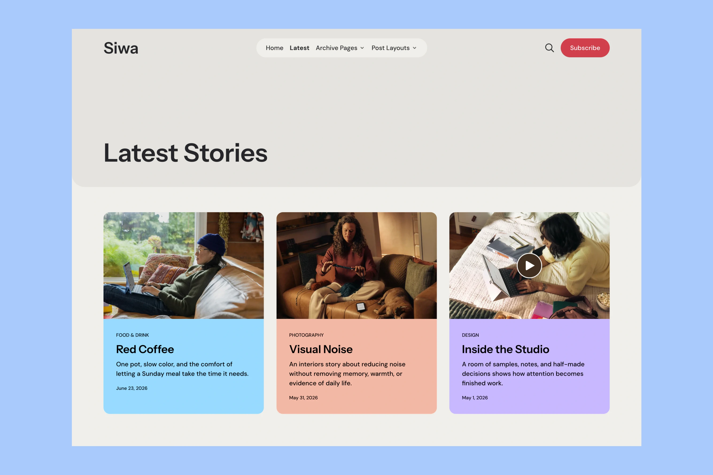
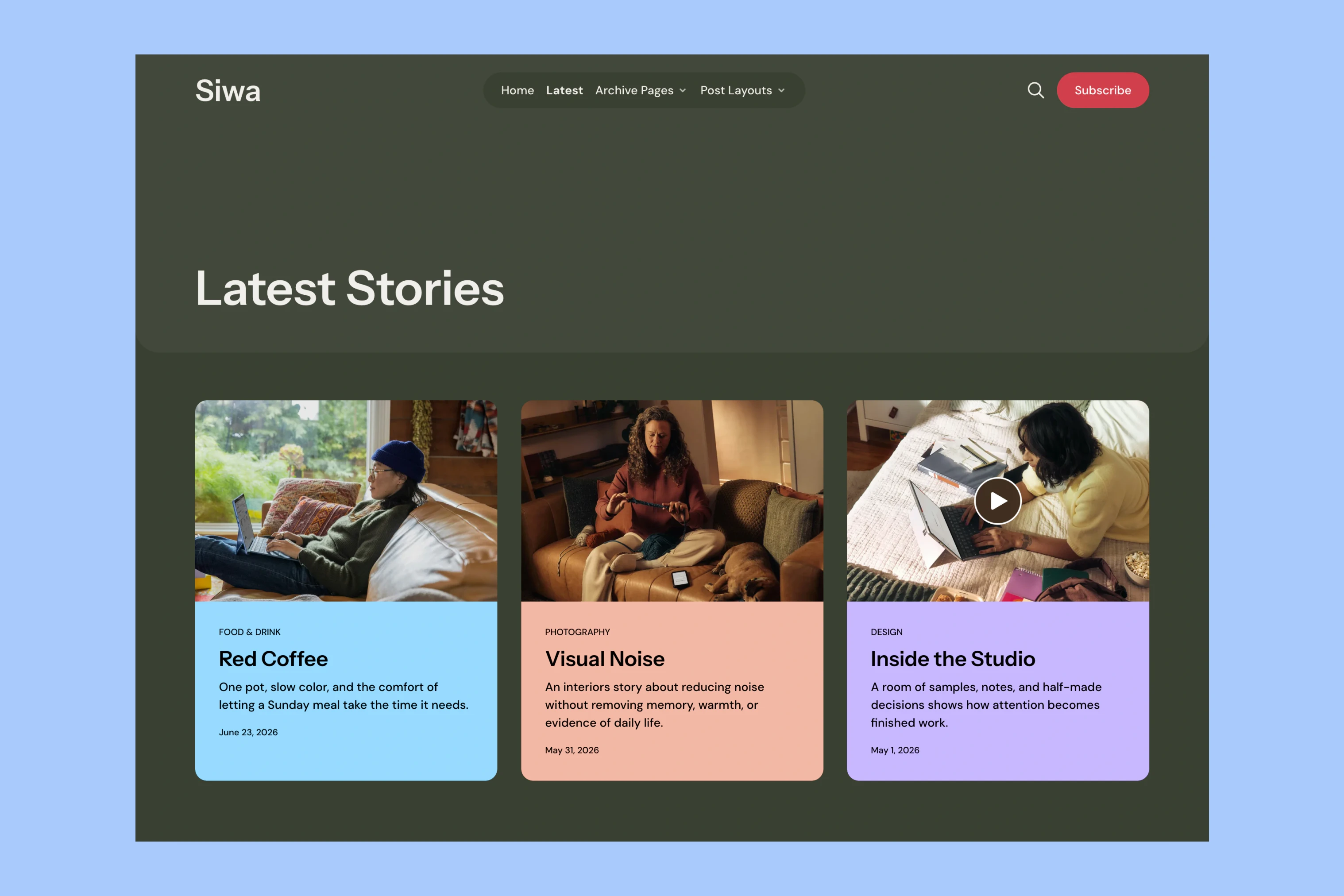
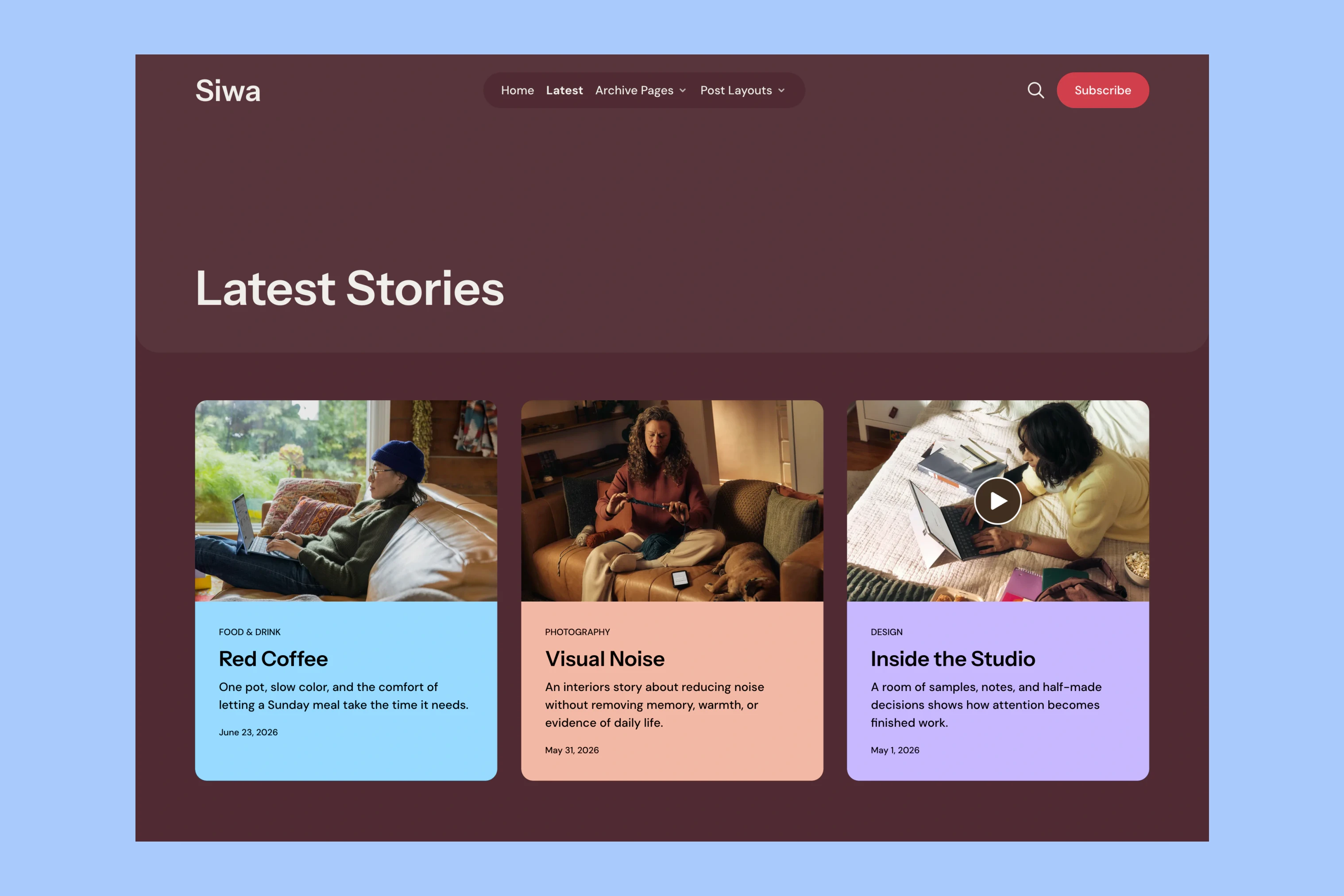
The surrounding page changes while the colored story cards remain recognizable. Publishers can give a story or section its own background, with a contrasting text color. The introduction, reader quotes and newsletter use that same approach.
A mint introduction and a peach Featured card can share a dark site without every element taking on the same accent.
Smaller surfaces also follow the page palette, so a panel does not carry a fixed light background into a dark scheme. The Siwa color guide covers the available palettes and custom settings.
The Newsletter Invitation
The newsletter section has room to explain what readers will receive before asking them to subscribe.
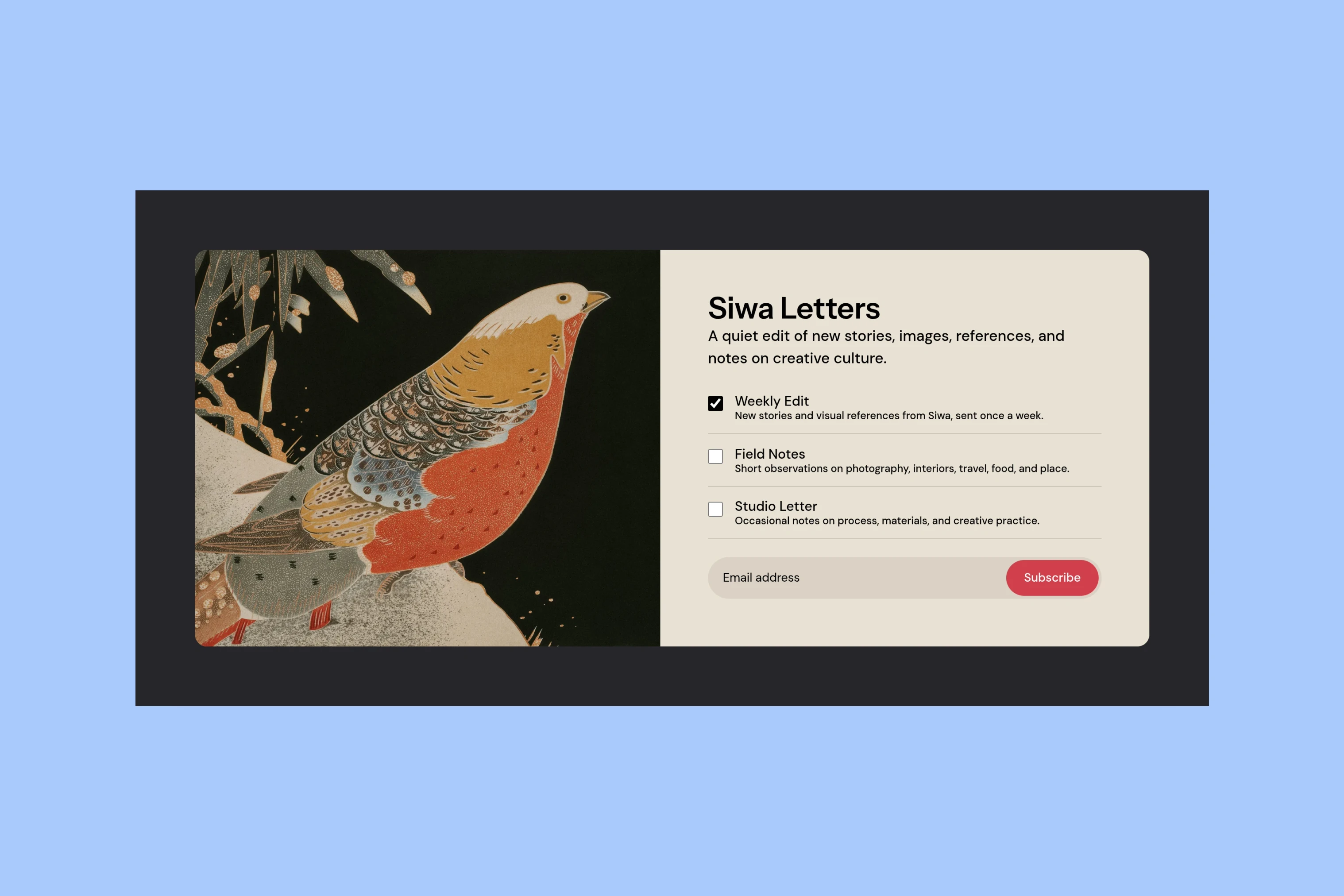
Its title, description and optional image come from a Ghost page. The choices come from the publication’s actual Ghost newsletters. Each can have a description, so a visitor can distinguish a weekly collection from occasional notes before selecting what to receive. The sample publication shows several choices; a publisher can configure their own offer.
The optional image accompanies the description; without it, the copy and form use a centered column. Publishers can explain the newsletter without supplying artwork.
This is one shared section across the homepage, archives and article layouts. A Split article and a video article can have different openings and arrive at the same newsletter presentation. Signed-in members do not see the repeated signup section. For signed-out visitors, it appears when Ghost Members is enabled and the newsletter page exists. The Siwa setup guide covers those requirements.
The theme shapes this invitation on the website; Ghost’s newsletter settings shape the email itself.
Siwa leaves a subscription link in the header for visitors who are already ready. The larger invitation remains available farther down, with room to explain each newsletter.
More from the Blog
Latest Ghost Themes
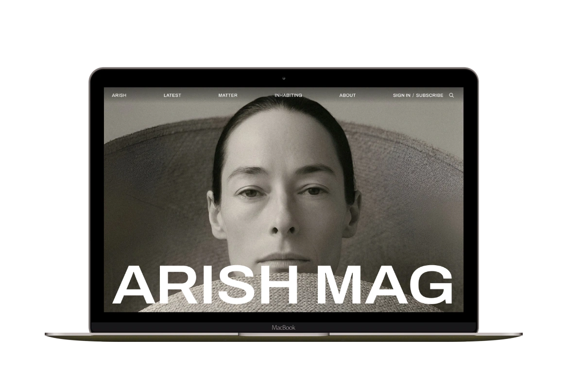
Arish
For visual magazines that lead with photography, film, and selected stories.
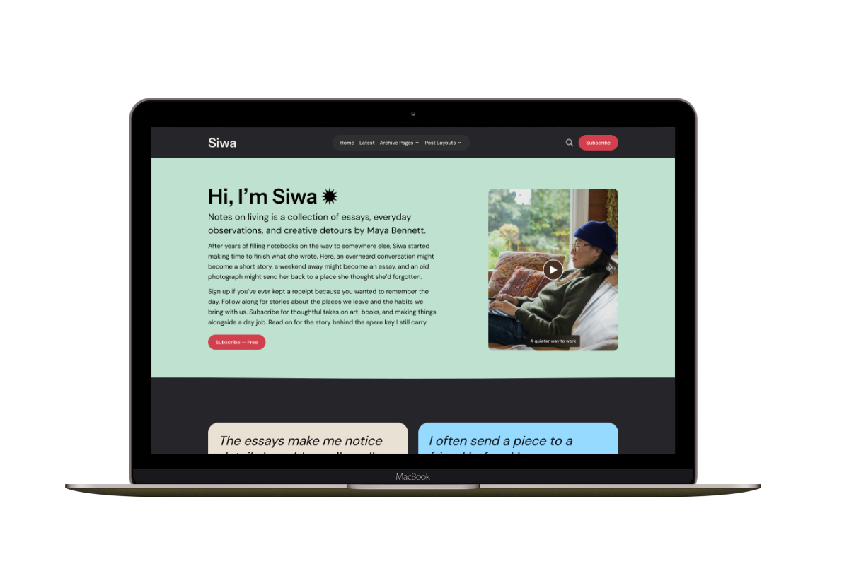
Siwa
A personal publication that introduces the writer before inviting readers into the stories.
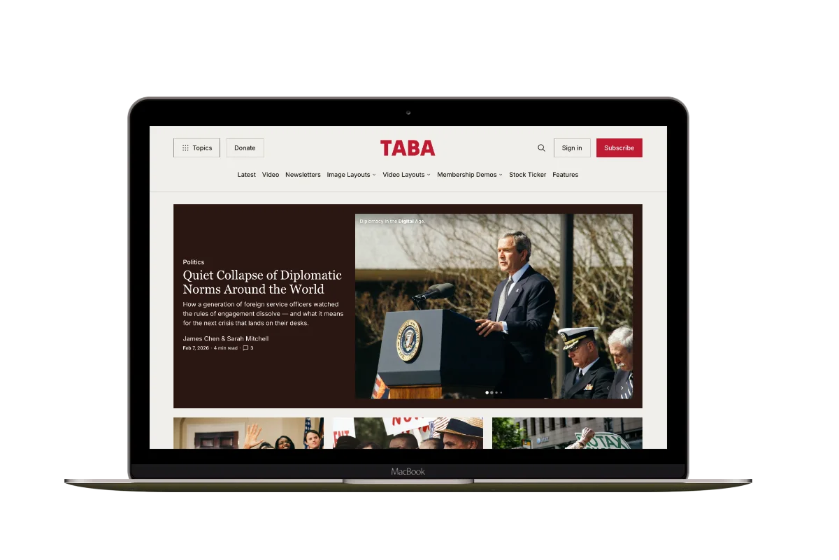
Hanoi
An image-led magazine for creative stories, rich navigation, and long-form reading.
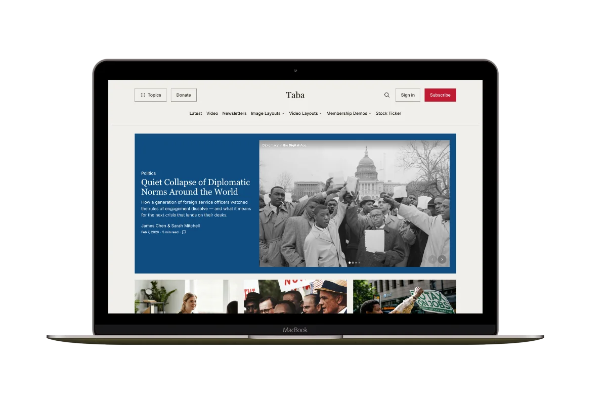
Taba
A newsroom front page for coverage across topics, video, and story formats.
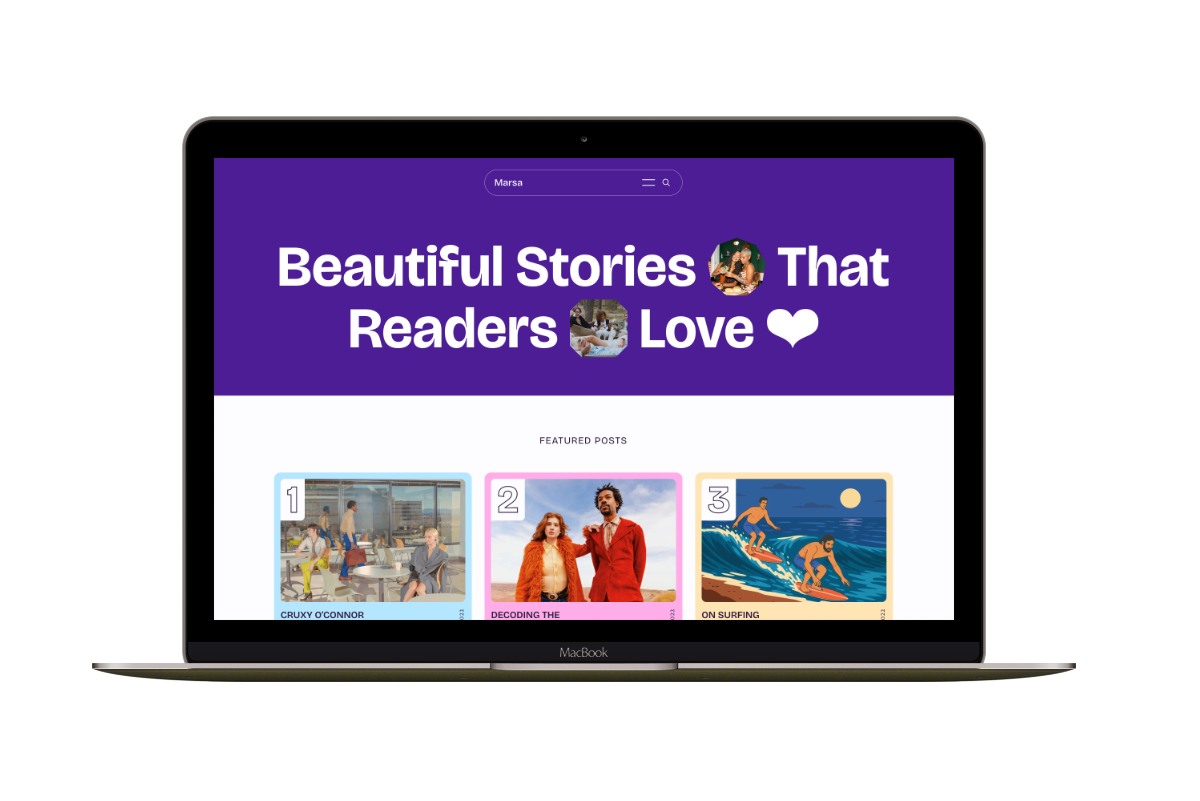
Marsa
A flexible publication homepage for featured stories, topics, and newsletters.
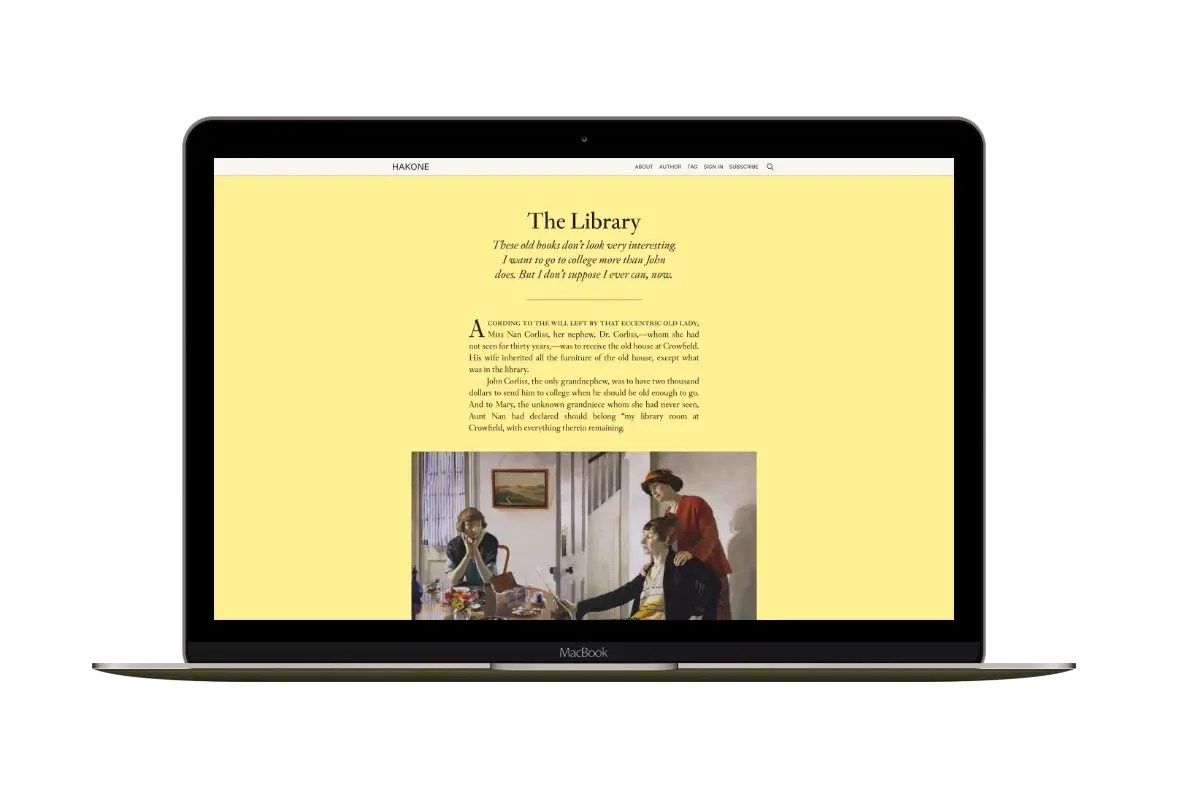
Hakone
For writers who want readers to browse complete posts on the homepage.