Siwa vs Ubud: Choosing a Ghost Theme for Your Writing
A writer’s website has two jobs: introduce the person behind the work and give visitors something worth reading. The balance depends on how readers find you. Someone following your name may want a short introduction. Someone arriving through an article needs a comfortable reading page and a way to find more of your work.
Siwa and Ubud both suit a personal Ghost publication. I make both themes at Aspire Themes, but they take different approaches: Siwa adds expressive story layouts and reading tools, while Ubud offers six arrangements for a personal homepage and a consistent article layout.
The Homepage Introduction
Before comparing the demos, decide what a new visitor needs to know about you. A portrait and a short description may be enough. If your work depends on a more personal introduction, a video or a longer passage may earn that space. In either case, readers should be able to reach a selected story without working through your whole biography.
Siwa’s Introduction
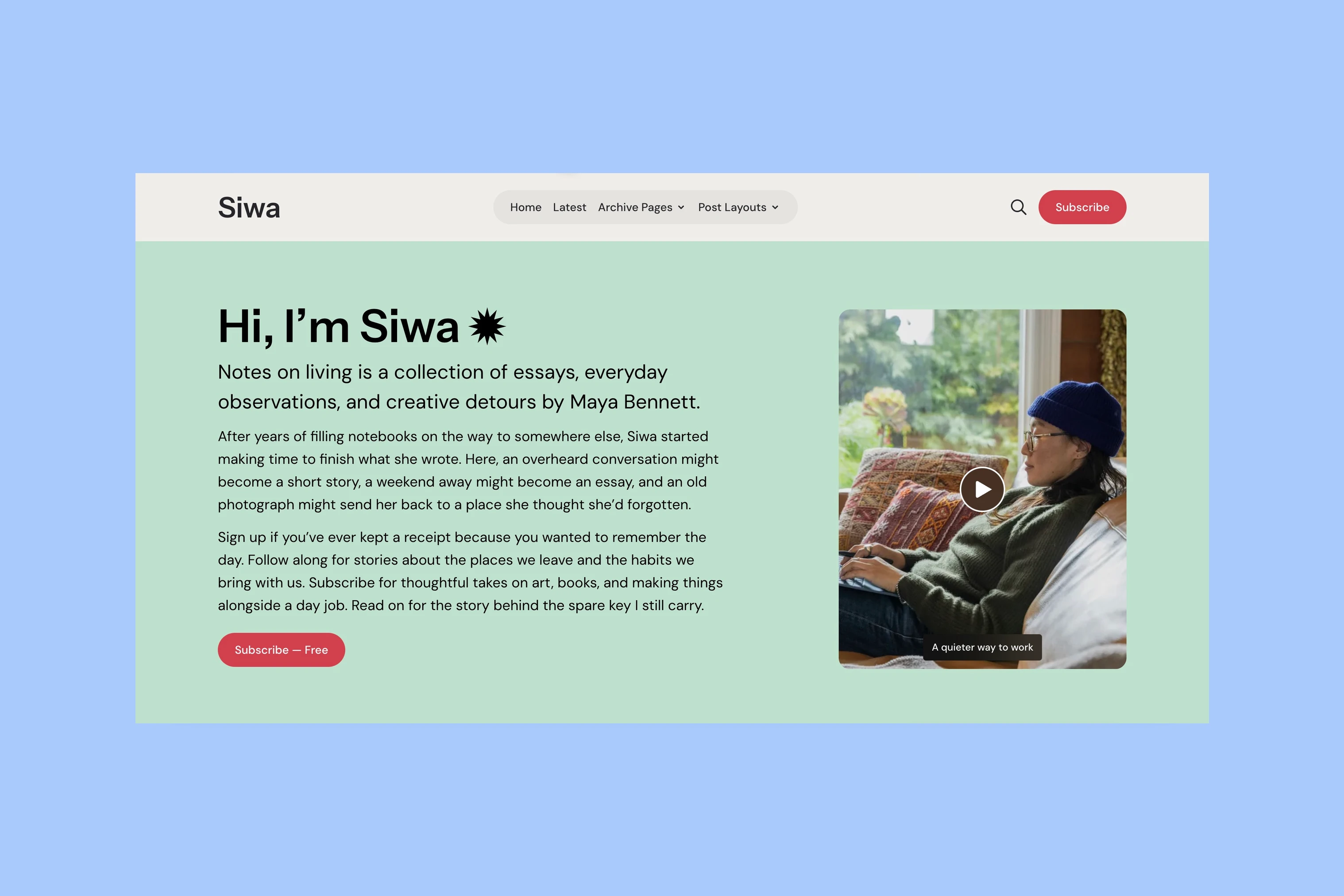
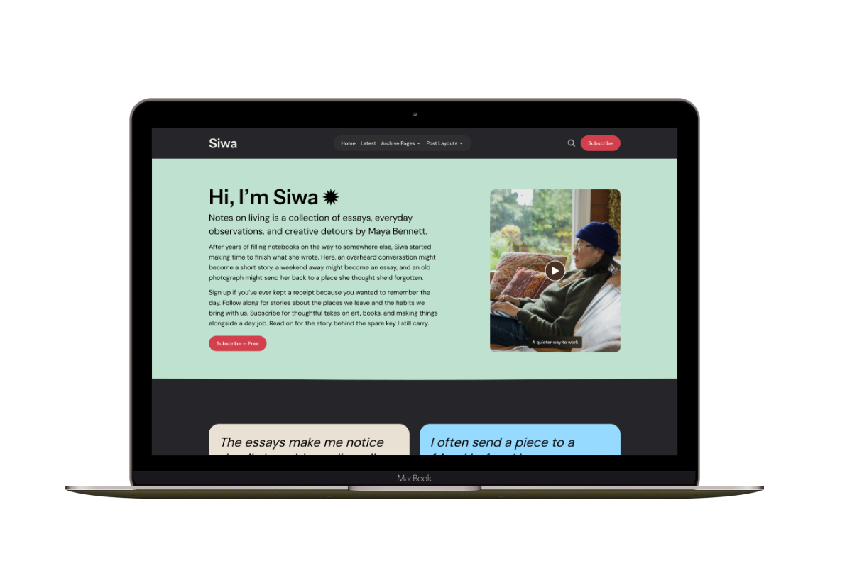
Siwa places the introduction in its own section above featured and recent stories. You can use a portrait or introduce yourself with a video that opens in a lightbox, a viewer over the page. That gives a writer who also speaks, teaches, or records a way to introduce their work in the same medium.
Its featured cards can have individual colors and use images or video. They can help selected pieces stand apart, but the choices need a purpose: a few essays you want new readers to start with, rather than a different treatment for every post. Optional testimonials and a newsletter section give you further ways to explain the publication.
Ubud’s Homepage Styles
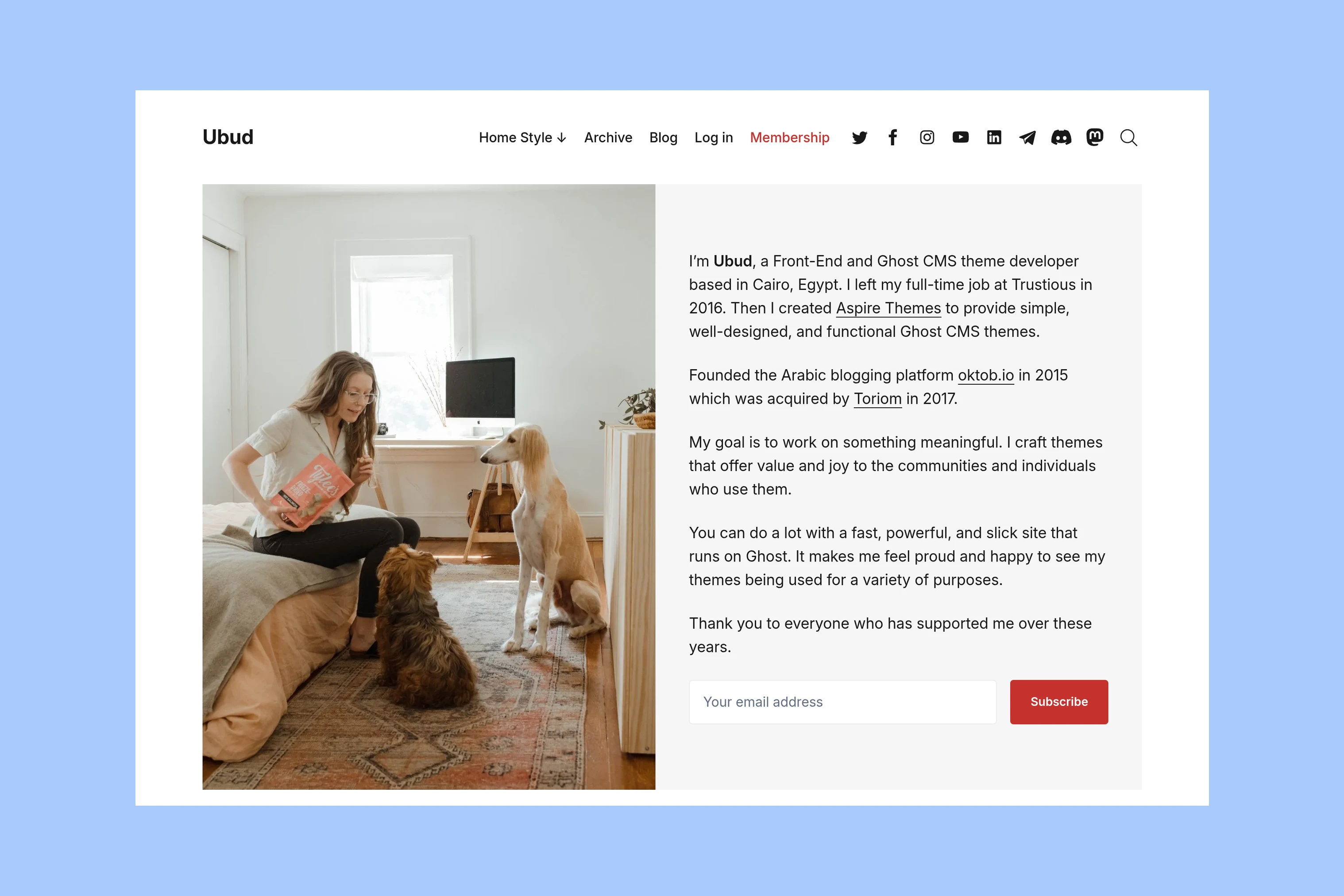
Ubud gives you six homepage styles. The default places an image beside the introduction; other styles move it to the right, use a circle, center it, or give it a wider treatment. These are alternatives for the same introduction, not six different publishing systems.
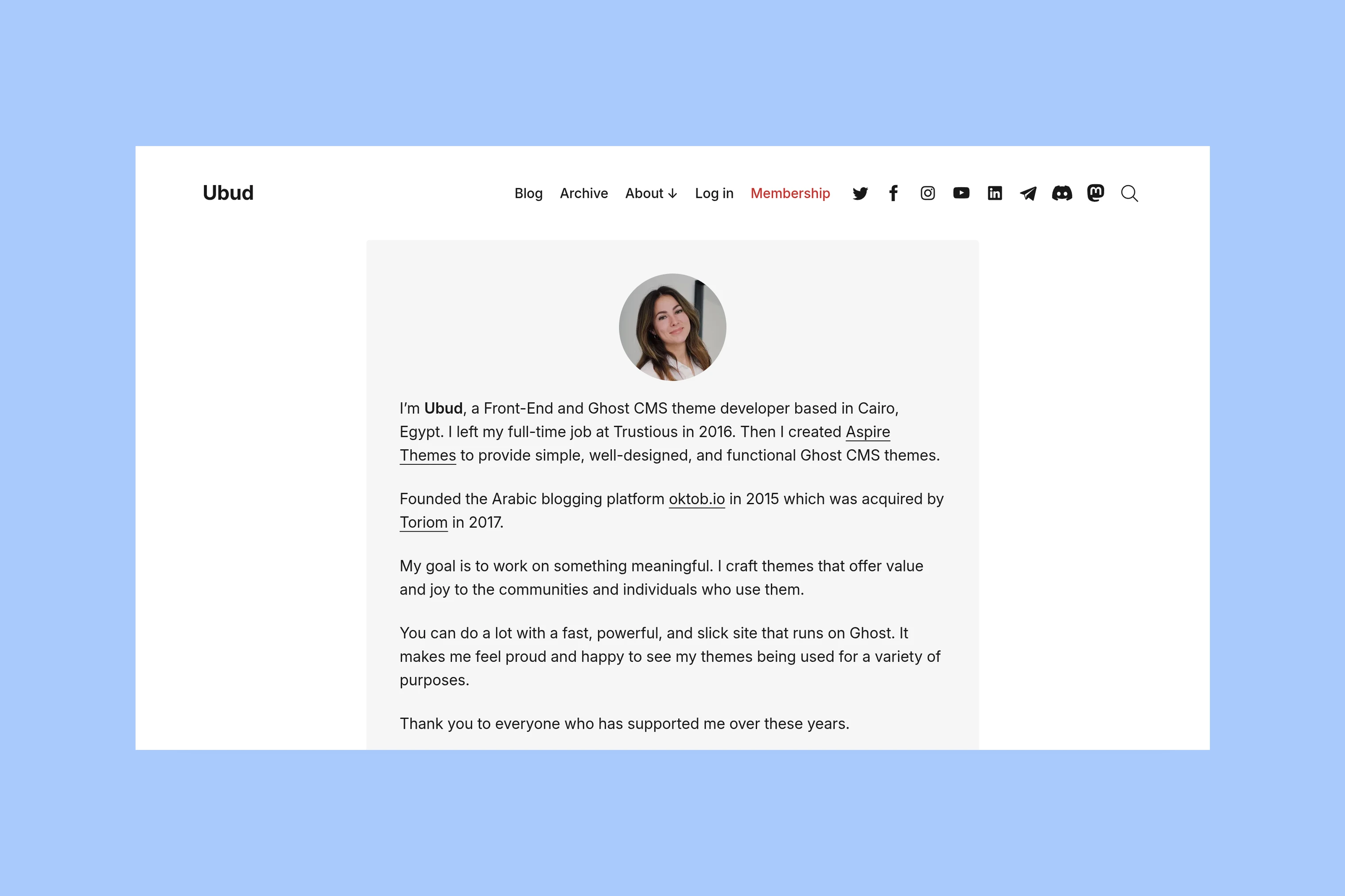
Choose a side-by-side style if the photograph and writing deserve similar attention. The circle style gives more room to the text. Featured and recent writing follow the introduction in either case. Ubud suits a writer who wants to settle on one arrangement and keep the rest of the website visually consistent.
These examples use demo content; the Siwa screenshots use its Cloud Dancer palette. Compare the space your own introduction would occupy, rather than choosing from the demo’s photograph or color palette alone.
Article Layouts
Once someone opens an essay, the introduction has done its job. The article layout now needs to fit the writing. Start with a standard written post in each theme before comparing Siwa’s additional layouts.
Siwa’s Layouts and Tools
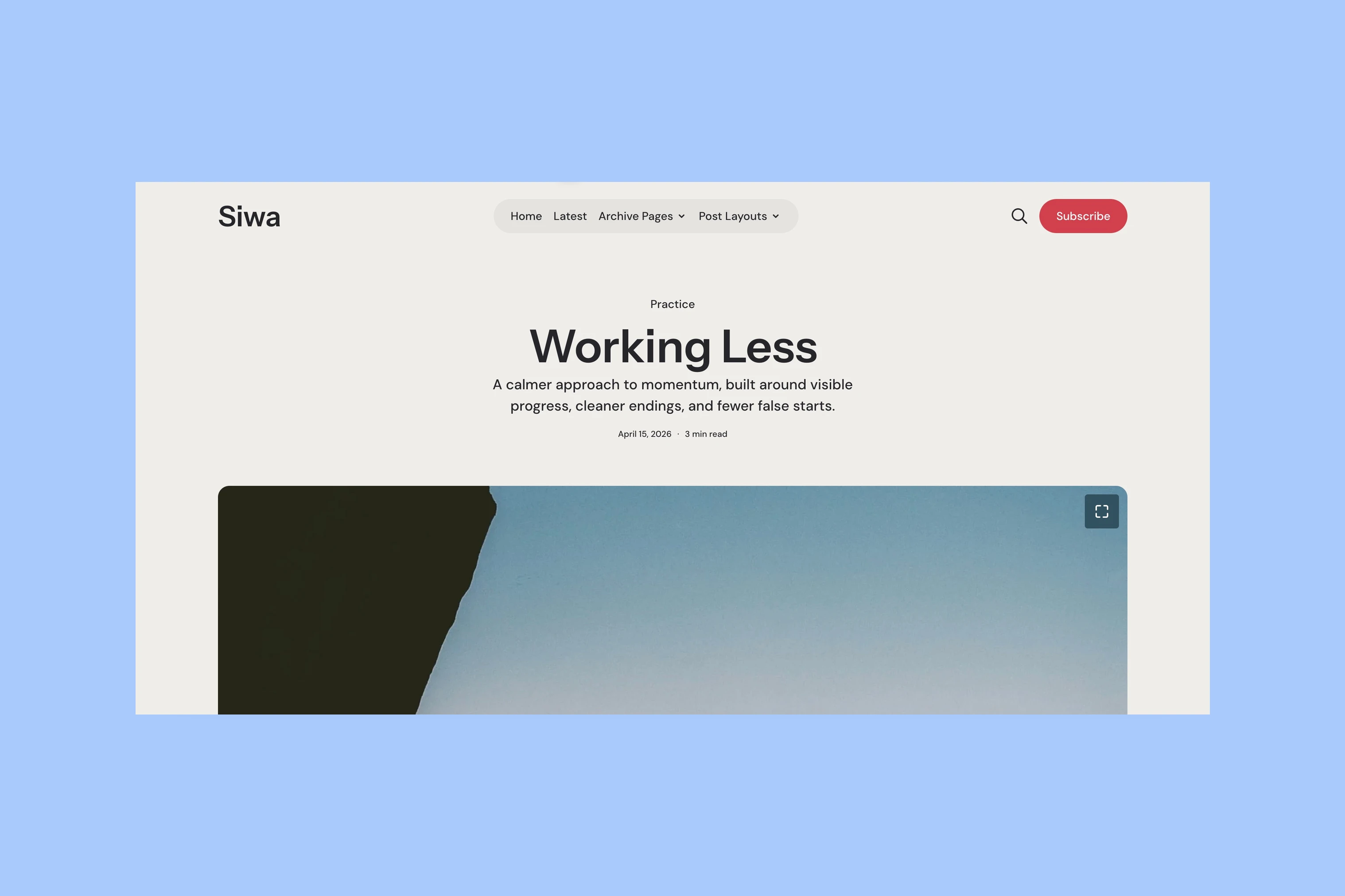
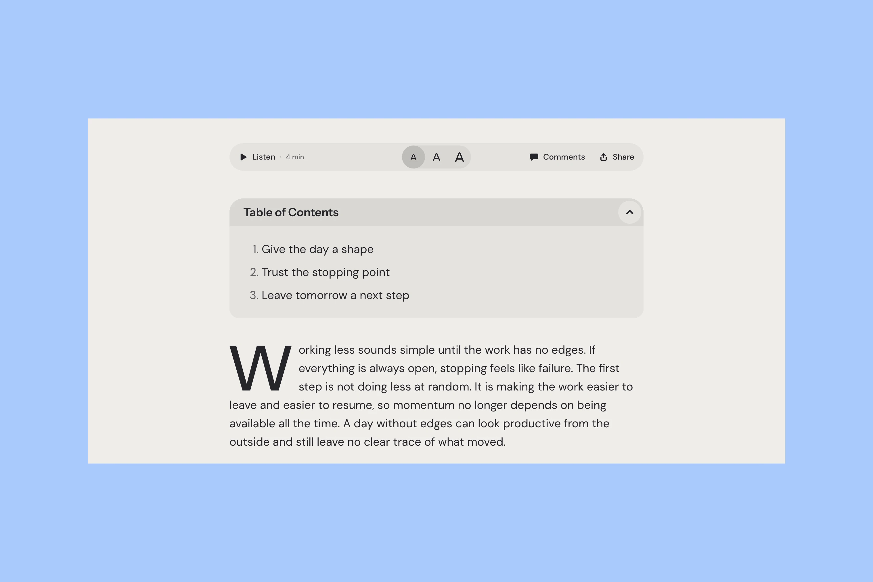
Siwa has five post layouts, including a default written article and layouts with a hero image, a fullscreen opening, a split opening, or video. A writer publishing visual essays alongside ordinary text can choose a presentation for each piece without changing themes.
It also offers controls for listening to an article, changing text size, commenting, and sharing. Those tools are a reason to choose Siwa if you want them in the reading experience. They are separate from putting an audio or video card inside a Ghost post, which both themes can display.
Ubud’s Reading Column
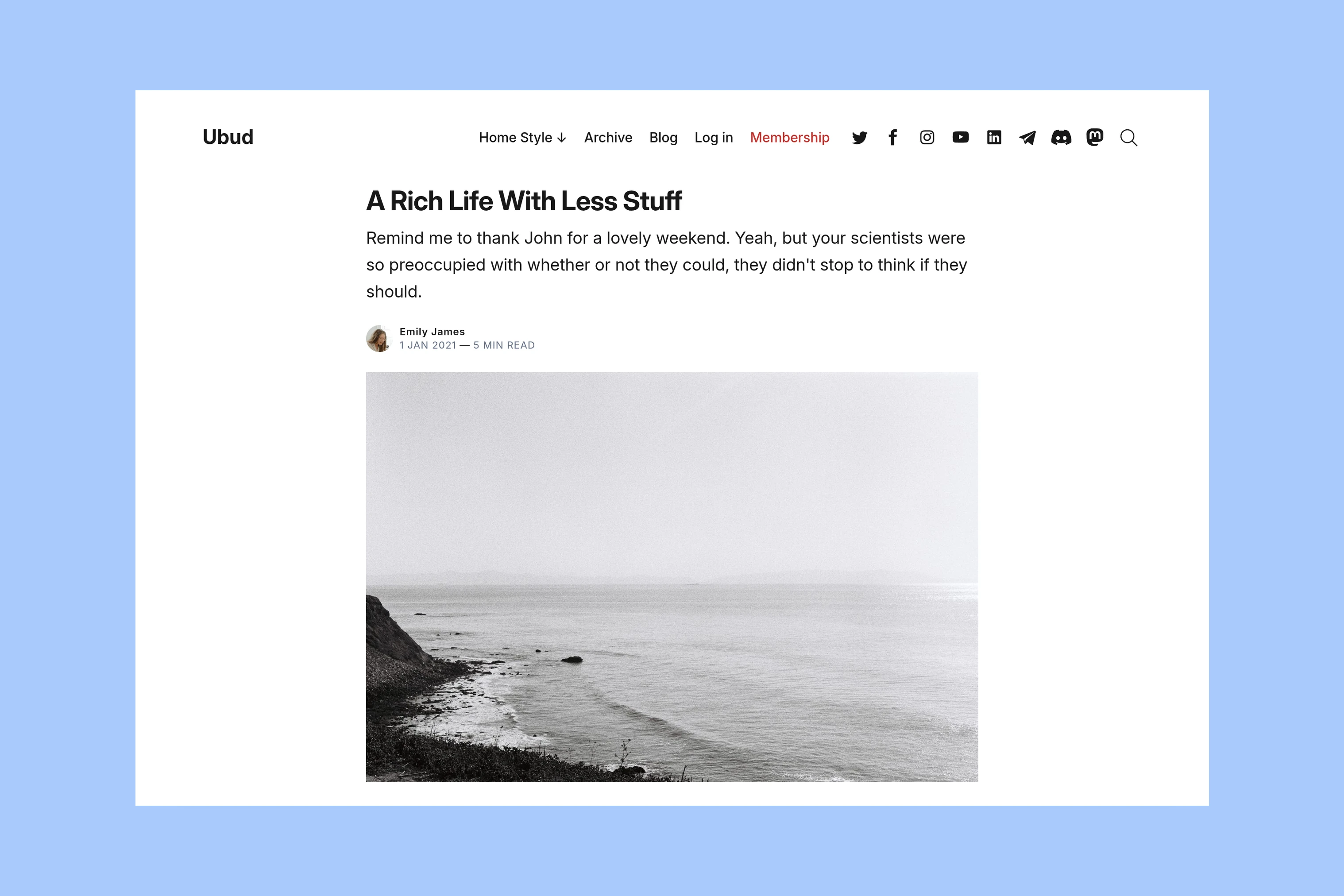
Ubud uses one article layout. Its opening keeps the title, excerpt, author, and image together in a narrower column. If most of your work is written essays, that consistency may suit you. Siwa can also keep using its default layout; its other openings are optional.
Both themes support Ghost’s editor cards, memberships, and posts without feature images. Those shared capabilities do not settle the comparison. The difference is how much variation and how many reading controls you want around the writing.
Read several paragraphs in each demo on your phone too. Pay attention to the line length, headings, captions, and the transition to another article. A dramatic opening image cannot tell you whether you enjoy reading the page.
Older Writing
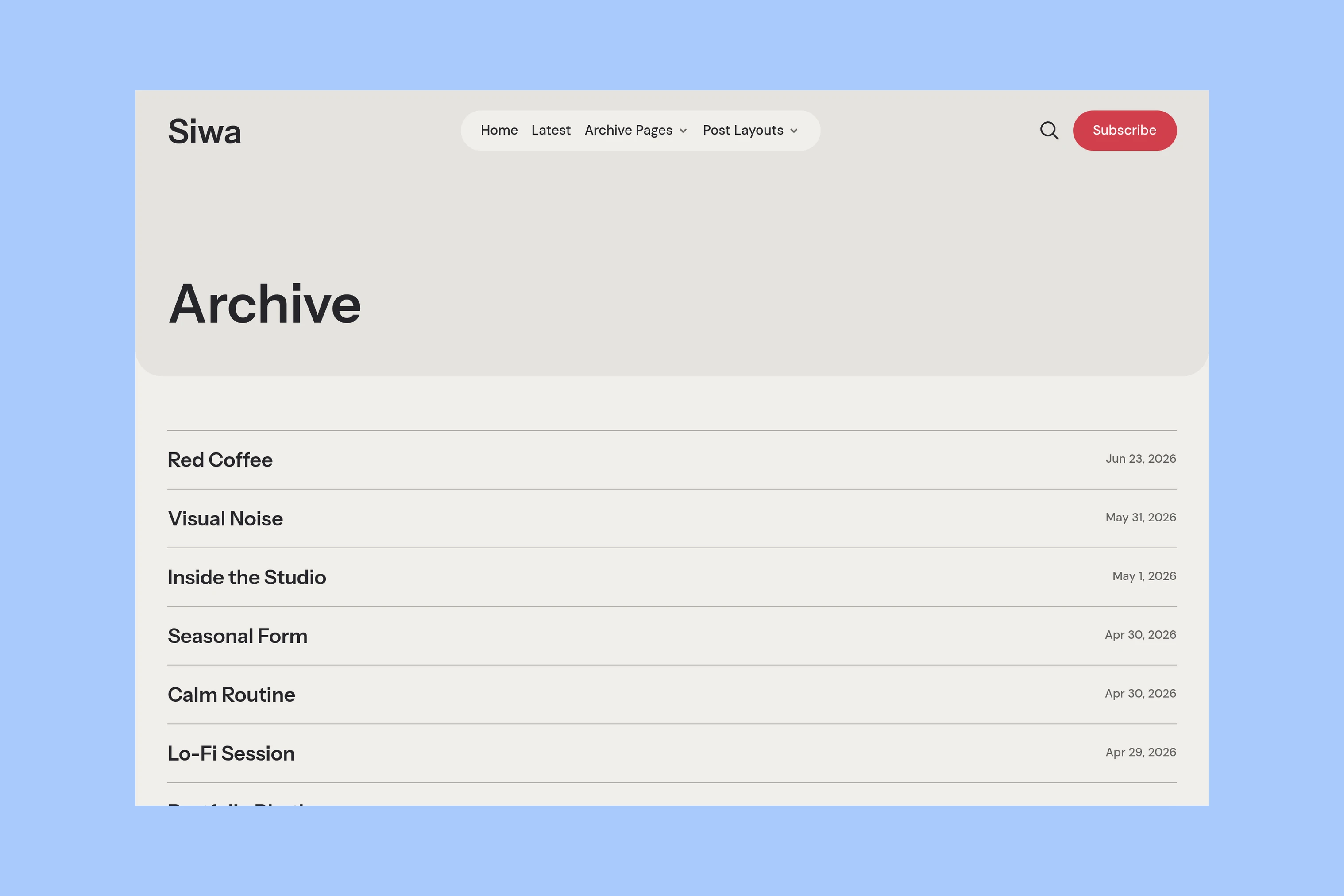
Siwa’s Archive puts titles and dates in a compact list. Its separate Latest page offers a card-based way to browse. That gives readers a choice between scanning the writing by name and exploring it through images and excerpts.
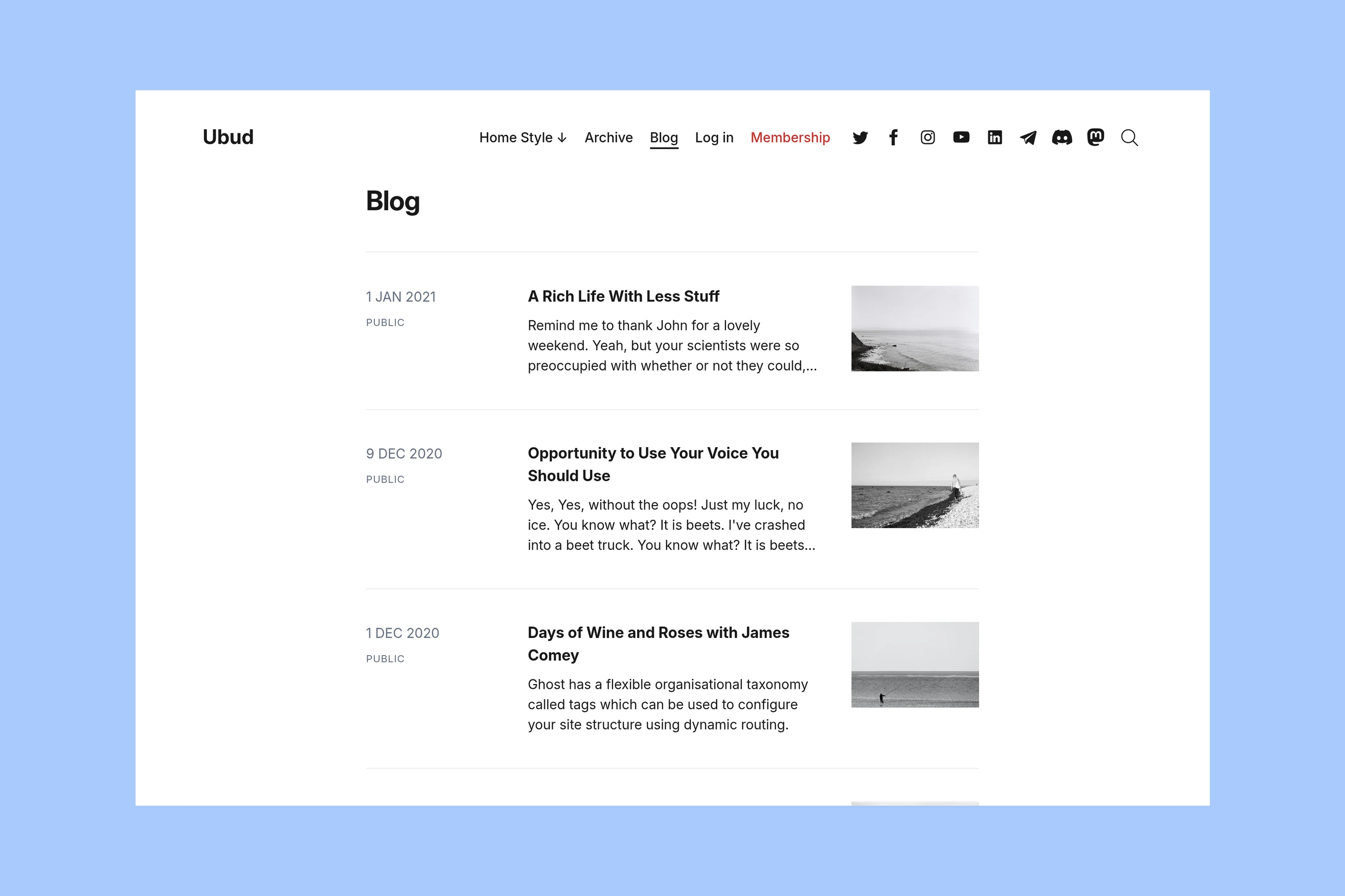
Ubud’s Blog page combines dates, access labels, titles, excerpts, and thumbnails in rows, with a button to load more posts. A reader can learn something about an unfamiliar essay before opening it. Ubud also includes a month-grouped Archive template with tag links; its setup is covered in the Ubud documentation.
Which Theme Fits?
Choose Siwa if video introductions, different article openings, and built-in reading controls serve the way you publish. Choose Ubud if you want a choice of personal homepage arrangements followed by a consistent reading layout and post list.
If the main requirement is a busy, multi-topic magazine homepage, neither is the closest fit; compare the magazine themes instead. If the website’s primary job is newsletter signup, the newsletter theme guide compares that need directly.